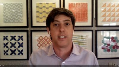
 Jonathan Schwabish of PolicyViz applies a racial equity lens to data visualization.PolicyViz founder Jon Schwabish asks probing questions along the lines of “Why do we do things this way? Is there a better way? When was the last time a way of doing something was evaluated?”
These are questions we all should ask from time to time about a variety of things in our efforts to learn and improve our data analysis, statistical modeling and data visualization. Jon asked these questions in discussing racial equity awareness for data visualization and shared some of his thinking about this topic in a recent Statistically Speaking event.
Jon's opening plenary was followed by a panel discussion with Court Sandau of Chemistry Matters and Tim Chartier, applied mathematician and sports analytics expert at Davidson College, which made for some engaging and varied perspectives.
Though the opening plenary was about racial equity awareness in data visualization, the takeaways are broadly applicable: when creating a data visualization:
- Think about the data and what they represent.
- Think about your audience and the choices you make in creating the visualizations.
- Be mindful of the data collection process.
- Show respect for the data.
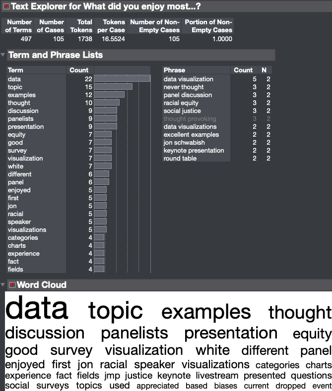
The survey responses for the live event were generally very favorable. Many viewers appreciated the focus of the plenary topic as well as the data visualization expertise shared by all of the panelists. Below is some Text Explorer output from the first question, “What did you most enjoy about the livestream event?”

The recording of Jon Schwabish's talk and the lively panel discussion that followed is available to watch anytime. Let us know what you think of it!
A great follow-up to watching Jon's talk is the Urban Institute blog post he wrote with Alice Feng.
You may also want to watch Jon's upcoming talk on this subject for the Data Visualization New York Meetup group on Monday, Sept. 21.
You must be a registered user to add a comment. If you've already registered, sign in. Otherwise, register and sign in.