“America’s health-care system is neither healthy, caring, nor a system.” – Walter Cronkite
The US health care system is not the most efficient system for delivering health care effectively. To improve the system, a lot of insurers are exploring a value-based care model. The idea behind this model is that providers will be reimbursed based on outcomes. This is in place of the traditional fee-for-service (FFS) model that pays providers based on services. The thought is that the FFS model sometimes leads to superfluous tests or treatments.
I personally think this is great idea, and it got me wondering: What if countries did this? I decided to dig into the data for health care costs and results from countries around the world. This data comes from the World Bank and shows health outcomes like life expectancy, infant mortality and maternal mortality rates by country. It also has the average health expenditure per person normalized to 2010 dollars. This health care expenditure is what we will use to calculate the return on investment.
First, let’s look at the data for each country looking at health expenditure vs. life expectancy dating back to 1970. Since both factors are changing over time, this is an excellent opportunity to utilize a bubble plot. In 1980, the United States had similar health care expenditures to Denmark, Switzerland and Germany: in the range of about $2,200-2,600 (2010 dollars).
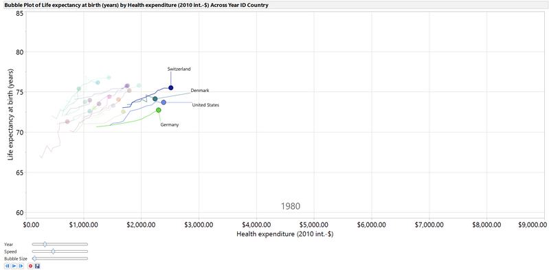
Fifteen years later, the United States is paying over $1,000 dollars (2010 dollars) per person more than any other country, and the life expectancy has not increased at a higher rate than other countries that managed to spend much less money per person.
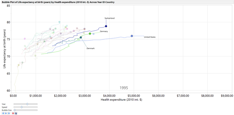
To show the entire trend, I saved the bubble plot as an animated gif, a new option in JMP 14. As you can see, the trend for most of the countries is toward a longer life expectancy and higher health care expenditures. Clearly, the country with the biggest increase in health care expenditures is the United States.
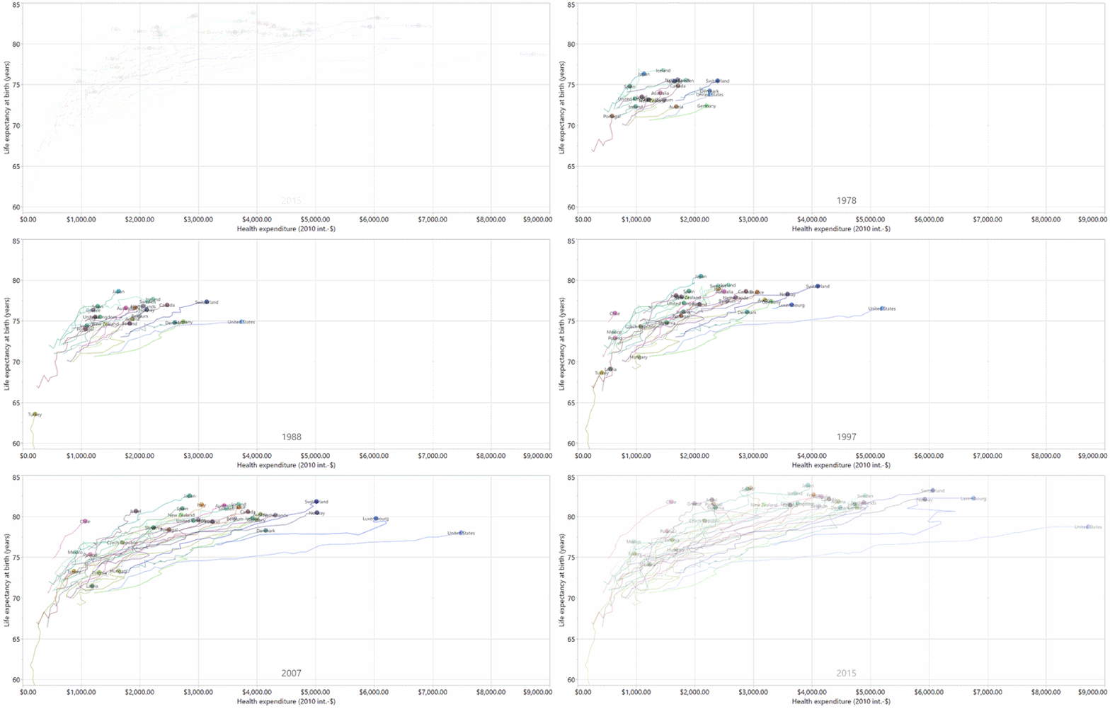
Some countries, such as Portugal and Turkey, have seen sharp increases in life expectancies with smaller increases in health expenditures. These countries seem to be getting more bang for their buck when it comes to health care spending.
Life expectancy is not the only metric to judge quality of health care, so let’s consider other factors. The other two factors we have access to in this data are infant mortality and maternal mortality. Obviously, a key goal of any health care system is to keep these rates as low as possible. To rate the overall quality of health for each country, I created a health score. The calculation for the health score is below.
Health Score = 10*Life Expectancy-5*Child Mortality Rate (per 1000)-Maternal Mortality (deaths per 100,000 births)
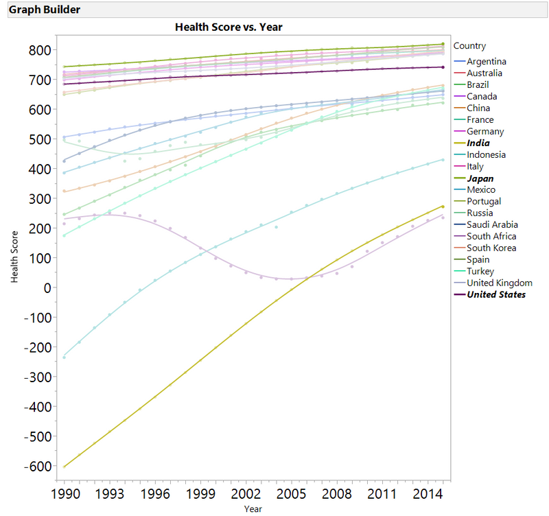
I did not get this health score calculation from any source. I determined this on my own. If we look at just the G20 countries from 1990-2015, we can see how each country is performing. As you can see, most countries have an improving health score over this 25-year period. I have highlighted three countries: India, Japan and the United States.
India has shown the largest improvement in health score in the last 25 years. Japan has had the highest health score each year for the past 25 years. The United States has seen the second-least amount of growth in health score in the 25-year period (the least was in South Africa, which went through the ending of apartheid).
I decided to evaluate what health care should cost based on outcomes. I wanted to look only at the G20 countries from 1990-2015, so I made a subset of the data for making the model. I excluded the US from the model building process since it was such an outlier on cost. I ran a Fit Y by X in JMP for the Health Expenditure vs. Health Score. When I looked at the relationship, it appeared that using a natural log transformation for the Health Expenditure would fit the data better than a polynomial.
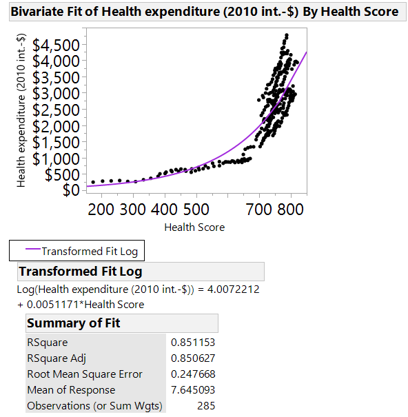
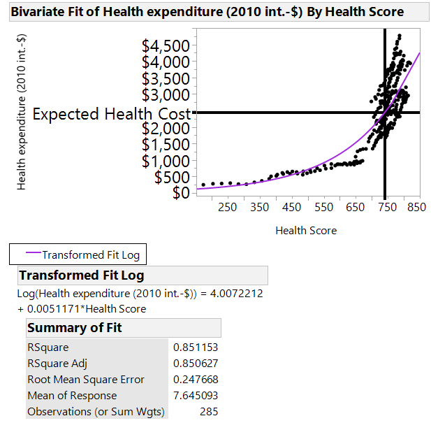
The line fit well, having an R2 value of around .85. Looking at the results from the model, I wanted to see what the United States should be paying per person for the health score the country had in 2015. The US should be paying $2,437.15 for the results it is getting if the country were in a value-based care method of paying for health care.
We could change the question and see what the US should be getting for the cost the country is currently paying for health care (~$8715 per person). We should expect a health score of 990.
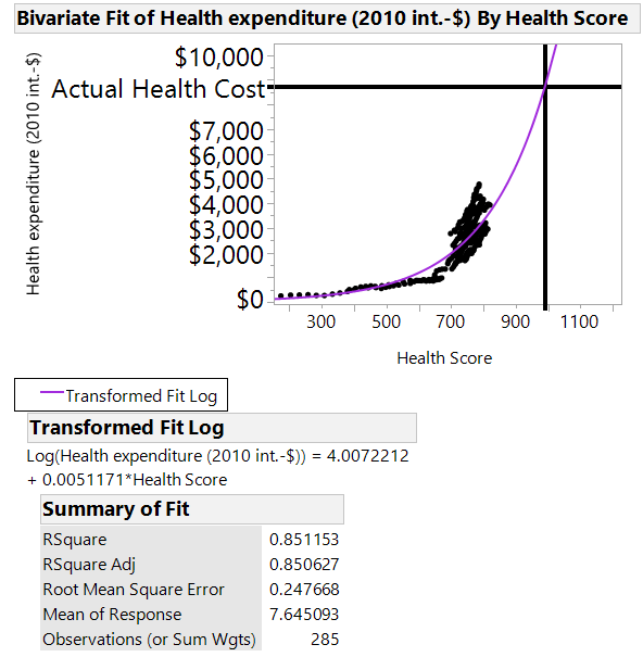
If the child mortality rate and maternal mortality rate remained the same in the US, that score would translate to a life expectancy of 103.6 years old. If the child mortality rate dropped to 0.1/1000 and maternal mortality rate dropped to 0.1/100,000, you would still have a life expectancy of over 99 years to justify the cost.
From a value-based care model, the US is not getting much value for its dollar.