Montgomery County, Maryland, publishes all traffic violations since 2013, now totaling more than 780,000 incidents. Besides the location and details of the violations, the table also contains information about the vehicles involved, such as make, model, year and color. It’s car colors that I want to explore here.
Even though the violations go back only to 2013, the model year of the cars goes back much further. It’s hard to say how far back it goes since the year data is a bit messy. Some years are obviously missing (0 and 9999) or miscoded (95 and 1013), and others are at least questionable (1930). I want to look at trends over time, so I’ll ignore low-data years anyway.
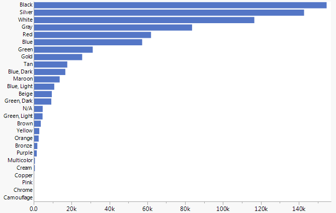
The color data, on the other hand, appears remarkably clean. No misspelled or strange colors. There could still be quality issues since all observers may not have the same interpretation of things like blue versus dark blue or tan versus cream. Here are the colors of all the citations.
To look at color trends over time, I made a summary table of counts by year and color. Then I removed very sparse years, keeping 1970 – 2016. Here’s an area chart of all that data.
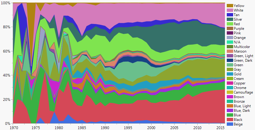
It’s starting to take shape but has some major flaws:
The early data is still too noisy to represent trends.
It’s confusing that the color of the areas don’t match the color names, resulting in a Stroop Effect in the legend.
The colors should have a meaning order, at least grouping like colors together.To address those issues:
I filtered the data to start at 1985.
I used Recode to standardize the color names to match HTML color names. Then I used those RGB values to make a Value Colors column property.
I made a Value Order column property to customize the order.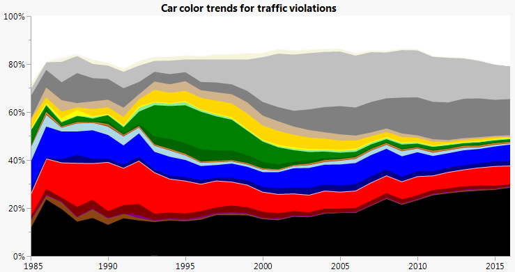
Much better, and we don’t even need the legend anymore.
Though the stacked area chart in general can obscure trends of the internal areas (those without a straight baseline), it does let use see the big trends well enough. We can see cars getting less "colorful" over time, with white, black and shades of gray generally increasing. And we can see that green has had the most dramatic changes. In the 1990s, it was the most popular color. But before and after, it’s one of the least common. Was that the forest green fad? Or have green cars from the 1990s held up better than other colors?
I put green in the middle so the other colors wouldn’t have the bulge between them and the nearest straight edge (top or bottom). In the spirit of less is more, we can combine some of the similar colors together.
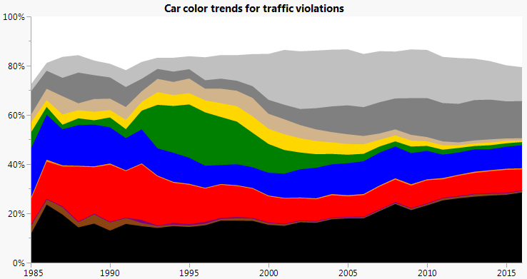
Now we have less detail but more accessible information on the general trends.
It’s interesting to compare the stacked areas to overlaid lines.
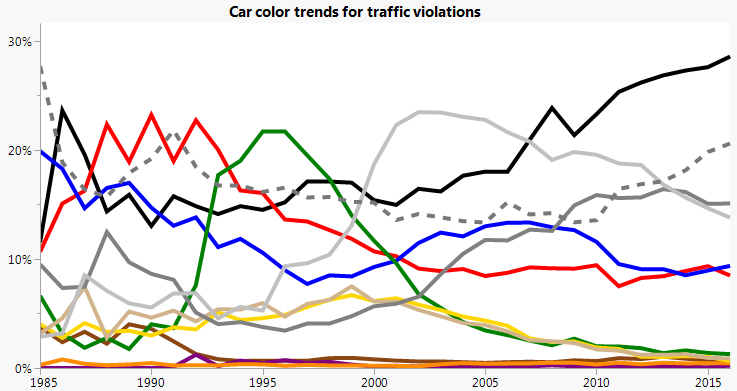
The dashed line is for white. We can see individual trends better, but we’ve lost the part-to-whole connotation and the ability to mentally combine adjacent colors, such as for the shades of gray.
It’s worth reminding ourselves what we're looking at. We’re not looking at a random sample of all cars sold or even all cars on the road. We’re looking only at cars involved in traffic violations in one county over a few years. Some cars are surely represented multiple times.
I can’t decide if this is the great weakness or the great strength of data science: We analyze the data that we have instead of the data that we need. It’s a weakness when we blindly extrapolate, but it’s a strength when we can characterize the unknowns enough to extract some information from the knowns.
For this data, the two main unknowns are regional differences in car colors and correlations between car color and incurring a traffic violation (deservedly or not). If we can eliminate those factors for one year, we can have more confidence in making generalizations.
DuPont publishes a survey on car color popularity, though I've only been able to find a few glimpses of the data. From those, we can see that color preferences differ around the world, so I'll only compare the Maryland traffic violations data to North America color sales.
Here's a slope chart comparing percentages from our data with the survey results, again using a dashed line for white.
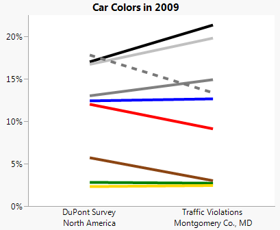
It looks like white, red and brown cars are showing up less often than expected in the traffic violations data. We can confirm that the differences are significant by using the Test Probabilities command in the Distribution platform in JMP. Doing that gives a p-value of practically 0 for seeing percentages this different in our population of 32,000 cars from 2009. On the plus side, at least the other colors have the same rank order in each sample, so perhaps the differences are secondary factors.
For that reason and because the most likely explanations for the differences are not related to time, I'm still hopeful that the rough time trends shown in the above charts are meaningful.
Any theories on why the white, red and brown cars show up so much less in the traffic violations than in the DuPont survey?
