- User Community
- :
- Blogs
- :
- JMP Blog
- :
- Control Charts for monitoring vital signs

I was recently having dinner with a friend who works in the neonatology department at a nearby hospital. My friend described a scenario where an infant’s heart rate started to drop. Like many patients in the hospital, all the premature infants’ vital signs are monitored continuously, including heart rate. I learned how even a small change in the heart rate can signal many changes happening to the body, including an infection. I realized monitoring vital signs like heartbeats is a great application for the CUSUM Control Chart.
When traditional control charts are applied to vital signs, tragically, about all they can detect are dire medical events. Traditional control charts are designed to spot out-of-control points or large shifts in a process. What happens when your process is a patient's heartbeat, respiratory rate or blood pressure? Waiting to spot something so far out of control after the fact could be life-threatening for a patient. All of these vital signs have fluctuations; however, it’s critical to spot a shift, especially for a patient in critical condition.
Because Cumulative Sum (CUSUM) Control Charts simply add up the deviations from each data point to the mean or target, these charts are acutely effective at detecting small shifts. As actual individual infant heart rate data is difficult to access and use in publications due to privacy laws, I turned to simulated infant pulse data for 15-minute intervals to test the idea. If you have JMP, you can find this data in the Infant Heart Rate.jmp file.
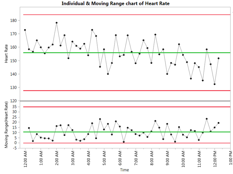
Graphing the data on an Individuals and Moving Range chart, we can see some variation, as expected. If we turn on all the tests, we see none fail – including the tests for runs. So, there’s no indication of anything wrong.
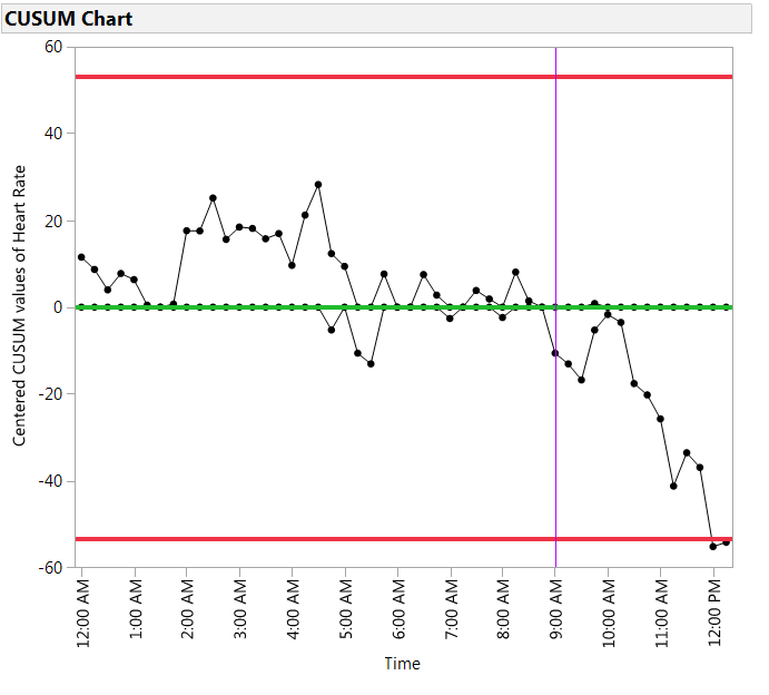
When we plot the same data using the CUSUM Control Chart, we see two sets of cumulative sums of the differences between each point and the mean, one positive and the other negative differences. The red line, or limit, is set to a conservative five times the average moving range of the data.
We can see clearly there was a downward shift or deceleration in the heart rate, as the negative cumulative sum crosses the lower limit around noon. The purple line shows where the shift in heart rate began, at approximately 9 am. In other words, this tells us that by noon, for this simulated example, we detected that the heart rate started a very gradual deceleration around 9 am.
Fortunately, in the real scenario my friend described, the hospital neonatal staff caught the drop in pulse early, diagnosed and treated the cause. My friend also shared that the baby was healthy and strong enough to go home from the hospital a few weeks later.
The new CUSUM Control Charts in JMP detect small shifts quickly and can be a helpful tool to monitoring many situations in the hospital, including vital signs. To learn more about CUSUM Control Charts, read my blog post "How to detect small shifts in Control Charts."
- Subscribe to RSS Feed
- Mark as New
- Mark as Read
- Bookmark
- Subscribe
- Printer Friendly Page
- Report Inappropriate Content
- © 2025 JMP Statistical Discovery LLC. All Rights Reserved.
- Cookie Preferences
- Terms of Use
- Privacy Statement
- Contact Us


You must be a registered user to add a comment. If you've already registered, sign in. Otherwise, register and sign in.