- New to JMP? Let the Data Analysis Director guide you through selecting an analysis task, an analysis goal, and a data type. Available now in the JMP Marketplace!
- See how to install JMP Marketplace extensions to customize and enhance JMP.
JMP Blog
A blog for anyone curious about data visualization, design of experiments, statistics, predictive modeling, and more- JMP User Community
- :
- Blogs
- :
- JMP Blog
- :
- Building hurricane dashboards
- Subscribe to RSS Feed
- Mark as New
- Mark as Read
- Bookmark
- Subscribe
- Printer Friendly Page
- Report Inappropriate Content
Here at the JMP home office in North Carolina, hurricane season is upon us in more ways than one. While we are getting close to the start of the Carolina Hurricanes hockey season, the hurricanes that are making the news recently are Harvey and Irma (not to be confused with this couple, who recently celebrated their 75th wedding anniversary). Hurricanes Harvey and Irma have inflicted a great deal of damage in Texas, Florida, and nearby states, including smaller amounts in Western North Carolina.
As many readers will know, one of the JMP sample datasets contains hurricane track data from NOAA. With the recent storms, I thought it would be interesting to go back to the source to get data for the most recent years. The IBTrACS database contains worldwide storm tracking data over a number of years. I decided to look only at the North Atlantic Basin, which has data available for 1851-2016. In exploring the data, you might ask a number of questions, such as:
- How common are Category 5 hurricanes relative to the lower classifications?
- Which storms are the largest on record?
- How do individual storms vary in intensity over time?
- Where did the storms occur geographically?
When asking multiple questions about data, it is often the case that you will need to use multiple JMP platforms and graphs to answer the questions. In many cases, information that you learn from one graph can then be used to guide the inputs that are used in other graphs. This type of workflow is ideal for demonstrating how a JMP dashboard can integrate multiple platforms together, using selection filters to guide exploration.
The setup
My first step after downloading the data was to do some additional processing on the data. The raw data includes Latitude, Longitude, and Wind Speed over the lifetime of the storm, usually at six-hour intervals. I wrote a script to loop over the rows and add a hurricane class, according to the Saffir-Simpson scale for hurricanes as well as the lesser classifications of Tropical storm and Tropical depression.
One thing that I wanted to look at is the energy of a storm. Going back to NOAA, I found that the wind energy from the storm is a product of air density, drag coefficient, and the windspeed3. Properly computing wind energy would require much more than the summary information available; so for simplicity I integrated the windspeed3 to compute a measure of energy at each observation as well as cumulative and total energy for each storm. A fun fact from the NOAA site is that while wind energy from a storm can be massive, the total energy released through cloud and rain formation can be 400 times greater!
Finally, I created a Duration and Cumulative Duration column for each hurricane track. This normalizes the date/time information, allowing tracks to be overlaid for comparison of how each storm progressed.
Creating the graphs
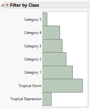
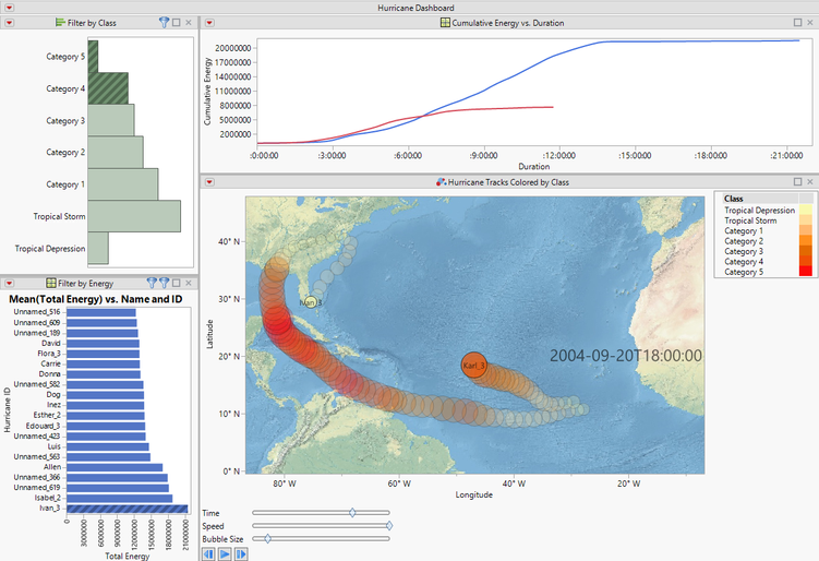
Armed with my derived data, I was ready to create some graphs to explore the data. A distribution of the Max Class works well to tally up the total number of observations for storms that reached each class level. I could have used the class itself here, but I wanted to use the distribution to select storms that reach a given classification, and I needed to select all rows of these storms.
Note that I customized the title and removed some of the default tables of information based on how the report will be used later. This is often helpful when combining multiple reports together, as it serves as a guide for using the reports in the combined dashboard and eliminates extraneous detail.
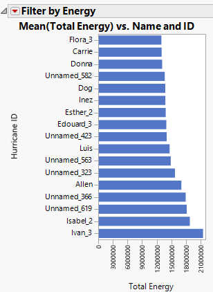
Next, I wanted to see how storms vary in the wind energy metric that was computed. I used Graph Builder to create a bar chart ordered by total storm energy. I resized the Y axis to show only the top 17 storms, but other storms can be found by scrolling the axis. The largest energy storm is at the bottom, primarily because this works well when filters are later applied.
One interesting plot shows the Cumulative Energy of each storm over the duration of the storm. This provides a view of the lifetime of the storm – how long it persisted, and when it strengthened and weakened. This graph shows that measured storms have persisted for more than 32 days and have a variety of signatures in terms of how quickly they strenghtened and weakened.
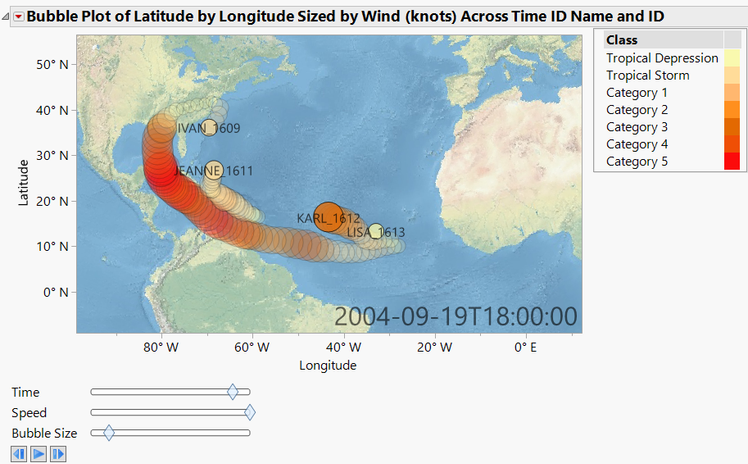
The final graph is a traditional geographic view that shows the position and strength of the hurricane over time, using the Bubble Plot platform. In this case, I chose to use the windspeed for the bubble size – I could have used the energy metric to show the strengthening of the storm. In either case, it is important to note that the bubble size is not intended to show the extent of the storm. The bubbles are colored by the hurricane class to reinforce the strength of the storm along the path.
Building a hurricane dashboard
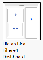
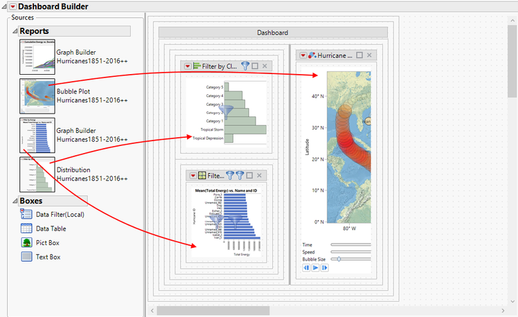
While each of the reports above can help to explore the data by itself, reports are often used in combination to define an exploration workflow. Building a dashboard in JMP is one way to build that process into a reusable component. In this example, I wanted to use the Distribution and Graph Builder bar reports to filter the views for the final two reports. To do this, I started creating a new Dashboard with File > New > Dashboard and selected the Hierarchical Filter + 1 template. This template has three predefined report locations – a primary filter, a secondary filter, and a final report.
The next step is to place the reports in the predefined positions. You can do this by single-clicking on a report and then clicking on the report position, or by dragging and dropping the reports. There are four reports and only three predefined positions in this case. So I started by adding the Distribution as the primary filter, the Graph Builder bar graph as the secondary filter, and the Bubble Plot as the final report.
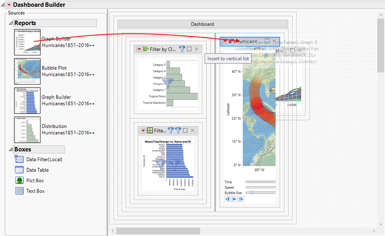
I added the final report by dragging into the workspace and choosing a drop zone. In addition to populating a template placeholder, drop locations are also available to create horizontal or vertical splitter layouts, as well as tabbed layouts. The template serves as a starting point, but you can create many layouts by dragging reports and choosing drop zones. In this case, I dropped the cumulative energy report in the location immediately above the Bubble Plot report.
Within the Dashboard Builder, the reports are shown using a thumbnail view for compactness, and most mouse interactions are used for dashboard layout rather than modifying the reports. One way to test the dashboard as it would appear in the final form is to use the Preview Mode found in the red-triangle menu. Preview mode can also be helpful for setting the specific splitter sizes that you would like, to control the sizes of each individual graph. Finally, you can save the dashboard from the File menu to one of two different file types:
- .jmpappsource – Opening this file returns to Dashboard Builder to allow additional editing
- .jmpapp – Opening this file runs the Dashboard
You can also use the red-triangle menu option under Save Script to save the dashboard to a JMP Add-In. When a JMP Add-In is distributed to other JMP users, opening it will add the dashboard as a main menu item. This is very helpful for dashboards or JSL scripts that will be used frequently on different tables with the same column names. You can also save the Dashboard to the Data Table, which is what I have done with the table attached to this post.
When I run the dashboard, the initial view includes all of the hurricane tracks. By selecting Category 5 in the primary filter, the view is updated for the remaining plots to show only the matching hurricane tracks. Selecting one or more bars in the energy chart further filters the remaining views to show only the selected storms, allowing a comparison of the cumulative energy curves and animated view of the Bubble Plot. In the image below, I've selected hurricanes of Category 4 and 5, and further selections of Ivan_3 and Karl_3 allow a comparison of two storms that formed near the same time in 2004.
In this example, I used some JSL for some initial table processing, but the layout and filtering arrangement is all done graphically using Dashboard Builder. Dashboard Builder is a subset of Application Builder; so for those who are scripters at heart, it is also possible to start with a similar dashboard layout and switch into application mode to add more advanced features with scripting.
Try it yourself
In many data projects, it is helpful to use multiple reports to explore and analyze the data. I hope this example gives you some ideas for how other projects could be streamlined in a similar way, combining data views that are designed to filter with data views that are designed to analyze or visualize the data.
The data table attached to this post contains the North Atlantic subset of the NOAA data, with additional columns added for this project. The included table script Hurricane Dashboard runs the example shown here (Note: requires JMP 13.0 or newer). It will be interesting to see where Hurricanes Harvey and Irma fit in with the historical data. Irma sustained maximum winds of 185mph (second only to Hurricane Allen) for 37 hours, and maintained Category 5 levels for 3 days, 3 hours.
You must be a registered user to add a comment. If you've already registered, sign in. Otherwise, register and sign in.
- © 2026 JMP Statistical Discovery LLC. All Rights Reserved.
- Terms of Use
- Privacy Statement
- Contact Us

