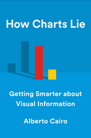
Alberto Ca Alberto Cairo shows how data visualization can be misleadingiro knows that data visualization can be misleading. The responsibility to be understood lies with the designer of the graph, but also with the reader: "Visualizations are meant to be read -- not only to be seen."
In his new book How Charts Lie (which is on preorder now and will be published in October) he encourages everyone to become a more informed reader of graphs, maps, diagrams, and infographics. Cairo will be our guest speaker at the JMP Explorers seminar in Eindhoven, Netherlands, on May 14. In this complimentary seminar, he explores best practices for creating a successful, meaningful visual that avoids some of the most common missteps. Sign up for the seminar or the live stream online. Prior to the event, I asked him some questions.
You say in your talk “Visual Trumpery” that there is a growing divide between the data visualization community and the general public. When creating a visualization, what should we look out for, in order to be better understood?
 Alberto Cairo's new book: How Charts Lie will be published in October.Visual Trumpery has ended up leading to my new book, How Charts Lie, which comes out in October this year. However, I often joke that a better title would have been How We Lie to Ourselves with Charts. It's clunkier, and that's why I didn't use it, but it certainly embodies what the book is about.
To make a visualization understandable, we need to consider at least two actors: a designer and a reader. Designers have a responsibility to use sensible visualization principles (good encodings, proper textual explanations, etc.), and to try to test their graphics before putting them out, if possible.
But readers also have a responsibility: to be attentive, to read things carefully, and to curb an impulse we all have to project what we already believe, or what we want to believe, onto the visualizations we see.
Why should we be more critical about charts and data visualization we see in the news?
Ask people — specialists and lay readers alike — about why they believe visualization is useful, and you'll get responses such as "a picture is worth a thousand words," "data should speak for itself," or "show, don't tell!" As I explain in the book, taken at face value, uncritically, myths like those are dangerous because they popularize the idea that a visualization is a mere illustration that can be interpreted at a quick glance. We need to change this frame of mind, and accept that visualizations are not just images, but visual arguments. The same way that you can't understand an article or essay by reading its title alone, you can't expect to understand a good visualization at a quick glance. Visualizations are meant to be read, decoded, not just seen.
The challenge that derives from these myths, I think, is that we all believe, wrongly, that visualizations are intuitive and easy to read, and that often leads to misinterpretations due to carelessness or ignorance. In the book, I present many examples, including some that misled me. Even when a graphic is perfectly designed, it still can "lie" to us because we don't read it with the attention it requires.
Do you have a favorite graph?
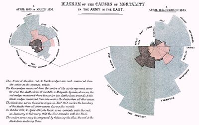
 "I don't think we give Florence Nightingale enough credit in the data visualization community," says Alberto Cairo. Image source: WikipediaI'd say Florence Nightingale's famous charts in her multiple reports after the War in Crimea and the statistical analyses that preceded those charts, beautifully explained by Hugh Small and other authors (for example, http://www.florence-nightingale-avenging-angel.co.uk/?p=462 and https://rss.onlinelibrary.wiley.com/doi/pdf/10.1111/j.1740-9713.2008.00327.x).
I recently read several biographies of Nightingale's, and wrote about her in the last chapter of How Charts Lie. I don't think that we give her enough credit in the visualization community.
What do you hope that attendees will take away from the Explorers seminar?
A better understanding of why visual design doesn't consist just on making graphics look pretty, but also more understandable and trustworthy. I'd also like to explain why we should pay more attention to the charts we design, even the simplest ones.
Sign up for the seminar on May 14 or the live stream online.
You must be a registered user to add a comment. If you've already registered, sign in. Otherwise, register and sign in.