JMP Blog
A blog for anyone curious about data visualization, design of experiments, statistics, predictive modeling, and more- JMP User Community
- :
- Blogs
- :
- JMP Blog
- :
- A friendlier dot plot?
- Subscribe to RSS Feed
- Mark as New
- Mark as Read
- Bookmark
- Subscribe
- Printer Friendly Page
- Report Inappropriate Content
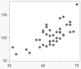
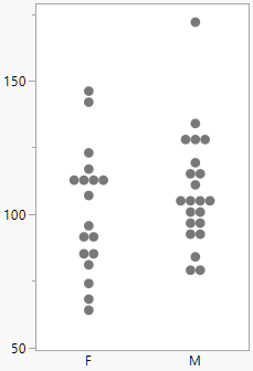
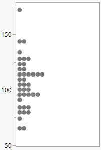
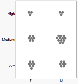
Graph Builder in JMP can generate dozens of types of charts, but it always starts with some form of dot plot. The idea is to show the data in its most basic representation, one dot per row. Beyond the familiar scatterplot form with two continuous variables, dot plots adapt to many situations: with any combination of continuous and categorical variables, with univariate data, with multivariate data and with small or medium sized data sets.
 |
 |
 |
 |
However, in one situation the dot plot invariably gets replaced with a bar chart, even at the expense of obscuring or distorting the data: when there is one continuous variable, one categorical variable with one data value per combination. After seeing yet another truncated bar chart, I wondered why on Twitter and found similar thinking from data visualization educator and consultant Nick Desbarats of Practical Reporting. We decided to team up on this article, and in this next section, Nick frames the issue from his teaching experiences.
A what plot?
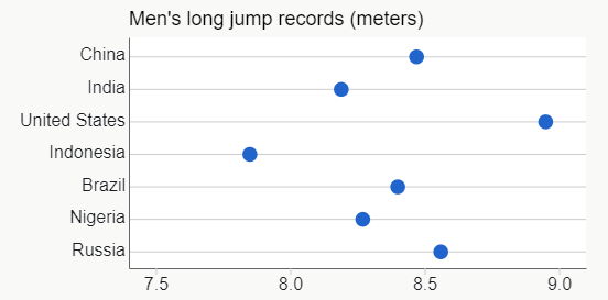
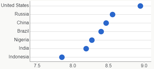
One of the chart types that I [Nick] cover when teaching Stephen Few’s Show Me the Numbers course is the Cleveland dot plot (named after pioneering data visualization researcher William S. Cleveland):
If you’re like most of my workshop participants, though, you won’t recognize this chart type. When I ask participants if they’ve seen one before, somewhere between 0% and 10% of hands typically go up. Immediately following the few hands that do go up, a much larger number of eyebrows invariably go down. The dominant emotion on the faces of participants is unmistakable: it’s confusion.
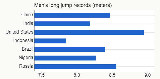
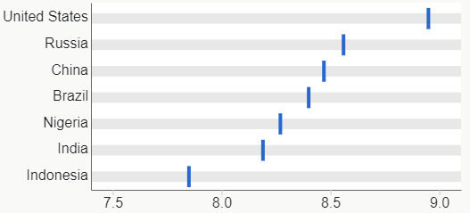
If you’re confused too, let me explain: The chart above is essentially a horizontal bar chart with seven bars, but with the end of each bar indicated by a dot and the bars removed. Why would I use dots instead of bars? Because, if I used bars, my chart would look like this:
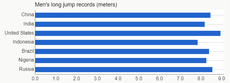
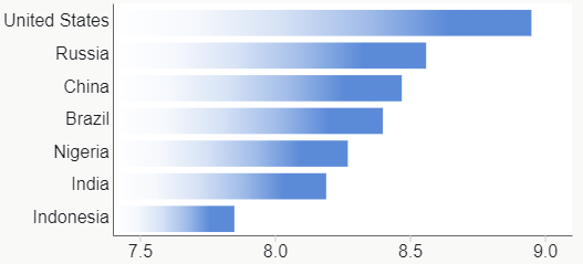
A bar chart such as this would be misleading because it looks like, for example, Brazil’s record is about twice that of Indonesia since its bar is about twice as long. Looking at the value scale below the bars tells us that that’s not even close to true, however. This perceptual problem is the reason why bar charts with quantitative scales that don’t include zero are a best practices no-no. One way to solve it would be to start the scale at zero:
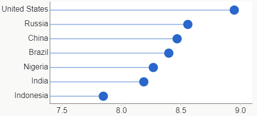
This is perceptually safer but, with this particular data, it’s difficult to see the differences between the values since they’re so close to one another. If we’re comparing long jump records, though, small differences are very important, so this graph wouldn’t be a very effective way to visualize this data. How could we visualize these values in a way that allows the differences between them to be clearly seen but also not risk causing people to visually misperceive them? The Cleveland dot plot:
Because there are no bar lengths to compare in a dot plot, the risk that viewers will mistakenly perceive that, for example, Brazil’s record is twice that of Indonesia is much lower, but they can also see the small differences between the values much more clearly and easily. Like I said, useful.
Yes, the confusion that my workshop participants experience is short-lived. Following a 30-second explanation, the eyebrows come back up and a quiet “ooooh…” rises from the room. And yes, even without my explanation, most participants would eventually figure it out, although I wonder how many would bother to make that journey unaided. Participants regularly (and sheepishly) tell me that, even though they now understand how dot plots work and how useful they are, they won’t use them because their audiences won’t bother to figure them out.
Potential causes of confusion
To those of us who are familiar with dot plots, this seems strange. Why would so many people have trouble grasping dot plots when those very same people have no problem grasping bar charts and line charts, as well as other chart types that are arguably less intuitive, such as scatterplots? After observing thousands of people reacting to seeing a dot plot for the first time, a combination of factors now seems plausible:
- Looks like a scatterplot: Many people seem to initially assume that they’re looking at a scatterplot, probably because almost every other chart that they’ve seen that featured dots arranged in a 2D space was a scatterplot. They then get confused because both axes aren’t quantitative and so they have to realize that their scatterplot assumption was wrong before they can even begin to understand what they’re looking at. If they fail to realize that their scatterplot assumption was wrong, they’ll conclude that the chart is a botched scatterplot and that the chart designer didn’t know what they were doing.
- Looks like it should have been a bar chart: If a viewer correctly grasps how a dot plot works, they might doubt their own understanding since they don’t see why the graph creator used dots instead of bars. They might question their own “this is like a bar chart” interpretation even though it’s correct, and wonder what they’re missing even though they’re not missing anything.
- “Direction of measure” not immediately obvious: It’s not immediately clear that, in the sample chart above, only the horizontal position of each dot represents a quantitative value, and that its vertical position does not. This might have something to do with the circular shape of the dots, which doesn’t give any visual clues as to whether its “direction of measure” is horizontal, vertical, or both.
- Guide lines violate expectations: We suspect that the thin, horizontal guide lines in the above example may be contributing to viewers’ initial confusion. While the lines make it easier and less error-prone to associate each dot with its corresponding category name, comments and questions from Nick's workshop participants suggest that these lines may also be communicating other, unintended visual messages to those who are encountering a dot plot for the first time:
- In virtually every other graph that participants are likely to have seen before, the presence of thin, horizontal lines means that the vertical position of each mark (dot, bar, etc.) encodes its quantitative value, i.e., that marks that are higher or lower on the graph represent greater or lesser quantities. The dot plot example above violates that expectation, though, since it contains horizontal lines, but it’s the horizontal position of each dot that indicates its quantitative value, not its vertical position, as the lines might suggest to many people.
- Some people seem to initially think that the lines are “going the wrong way” since, in their minds, such lines are always associated with quantitative scales in graphs, not categorical scales. Seeing lines associated with a categorical scale seems to throw some people off, possibly because they can’t make sense of the graph until they realize that their understanding of how gridlines work is wrong or, at least, too narrow.
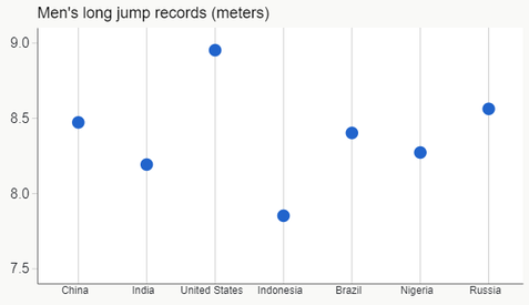
- Looks like a time-series dot plot: When encountering a vertical dot plot for the first time, some people seem to initially assume that they’re looking at a time-series dot plot, but then get confused when they see that the horizontal axis isn’t time. They then have to realize that their time-series dot plot assumption was wrong before they can understand what they’re looking at.
Can anything be done?
Note that none of these problems arise from the fact that the graph above is a dot plot but, instead, from the individual design elements (dot shape, presence/orientation of gridlines, etc.) of this particular dot plot design, which is the traditional design for dot plots. By changing the design elements, then, might we be able to make dot plots “friendlier” to those who are encountering them for the first time? Even, possibly, friendly enough that they require no explanation at all? My recent tweets on dot plot alternatives dovetailed with Nick's thinking, and we decided to collaborate on this article in an effort to design a friendlier dot plot. The main goals of our redesign, then, would be:
- To make it more immediately obvious that the chart isn’t a scatterplot or a time-series dot plot and, for dot-plot-naïve viewers, that it’s a new chart type so they’ll need to slow down and figure out how to it works.
- To make the direction of measure more obvious (horizontal for a horizontal dot plot, vertical for a vertical dot plot, and not both horizontal and vertical as in a scatterplot).
- To make it more obvious that the chart works similarly to a bar chart.
How might we modify the design elements of the Cleveland dot plot to achieve these redesign goals and make dot plots friendlier, then? Thinking broadly at first, we can imagine the following changes:
- Replace the category guide lines with something that looks less like quantitative gridlines. Maybe thicker but lighter lines, zebra shading, or nothing at all.
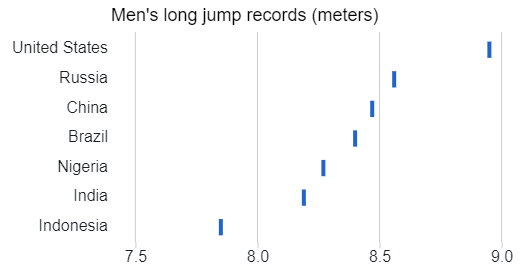
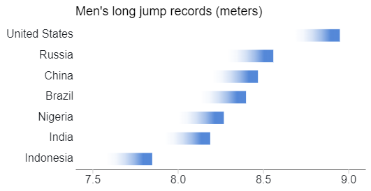
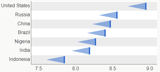
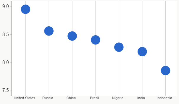
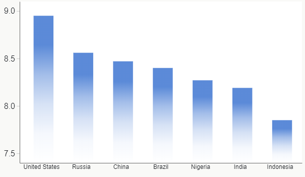
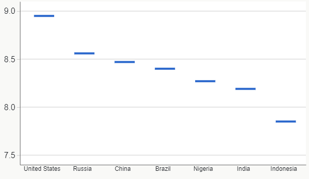
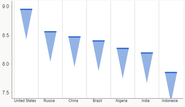
- Replace the circular dot mark with a shape that visually suggests a direction of measure (horizontal or vertical, but not both). Maybe a pipe mark (“|”), faded bar end, or pennant.
- Add guides for the quantitative scale. Maybe gridlines, shading or more padding that behave the same as in most other graphs, i.e., are perpendicular to the direction of measure and serve to enable users to more precisely visually estimate the quantitative values of marks in the chart.
Exploring alternatives
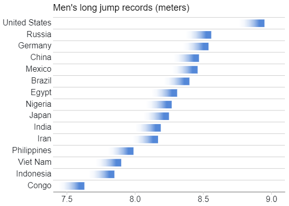
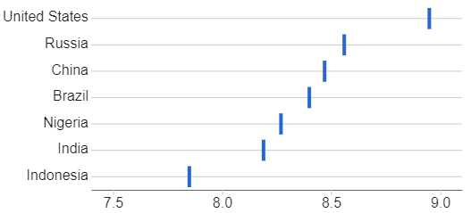
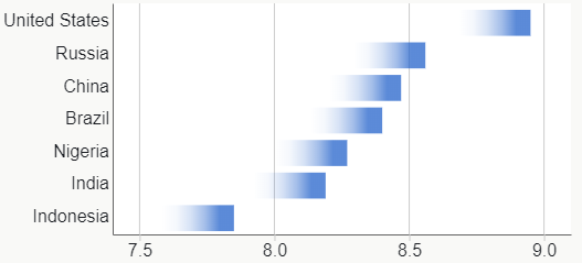
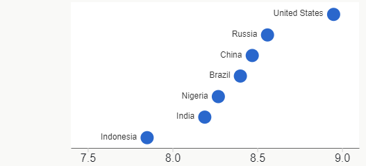
The possible combinations of design elements add up quickly (or, should we say, “multiply up” quickly), and the above options don’t yet include non-data variables like chart size, orientation, and borders, which also influence comprehension. The gallery below features just a few of the combinations of our broad array of options. The data comes from Wikipedia’s list of national long jump records. To control the number of categories and still provide a reasonable spread of values, we display only the countries with the largest populations. As a result, small countries with excellent long jump records do not appear.
 |
 |
 |
 |
 |
 |
 |
 |
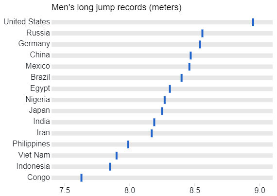
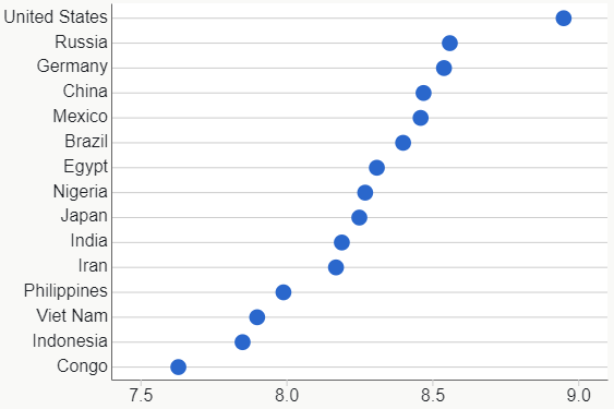
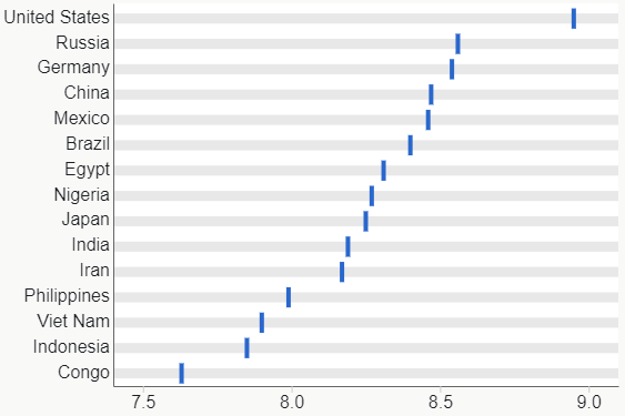
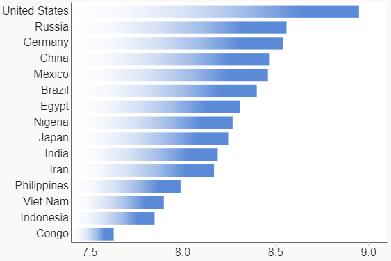
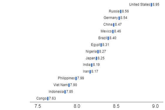
When the number of categories is larger, it becomes more difficult to visually associate marks with their corresponding category labels, so the design choices that work best for charts with a small number of categories may differ from those for charts with a larger number of categories. The gallery below features a few design element combinations with a larger number of categories:
 |
 |
 |
 |
As if we didn’t already have enough design choice combinations to consider, there’s also the orientation (horizontal or vertical) to throw into the mix:
 |
 |
 |
 |
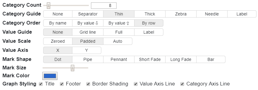
Since we can’t show all possible design element combinations and we want to encourage experimentation, we made a cool interactive Observable notebook that allows anyone to experiment with different combinations of design elements. On that page, you can use a control panel (see screenshot below) to instantly see what different design combinations look like in a sample chart that’s regenerated every time a design element is changed.
Promising redesigns
After experimenting with various combinations ourselves, and keeping our redesign goals in mind, we hypothesized that the ones below would perform best with dot plot-naïve users or, at least, perform better than the conventional design.
For data sets with fewer than about eight categories:
We favored these designs for several reasons:
- The pipe and faded bar mark shapes support several of our redesign goals:
- They make it more immediately obvious that the chart isn’t a scatterplot or time-series dot plot since those mark shapes would be unconventional choices for those chart types. For users who’ve never seen a dot plot before, then, the marks will likely be unfamiliar to them, suggesting a new chart type that they’ll need to learn.
- They make it more immediately obvious that the direction of measure is exclusively horizontal, and not vertical or both horizontal and vertical. The faded bar marks make it even more obvious that marks that are further to the right represent greater absolute quantities (as opposed to lesser absolute quantities, which would be the case if the values were all negative).
- They visually suggest the ends of bars, which suggests the correct way to interpret the chart. The “faded bar” marks make this even more obvious.
- There are no category guide lines that could be mistaken for quantitative gridlines. If users will need to visually estimate values with very high precision, quantitative gridlines can be added without introducing any confusion (in fact, quantitative gridlines might even aid with initial comprehension since they’d further visually reinforce the direction of measure).
- These designs preserve a key benefit of Cleveland dot plots since the values are still represented as marks with different 2D positions and not different lengths (as in a bar chart), which lowers the risk that users will compare the quantities incorrectly when the quantitative scale doesn’t include zero. If we’d used the “bar” shape or “needle” category guides, we would have lost this benefit.
If the data to be visualized has more than about eight categories, associating the marks with their category labels becomes more effortful and error-prone, and so some form of category guide becomes necessary. To our eyes, thick but light category guides worked best with pipe marks, and thin separator lines worked best with faded bar marks:
We haven’t tested these designs on dot-plot-naÏve users against the conventional design, however, so these are only hypotheses at this point. For the reasons discussed above, though, we suspect that they’d perform better than the conventional dot plot design. Let us know what you think in the comments, or if you think that other combinations of design elements might make for a friendlier dot plot.
You must be a registered user to add a comment. If you've already registered, sign in. Otherwise, register and sign in.
- © 2026 JMP Statistical Discovery LLC. All Rights Reserved.
- Terms of Use
- Privacy Statement
- Contact Us

