- Subscribe to RSS Feed
- Mark as New
- Mark as Read
- Bookmark
- Subscribe
- Printer Friendly Page
- Report Inappropriate Content
JMP Add-Ins
Download and share JMP add-ins- JMP User Community
- :
- File Exchange
- :
- JMP Add-Ins
- :
- Spider Plot Add-in
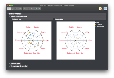
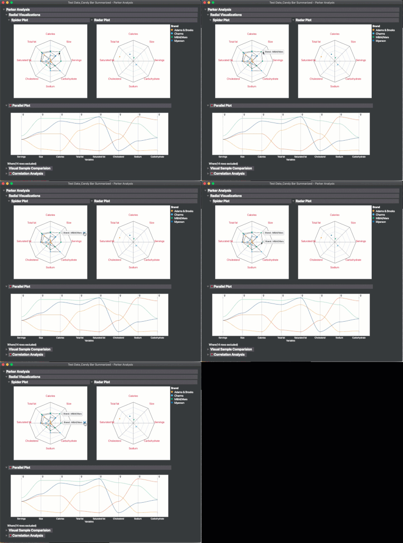
This add-in combines a number of visualizations related to consumer analytics, including Spider Plots, a multivariate plot on normalized values (riffing on @danschikore's RadViz add-in), a parallel plot, and pairwise correlation analysis. The add-in installs as "Parker Analysis" (e.g. Peter Parker) under the add-in menu.
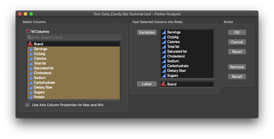
The setup is straight forward - just drop the variables of interest into the variables field and the sample/person/product ID in the Label field. A summarized version of the Candy Bar Nutrition sample data set is included to demonstrate the table set up.
Since collected data can sometimes not extend the full width of an available scale (i.e. possible values ranged between 1 and 7, but observed values only ranging between 2 and 4) the platform has an option to use the Axis column property. Select the checkbox in the lower left of the launcher and the tool will scan the variables for Axis settings and scale those parts of the Spider plot accordingly.
Updates:
19May2020: Switched from adhoc parallel plot to using Graph Builder's Parallel Plot and added a bar chart with a column switcher.
25Jul2024: Please note that there are no plans for further development of this add-in.
Mike,
I get an error message. I have JMP Pro 13 installed.
Add-In "com.jmp.MikeyD.parker - Parker Analysis" is not valid for this version of JMP
-B
Hi, @bemevar!
I developed the Add-in on 15. Since I'm not set up to test on older versions of JMP, I peg my add-ins at the development version. Check with the person that owns the license, you should be able to upgrade.
Best,
M
Hi Mike,
Very useful graph addin! I however do not see the red triangle for the radial visualizations (Spider and Radar plots), so I can not apply a local data filter or save these plots. Also the resulting plots don't seem available when creating a dashboard.
I have version 14.2.
Thanks!
Best,
Hi, @mnkamel,
Since this is an add-in, the red triangle menu would be something that I would have to program in. But, you can get the pictures out by selecting them using the selection tool:
That should allow you to paste them into a PowerPoint, etc. If you wanted that part to be in a dashboard, you'd probably have to code it directly. I'm not aware of a method for making an addin available like that in Dashboards.
Hope that helps!
best,
M
Hi Mike,
Great Add-In!
It works really well on our test/manufacturing data for high volume MEMS products.
Thanks for sharing.
- Philip
Hi Mike
can one include this in a interactive jmp html file ?
Tried but the plots does not appear in the fields one can choose content for the web
Cheers, Gernot
Just checked the log and when trying to turn it into a html:
Interactive HTML: Unsupported display type: DataBrowserBox
Interactive HTML: Unsupported display type: Box
Interactive HTML: Internal operation does not support interactive graphs.
Interactive HTML: Color statistics on nominal and ordinal data types are not fully supported
Interactive HTML: Unsupported display type: ParallelAxisSeg
Interactive HTML: Parallel plot is not interactive.
Interactive HTML: Unsupported display type: ColumnSwitcherContextListBox
Interactive HTML: Unsupported display type: ColumnSwitcherContextOutlineBox
Interactive HTML: Controls are not interactive.
Interactive HTML: Unsupported display type: ListBoxBox
ok - I can see that you answered that one before :)
pitty that the spider web is not standard in JMP 15 - the code you made: is it accesible ?
@GEAB - I've attached the source - but I would really recommend that, rather than trying to use or extend the Spider Plot, you look for alternate ways of visualizing the data. Spider Plots are pretty a pretty awful graph-type for communicating information. That's the main point of the Parker Analysis add-in - to put other methods of visualizing the same data along side a spider plot to show how much more informative they can be.
- Just a thought
M
@MikeD_Anderson You are totally right on the visualization with radar plots - however in sensory its one of the hioghly accepted/used ways https://www.researchgate.net/figure/Comparison-of-sensory-profiles-of-cow-ewe-and-goat-yogurt-sample...
Thnaks for pointing at the code - did miss that :)
Thank you very much mike for add in. It is very usefull.
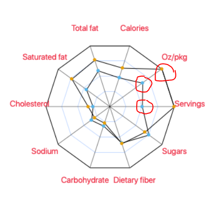
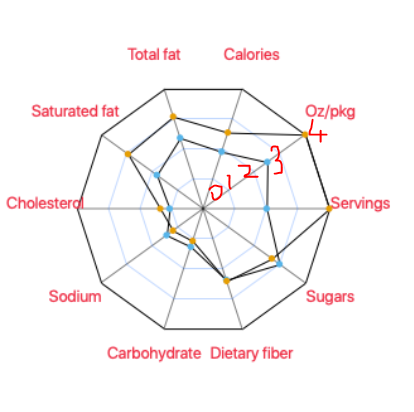
How can put label of points to each red and blue dot in the map and how can i change axis min max levels?
I am not sure whether i can explain what i am searching but here are pictures below to explain what i can try to do?
Kind regards,
Hi, @Ella!
Thanks for having a look at the add-in - labeling dots can be done by hovering over one of the data points and pinning the pop-up (there's a little pin in the upper right corner when you mouse over the pop-up). I'm not planning to add labeling to the plot, since every axis could be on it's own scale that would make things really busy. You can control the scale of each graph by adding an axis column property and setting the max and min in there. After that, there's a check-box in the dialog to tell the add-in to check the columns for axis properties. That will scale each one independently, but again - no labels.
Best,
M
Hi again Mike,
Actually i can not find add value of each point to the graph. I only find adding row labels, but i dont want it, i want to add the values of that point in the cell. Could you put picture that explain how ı dan do it.
Kind regards.
Hi, Ella! You can right click on a column name in the data table and select "Label/Unlabel" and that will then show those values in the hover label in the plot. I've added a gif below to show how to pin the individual hover labels (though I don't have any labels turned on).
Hey Mike,
The values I would like to display in the spider web are between 1-5 and I do not know how to change the size of the spider web. For example, that the minimum value is 0 and the maximum value is 5. Is there any option to set the minimum and maximum value of the spider web?
Thanks :)
@s192403 - set the Axis Column Property to have the max and min values you want. Then use the check box below the columns list in the set up dialog to have JMP check for the settings. If you need details, this has be covered a couple of times in the comments and in the description of the add-in.
Best,
M
Well, disregard my last JMP Community "vote" for a spider/radar plot option.....turns out this excellent add-in is exactly what I need!
Hi Mike,
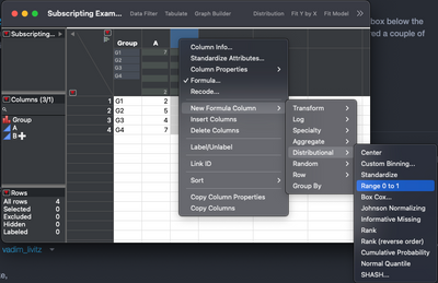
Great add-in! works really well. What formula do you use to normalize values from 0 to 1?
- Mark as Read
- Mark as New
- Bookmark
- Get Direct Link
- Report Inappropriate Content
How can I add filters to the spider plot?
- Mark as Read
- Mark as New
- Bookmark
- Get Direct Link
- Report Inappropriate Content
Hello, @MikeD_Anderson
Thank you for your response. Could you please let me know if there is an alternative or workaround to use filters with this add-in?
Best regards,
@ResamplingFawn4 - unfortunately, there isn't an alternative unless you wanted to subset your data table before generating the graph. The point of the add-in is to demonstrate that there are better ways to visualize data than with a spider plot. So, I didn't really worry about fleshing out the capabilities of the plot.
Best,
M
Great add in! Some improvements could be:
- don't auto color by Label. Right now it automatically colors by Label that overwrites my existing row states
- the ability to selectively make some lines darker than others (i.e. bold out parts of interest). Right now I have to customize each and every line, but with 50-100 lines I need to count my way down to find the exact line I want to bold. Line should be named by Label when generating the plot so it's easier to find the ones I want to bold.
I'm in JMP17.2
This is effectively what I wish to do... bold/color some lines and leave the remainder black.
And ideally remove the blue "grid lines"
@kasias - thanks for the feedback - I don't have any plans to develop the add-in further. Its purpose is to give alternatives to the spider and radar plots. The general consensus is that they look cool, but do a pretty awful job of communicating information (e.g., Practical Charts, pg 207, Better Data Visualizations, pg 267). In the case above, you might consider using a heat map instead.
- Mark as Read
- Mark as New
- Bookmark
- Get Direct Link
- Report Inappropriate Content
- レーダーチャートグラフを、下のように変更したいのですが、編集の仕方をご教示ください。
※現在
※変更希望
@MathPeccary8773 I'd suggest using something like a heat map instead of a spider plot for this application.
Best,
M
Recommended Articles
- © 2026 JMP Statistical Discovery LLC. All Rights Reserved.
- Terms of Use
- Privacy Statement
- Contact Us
