- JMP will suspend normal business operations for our Winter Holiday beginning on Wednesday, Dec. 24, 2025, at 5:00 p.m. ET (2:00 p.m. ET for JMP Accounts Receivable).
Regular business hours will resume at 9:00 a.m. EST on Friday, Jan. 2, 2026. - We’re retiring the File Exchange at the end of this year. The JMP Marketplace is now your destination for add-ins and extensions.
- Subscribe to RSS Feed
- Mark Topic as New
- Mark Topic as Read
- Float this Topic for Current User
- Bookmark
- Subscribe
- Mute
- Printer Friendly Page
Discussions
Solve problems, and share tips and tricks with other JMP users.- JMP User Community
- :
- Discussions
- :
- Re: when i use graph builder to plot Bar chart, how do I display a decimal?
- Mark as New
- Bookmark
- Subscribe
- Mute
- Subscribe to RSS Feed
- Get Direct Link
- Report Inappropriate Content
when i use graph builder to plot Bar chart, how do I display a decimal?
Hello everyone,
thank you very much for your time.
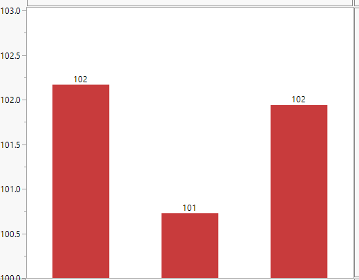
when i use graph builder to plot Bar chart, i want to show the data mean value.
but if i select"label by value", numbers are integers. How do I display a decimal?
thank you very much.
Accepted Solutions
- Mark as New
- Bookmark
- Subscribe
- Mute
- Subscribe to RSS Feed
- Get Direct Link
- Report Inappropriate Content
Re: when i use graph builder to plot Bar chart, how do I display a decimal?
Hmmm, I am wondering which version of JMP you are using the bar heights and the labels do not seem to match the left, Y, Axis.
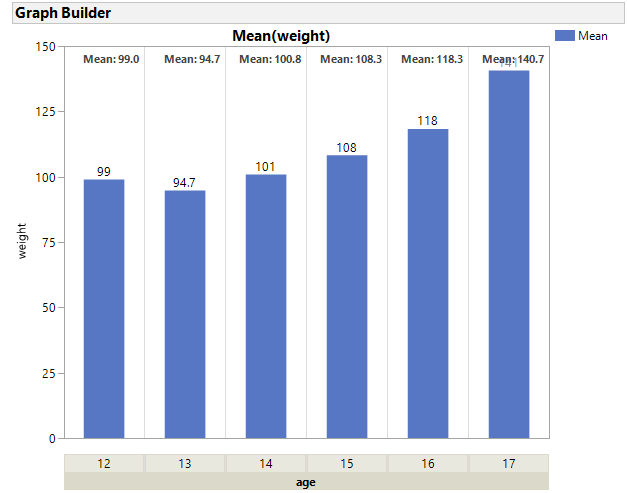
I do not know of a point and click method to specify a format for the Bar or Boxplot labels. If your version allows you to Add > Caption, You can create a graph like the one displayed below without scripting. Captions seem to show smarter formatting, than labels. If the format of the Y variable (weight for the example below) is Fixed with 0 decimals, the caption mean will be reported with 1 decimal. If the format of Y was Fixed with 2 decimals then the caption mean would have 3 decimals. If the format is best then each group has different formats, based upon "Best."
The steps to create this and the script can be found below. With JSL you can create a script to add a custom label to each bar, but to keep it current with exclusions, the scripting becomes more advanced.
Steps:
- Drag Y variable to the Y axis.
- Right click in the graph and select Points and Change to Bar
- Right click in the graph and select Add Caption
- Right click in the graph and select Customize. The click on Text then click on the Font button and select Bold.
- Drag the nominal varaible to the X group area at the top. For this example, drag column age. Note all the bars have bolded Means.
- Right click on the X Group Area and select X Group Edge, select Bottom.
Note that the format for column weight was Fixed width=5 and decimals=0, so the mean has exactly 1 decimal point in the caption.
Names default to here(1);

dt = Open("$sample_data/big class.jmp");


gb = dt << Graph Builder(
	Size( 534, 454 ),
	Show Control Panel( 0 ),
	X Group Edge( "Bottom" ),
	Variables( Y( :weight ), Group X( :age ) ),
	Elements( Bar( Y, Legend( 1 ) ), Caption Box( Y, Legend( 2 ) ) )
);

tseg = gb << Xpath("//FrameBox//TextSeg");
tseg <<  {Font( "Segoe UI", 8, "Bold" )};
Attached is a script that demonstrates customizing boxplots. It does not have the added code to manage exclusions ( it requires a row state handler). It demonstrates some of the steps required to figure out placement and formatting of custom labels.
- Mark as New
- Bookmark
- Subscribe
- Mute
- Subscribe to RSS Feed
- Get Direct Link
- Report Inappropriate Content
Re: when i use graph builder to plot Bar chart, how do I display a decimal?
thank you very much
Recommended Articles
- © 2026 JMP Statistical Discovery LLC. All Rights Reserved.
- Terms of Use
- Privacy Statement
- Contact Us

