- New to JMP? Let the Data Analysis Director guide you through selecting an analysis task, an analysis goal, and a data type. Available now in the JMP Marketplace!
- See how to install JMP Marketplace extensions to customize and enhance JMP.
- Subscribe to RSS Feed
- Mark Topic as New
- Mark Topic as Read
- Float this Topic for Current User
- Bookmark
- Subscribe
- Mute
- Printer Friendly Page
Discussions
Solve problems, and share tips and tricks with other JMP users.- JMP User Community
- :
- Discussions
- :
- Re: need to plot a regression line that includes my custom computed upper and lo...
- Mark as New
- Bookmark
- Subscribe
- Mute
- Subscribe to RSS Feed
- Get Direct Link
- Report Inappropriate Content
need to plot a regression line that includes my custom computed upper and lower error bars
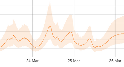
Hi - I am trying to write a script that will plot my computed regression value along with my custom computed upper and lower error bars. That is, for each independent value, my chart would plot the dependent (regressed) value, the upper bound, and the lower bound. My chart would look something like the example below, ideally with the error range shaded. Thanks in advance!
Accepted Solutions
- Mark as New
- Bookmark
- Subscribe
- Mute
- Subscribe to RSS Feed
- Get Direct Link
- Report Inappropriate Content
Re: need to plot a regression line that includes my custom computed upper and lower error bars
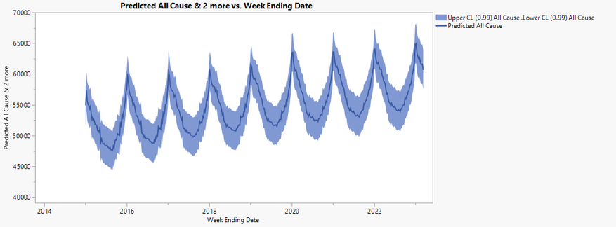
I apologize as I was not very clear/helpful. In the script available using the 'View More' button in the very first post, after all of the statistical analysis is a graph with a prediction, confidence limits, and a shaded area. In graph builder, you could:
- Add time to x axis
- Add prediction, upper and lower confidence limits to y axis
- Change to line and remove the smoother
- Right click inside the chart area and select Add > Area
- On the bottom left, under 'Area', change the Area Style to Range, and under Variables uncheck the prediction, so you only have time, upper, and lower confidence variables checked.
- On the bottom left, under 'Line', uncheck the confidence variables, so you only have time and prediction checked.
- Mark as New
- Bookmark
- Subscribe
- Mute
- Subscribe to RSS Feed
- Get Direct Link
- Report Inappropriate Content
Re: need to plot a regression line that includes my custom computed upper and lower error bars
Have a look at some of the code in the post below, I think everything you need is there:
A time series (seasonal ARIMA) model for varying variability in different seasons
- Mark as New
- Bookmark
- Subscribe
- Mute
- Subscribe to RSS Feed
- Get Direct Link
- Report Inappropriate Content
Re: need to plot a regression line that includes my custom computed upper and lower error bars
Thank you ih. Sorry, I think my original question was unclear. I only need to plot my computed values as a time series. (I do not need to do seasonal modeling.) I have already computed my regression and my upper and lower errors and I just need to plot them with the error range shaded. I looked through the link you sent, to no avail. I am probably missing something.
- Mark as New
- Bookmark
- Subscribe
- Mute
- Subscribe to RSS Feed
- Get Direct Link
- Report Inappropriate Content
Re: need to plot a regression line that includes my custom computed upper and lower error bars
I apologize as I was not very clear/helpful. In the script available using the 'View More' button in the very first post, after all of the statistical analysis is a graph with a prediction, confidence limits, and a shaded area. In graph builder, you could:
- Add time to x axis
- Add prediction, upper and lower confidence limits to y axis
- Change to line and remove the smoother
- Right click inside the chart area and select Add > Area
- On the bottom left, under 'Area', change the Area Style to Range, and under Variables uncheck the prediction, so you only have time, upper, and lower confidence variables checked.
- On the bottom left, under 'Line', uncheck the confidence variables, so you only have time and prediction checked.
- Mark as New
- Bookmark
- Subscribe
- Mute
- Subscribe to RSS Feed
- Get Direct Link
- Report Inappropriate Content
Re: need to plot a regression line that includes my custom computed upper and lower error bars
Thank you ih - this should help!
Recommended Articles
- © 2026 JMP Statistical Discovery LLC. All Rights Reserved.
- Terms of Use
- Privacy Statement
- Contact Us


