- New to JMP? Let the Data Analysis Director guide you through selecting an analysis task, an analysis goal, and a data type. Available now in the JMP Marketplace!
- See how to install JMP Marketplace extensions to customize and enhance JMP.
- Subscribe to RSS Feed
- Mark Topic as New
- Mark Topic as Read
- Float this Topic for Current User
- Bookmark
- Subscribe
- Mute
- Printer Friendly Page
Discussions
Solve problems, and share tips and tricks with other JMP users.- JMP User Community
- :
- Discussions
- :
- Re: help!! How can I change each variables plotted points to something other tha...
- Mark as New
- Bookmark
- Subscribe
- Mute
- Subscribe to RSS Feed
- Get Direct Link
- Report Inappropriate Content
help!! How can I change each variables plotted points to something other than solid circle in graph builder?
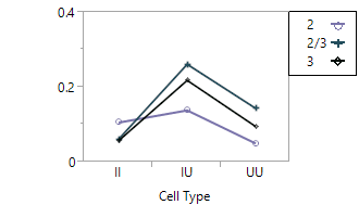
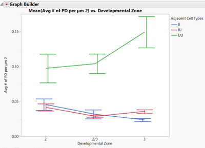
help!! How can I change each variables plotted points to something other than solid circle in graph builder, such as an open circle or diamond? Attached is an example of an older graph (created in older JMP version) with the variables points marked differently and
an example from newest JMP version.
- Mark as New
- Bookmark
- Subscribe
- Mute
- Subscribe to RSS Feed
- Get Direct Link
- Report Inappropriate Content
Re: help!! How can I change each variables plotted points to something other than solid circle in graph builder?
Yes, depending on how your datable is set up, you may be able to use the Color or Overlay fields in Graph Builder.
- Mark as New
- Bookmark
- Subscribe
- Mute
- Subscribe to RSS Feed
- Get Direct Link
- Report Inappropriate Content
Re: help!! How can I change each variables plotted points to something other than solid circle in graph builder?
How does my data table*?* need to be set up? what are the steps to get to the option? I've tried color and the above graph is using overlay.
- Mark as New
- Bookmark
- Subscribe
- Mute
- Subscribe to RSS Feed
- Get Direct Link
- Report Inappropriate Content
Re: help!! How can I change each variables plotted points to something other than solid circle in graph builder?
is this what you are looking for?
basic:
JMP Graphics Tip: Alphabetic Markers
more advanced:
http://blogs.sas.com/content/jmp/2009/03/24/want-cool-row-markers-in-jmp-8-heres-how-to-get-em/
there is also a way of customizing the markers and their direction i just couldn't get the reference.
- Mark as New
- Bookmark
- Subscribe
- Mute
- Subscribe to RSS Feed
- Get Direct Link
- Report Inappropriate Content
Re: help!! How can I change each variables plotted points to something other than solid circle in graph builder?
As is the case in JMP there is more than one way to do this, here are a few that I know of:
1. Try putting your grouping category in both the overlay and the color options and see if you get what you want. Note, if you are using lines then you may have to add "points". If you open the big class sample data:
Y = height
X = age
select the line
overlay = sex
color = sex
right click, add points
on the left under points change summary statistic to mean
[Missing image]
2. Double click on the legend to bring up legend settings. Click on the line or marker to change them.
3. Right click (in any plot) and select "customize", there you will find options for line colors, maker colors, marker shapes, etc.
Recommended Articles
- © 2026 JMP Statistical Discovery LLC. All Rights Reserved.
- Terms of Use
- Privacy Statement
- Contact Us


