- New to JMP? Let the Data Analysis Director guide you through selecting an analysis task, an analysis goal, and a data type. Available now in the JMP Marketplace!
- See how to install JMP Marketplace extensions to customize and enhance JMP.
- Subscribe to RSS Feed
- Mark Topic as New
- Mark Topic as Read
- Float this Topic for Current User
- Bookmark
- Subscribe
- Mute
- Printer Friendly Page
Discussions
Solve problems, and share tips and tricks with other JMP users.- JMP User Community
- :
- Discussions
- :
- X and Y error bars in X-Y Plot
- Mark as New
- Bookmark
- Subscribe
- Mute
- Subscribe to RSS Feed
- Get Direct Link
- Report Inappropriate Content
X and Y error bars in X-Y Plot
For physical property correlation tests, we often measure two properties on a series of samples differentiated by a varying concentration of an additive. These two property measurements are repeated 5 times for each sample (at a set concentration). What I would like to do, is plot the two properties on a scatter plot and show the error bars for both properties by concentration.
In Excel, I would calculate mean, std.dev and the confidence interval. The confidence interval can then be used to set the size of the error bars in the X and Y direction.
JMP is bound to have a much better and more statistically sound mechanism for this, I hope? I've added some example files, to illustrate my intention. These are randomly generated data.
Accepted Solutions
- Mark as New
- Bookmark
- Subscribe
- Mute
- Subscribe to RSS Feed
- Get Direct Link
- Report Inappropriate Content
Re: X and Y error bars in X-Y Plot
With some effort it can be done with Graph Builder in JMP 13 by plotting Y positioned at mean_X and X positioned at mean_Y on top of eachother but with different response axis settings. In the example below locally tranformed columns are used within Graph Builder (i.e. no need to change the data table).
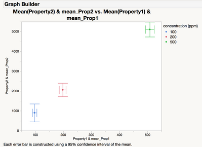
Here the script to reproduce it:
Graph Builder(
    Variables(
        X(:Property1),
        X(Transform Column("mean_Prop1", Formula(Col Mean(:Property1, :concentration))), Position(1)),
        Y(:Property2),
        Y(Transform Column("mean_Prop2", Formula(Col Mean(:Property2, :concentration))), Position(1)),
        Overlay(:concentration)
    ),
    Elements(
        Points(X(1), Y(2), Response Axis("X"), Summary Statistic("Mean"), Error Bars("Confidence Interval")),
        Points(X(2), Y(1), Response Axis("Y"), Summary Statistic("Mean"), Error Bars("Confidence Interval"))
    )
);
- Mark as New
- Bookmark
- Subscribe
- Mute
- Subscribe to RSS Feed
- Get Direct Link
- Report Inappropriate Content
Re: X and Y error bars in X-Y Plot
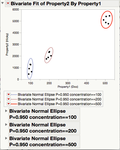
How about a bivariate density elipse for each concentration?
You can get this using Fit Y by X with your two measurements.
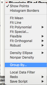
Then choose Group By... from the red triangle hotspot and choose Concentration as your grouping column.
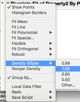
Then add a density elipse.
- Mark as New
- Bookmark
- Subscribe
- Mute
- Subscribe to RSS Feed
- Get Direct Link
- Report Inappropriate Content
Re: X and Y error bars in X-Y Plot
With some effort it can be done with Graph Builder in JMP 13 by plotting Y positioned at mean_X and X positioned at mean_Y on top of eachother but with different response axis settings. In the example below locally tranformed columns are used within Graph Builder (i.e. no need to change the data table).

Here the script to reproduce it:
Graph Builder(
    Variables(
        X(:Property1),
        X(Transform Column("mean_Prop1", Formula(Col Mean(:Property1, :concentration))), Position(1)),
        Y(:Property2),
        Y(Transform Column("mean_Prop2", Formula(Col Mean(:Property2, :concentration))), Position(1)),
        Overlay(:concentration)
    ),
    Elements(
        Points(X(1), Y(2), Response Axis("X"), Summary Statistic("Mean"), Error Bars("Confidence Interval")),
        Points(X(2), Y(1), Response Axis("Y"), Summary Statistic("Mean"), Error Bars("Confidence Interval"))
    )
);
- Mark as New
- Bookmark
- Subscribe
- Mute
- Subscribe to RSS Feed
- Get Direct Link
- Report Inappropriate Content
Re: X and Y error bars in X-Y Plot
Thanks for taking the time to help me!
Is there an obvious way to generate this script through the Graph Builder application? I might invest time to generate scripts this way, but I'd like to convey this to my co-workers as well.
Recommended Articles
- © 2026 JMP Statistical Discovery LLC. All Rights Reserved.
- Terms of Use
- Privacy Statement
- Contact Us


