- New to JMP? Let the Data Analysis Director guide you through selecting an analysis task, an analysis goal, and a data type. Available now in the JMP Marketplace!
- See how to install JMP Marketplace extensions to customize and enhance JMP.
- Subscribe to RSS Feed
- Mark Topic as New
- Mark Topic as Read
- Float this Topic for Current User
- Bookmark
- Subscribe
- Mute
- Printer Friendly Page
Discussions
Solve problems, and share tips and tricks with other JMP users.- JMP User Community
- :
- Discussions
- :
- What are the principal components in a 3D Biplot after k-means clustering?
- Mark as New
- Bookmark
- Subscribe
- Mute
- Subscribe to RSS Feed
- Get Direct Link
- Report Inappropriate Content
What are the principal components in a 3D Biplot after k-means clustering?
Hi,
I have clustered a dataset with n=5008 using the kmeans clustering algorithm. One option for a visualization is the 3D biplot that uses 3 axes with the principal components. Unfortunately, I can not find a clear explanation where it comes from. My guess is, that simply the variables used for clustering are used for a principal component analysis, but i have no proof.
Thank you for your help!
Seb
Accepted Solutions
- Mark as New
- Bookmark
- Subscribe
- Mute
- Subscribe to RSS Feed
- Get Direct Link
- Report Inappropriate Content
Re: What are the principal components in a 3D Biplot after k-means clustering?
I selected the "?" tool and clicked on the 3D biplot and the help screen for the K Means Clustering Report Options was displayed. Here is part of its verbage:
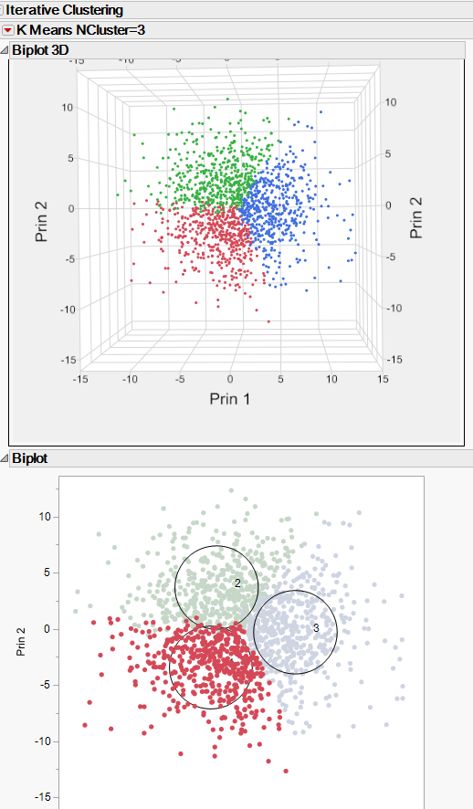
And as seen below the 3D Biplot is just an expansion on the 2D Biplot, so the 2D Biplot definition also describes the 3D Biplot
I hope this is helpful
- Mark as New
- Bookmark
- Subscribe
- Mute
- Subscribe to RSS Feed
- Get Direct Link
- Report Inappropriate Content
Re: What are the principal components in a 3D Biplot after k-means clustering?
Hi Jim,
thank you for your answer. I think I am on the right track. I'm still wondering about the definition. It says the "principal components of the data". It is not clear if the PCA ist based on the whole dataset and used in the visualization of the kmeans-clustering result or it is based in the variables used for clustering. I guess it is the latter case, It is not clearly stated though.
Thanks,
Seb
Recommended Articles
- © 2026 JMP Statistical Discovery LLC. All Rights Reserved.
- Terms of Use
- Privacy Statement
- Contact Us

