- Don’t miss your chance to experience Discovery Summit Europe at our best available rate! Early bird registration through 31 Oct.
- Graph Builder Toolbar streamlines interactive graphing. Creates shortcuts on Report and GraphBuilder Helpers toolbars. Download and install the extension.
- Subscribe to RSS Feed
- Mark Topic as New
- Mark Topic as Read
- Float this Topic for Current User
- Bookmark
- Subscribe
- Mute
- Printer Friendly Page
Discussions
Solve problems, and share tips and tricks with other JMP users.- User Community
- :
- Discussions
- :
- Re: Visualizing Control Charts for multiple instrument and parameters in one pla...

- Mark as New
- Bookmark
- Subscribe
- Mute
- Subscribe to RSS Feed
- Get Direct Link
- Report Inappropriate Content
Visualizing Control Charts for multiple instrument and parameters in one platform/interface (user-friendly)
Hello,
I'd like to get your input on something I want to implement in my team, and to a greater extent, in the company I work for.
Context:
We are running a number of processes in multiple instruments. For each of these, we collect a lot of results (process performances) that we measure.
We use control charts to visualize if a process is in control in an instrument but this can lead to to tens of control charts per process per instrument.
Instruments are grouped in cluster and I have datatables for each cluster. These datatables are grouped in one JMP project.
Problem statement:
I would like to create an interface where you can select the instrument, the process and the parameters/performances you want to visualize. The interface should be pretty user-friendly (for example using buttons and drop-down list or selecting items). Then clicking on a "Display control charts" button, would either have for effect to open a new window or display in the same window the selected control charts. There will also be an "update" button that would update the JMP datable, which is at the moment, linked to an Sharepoint-Excel table, such that you would always have the latest version of the data when you visualize the control charts. (I have everything here, I just need to implement the update button, should be straightforward).
I've used AI to sort of generate what I would ideally like to have:
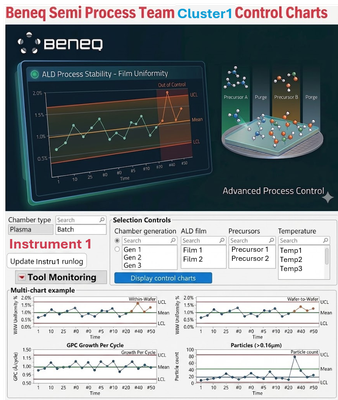
Routes for a solution
I initially thought of using a JMP journal, combined with JMP dashboard but before spending time in this direction I would like to have some feedback on the feasibility of that little project I have and on the best options. Should it be a JMP journal, a JMP dashboard or an application (which means I would need to start scripting in JSL) ? Is that even feasible with JMP at the moment ?
Thank you in advance for your help and any idea is welcome!


- Mark as New
- Bookmark
- Subscribe
- Mute
- Subscribe to RSS Feed
- Get Direct Link
- Report Inappropriate Content
Re: Visualizing Control Charts for multiple instrument and parameters in one platform/interface (user-friendly)
You might be able to do this with control chart builder + local data filter and then workflow/update table script to update the data. If you want the UI look exactly like that, I would go with more customized JSL solution.

- Mark as New
- Bookmark
- Subscribe
- Mute
- Subscribe to RSS Feed
- Get Direct Link
- Report Inappropriate Content
Re: Visualizing Control Charts for multiple instrument and parameters in one platform/interface (user-friendly)
bonjour,
je fais des dashboards avec le même modèle:
filtre de données locales (sélection année, mois, produit + autres variables), des tab page boxes avec graphique + tableau récapitulatif pour avoir quelques statistiques (nombre de résultats, moyenne, écart-type,..). quand j'ajoute les cartes de contrôle, j'utilise l(IMR avec de plus en plus souvent le sélecteur de colonnes. Il faut bien paramétrer les variables pour que l'axe Y s'adapte à chaque variable dans la carte de contrôle.
cordialement


- Mark as New
- Bookmark
- Subscribe
- Mute
- Subscribe to RSS Feed
- Get Direct Link
- Report Inappropriate Content
Re: Visualizing Control Charts for multiple instrument and parameters in one platform/interface (user-friendly)
Process Screening provides an interactive summary table and some graphical methods to see all your processes in a dashboard-like view. Instantly generate the control chart(s) for process(es) of interest by clicking on them in the table, then drill-down further as needed.
See the Semiconductor Capability.jmp sample dataset as a reference. Run the built-in Process Screening analysis, using the Red Triangle Menu to enable Show Charts as Selected. Next, try using a Local Data Filter to filter by, say, SITE, in the example dataset. Would this functionality allow your users to filter to their cluster/chamber/process of interest?
My recommendation for one-click update from your SharePoint data source: OneDrive and SharePoint Data Connector.
- Mark as New
- Bookmark
- Subscribe
- Mute
- Subscribe to RSS Feed
- Get Direct Link
- Report Inappropriate Content
Re: Visualizing Control Charts for multiple instrument and parameters in one platform/interface (user-friendly)
Hello Christian,
Thanks for the tip, I've looked at the sample and this is already pretty nice. And you are all right that I could use the local data filter to filter through my processes and equipment. Or I could replicate the scripts for each equipment and then use the local data filter for screening through processes for individual equipment. I could then probably have these scripts linked to a JMP journal such that by click of a button, these windows would open and people could browse through different parameters and have the associated control charts.
That helped me greatly (and thank you also Françoise and Jarmo). If you have any other suggestions to make this better, let me know (I'd still like that UI though but I think that won't be without scripting).
- Mark as New
- Bookmark
- Subscribe
- Mute
- Subscribe to RSS Feed
- Get Direct Link
- Report Inappropriate Content
Re: Visualizing Control Charts for multiple instrument and parameters in one platform/interface (user-friendly)
Another idea to consider would be Building a Dashboard. You could have all the analyses in one view, or organize them using tabs.
Or, check out the Workflow Builder for a step-by-step implementation with user input.
- Mark as New
- Bookmark
- Subscribe
- Mute
- Subscribe to RSS Feed
- Get Direct Link
- Report Inappropriate Content
Re: Visualizing Control Charts for multiple instrument and parameters in one platform/interface (user-friendly)
Yes, I have been trying both the Process Screening and Dashboard method now. For the Process Screening, is there any way to have the Process Variables divided in their respective groups instead of having a long list of all process variables ? I have all my columns grouped with the grouped column option and I would really like to have several Process screening groups that would mimic that.
One option would be to have multiple Process Screening windows (one per grouped column) and then create a dashboard with all of these, but I wonder if there is not an easier way?
An additional question I have is regarding the use of the final solution. Will it be possible for two or more users to use it at the same time since this will be connected to a JMP datatable, which itself will be updated from an shareable Excel (SharePoint) table ?
So in theory, the user will click on the button "Update table" either in a journal or the dashboard itself, which will be a JSL script that updates the Excel data to the JMP datatable. Then the user will click on a button that will open the Dashboard or Process Screening windows, but does that mean the JMP datatable needs to be open in the background (therefore potentially prohibiting another user from opening it?). Sorry for the specific questions, I'm trying to foresee the potential issues I'll face. This would probably be easier with JMP live but we have to stick with JMP for now. If that's an issue, maybe there would be a workaround to have a local copy of the up-to-date JMP datatable, created every time a user clicks on "Update table from Excel"...
Thanks!

- Mark as New
- Bookmark
- Subscribe
- Mute
- Subscribe to RSS Feed
- Get Direct Link
- Report Inappropriate Content
Re: Visualizing Control Charts for multiple instrument and parameters in one platform/interface (user-friendly)
Hi Thibaut,
Here are three customer references that closely match your use case:
- NXP – Cody Sandquist | Using JMP as an SPC Interface
Built a custom JSL interface to filter and display control charts by instrument, zone and process factor, replacing dozens of static charts with one interactive dashboard. - JSR Micro – Ruben Lenaerts | Automating-Control-Charts-with-JMP-Live
Automated SPC workflows and data refresh in JMP Live , reduced evaluation time from 15 to 5 min, saving 10 working days/year and reducing batch quality issues. - ADM – Drew Luebe | Automatically Updated Multivariate Control Charts with JMP Live
Connected JMP Live to an external live data source with scheduled automatic refreshes, eliminating manual data updates entirely.
I know you mentioned you have to stick to JMP (not Live) for now, but these gents might be good resources on the architecture and automation steps.
- Mark as New
- Bookmark
- Subscribe
- Mute
- Subscribe to RSS Feed
- Get Direct Link
- Report Inappropriate Content
Re: Visualizing Control Charts for multiple instrument and parameters in one platform/interface (user-friendly)
Thanks for the examples Emmanuel, they are very helpful as well.
Recommended Articles
- © 2026 JMP Statistical Discovery LLC. All Rights Reserved.
- Terms of Use
- Privacy Statement
- Contact Us