- Subscribe to RSS Feed
- Mark Topic as New
- Mark Topic as Read
- Float this Topic for Current User
- Bookmark
- Subscribe
- Mute
- Printer Friendly Page
Discussions
Solve problems, and share tips and tricks with other JMP users.- JMP User Community
- :
- Discussions
- :
- Re: Stacked Bar Graph Bar Width
- Mark as New
- Bookmark
- Subscribe
- Mute
- Subscribe to RSS Feed
- Get Direct Link
- Report Inappropriate Content
Stacked Bar Graph Bar Width
Hello,
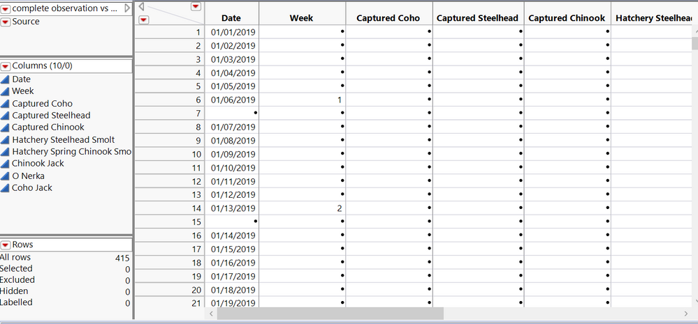
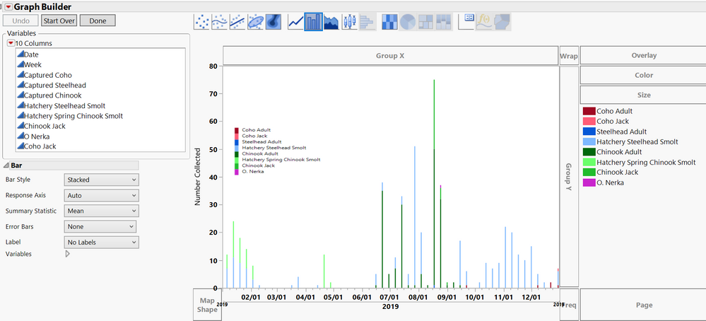
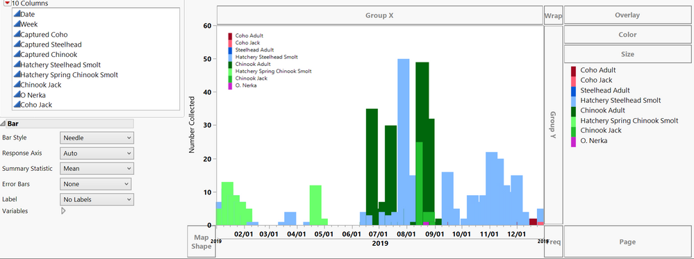
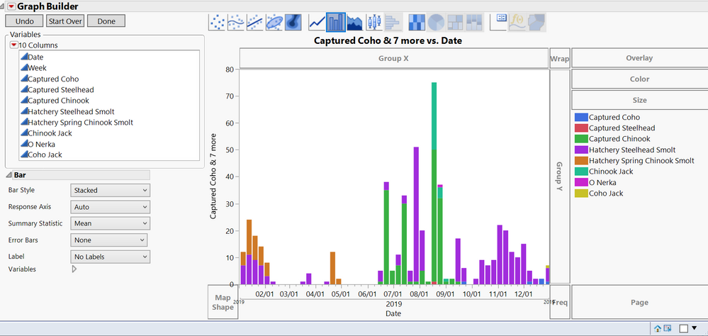
I am having issues increasing the size of the bars in my stacked bar graph. I would just like the bars to be a little wider for better visibility. I am plotting the data (see attached screen shot) by week for the year 2019. I am assuming that my bars are as thin as they are because I am trying to graph 8 different variables for each week but since some are blank and the graph is "stacked" I would assume there is some sort of work-around for this. Thanks in advance.
- Mark as New
- Bookmark
- Subscribe
- Mute
- Subscribe to RSS Feed
- Get Direct Link
- Report Inappropriate Content
Re: Stacked Bar Graph Bar Width
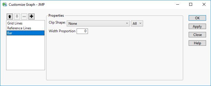
Right-click on one of the bars and select Customize. Select the Bar item and you should see an option called Width Proportion. The default value 0 tells JMP to size the bars automatically but you can change the value to adjust the width to your liking.
- Mark as New
- Bookmark
- Subscribe
- Mute
- Subscribe to RSS Feed
- Get Direct Link
- Report Inappropriate Content
Re: Stacked Bar Graph Bar Width
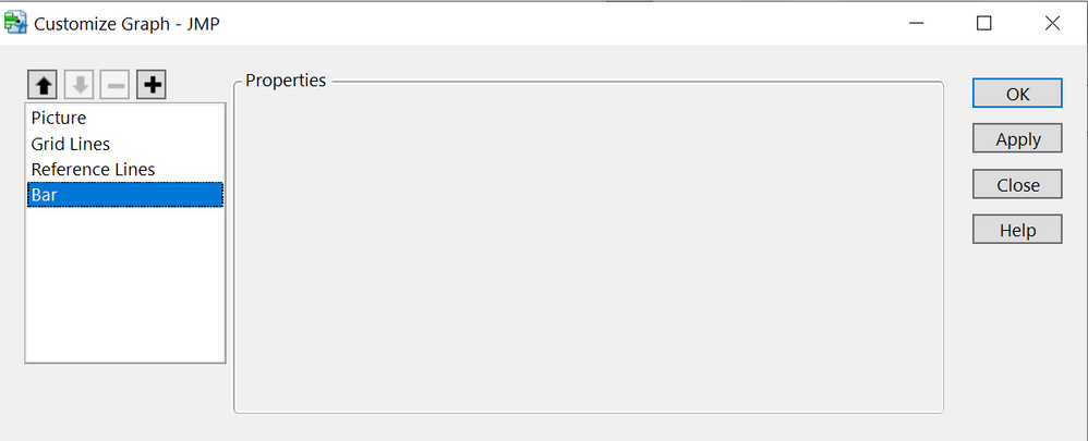
Thank you for your response. However, I have tried this to no avail. This is what it looks like when I right-click and choose "customize". I have toyed with a lot of the right-click options also with no success.
- Mark as New
- Bookmark
- Subscribe
- Mute
- Subscribe to RSS Feed
- Get Direct Link
- Report Inappropriate Content
Re: Stacked Bar Graph Bar Width
I see this dialog with JMP 15:
What version of JMP are you using?
- Mark as New
- Bookmark
- Subscribe
- Mute
- Subscribe to RSS Feed
- Get Direct Link
- Report Inappropriate Content
Re: Stacked Bar Graph Bar Width
Ah. I am using 12.1. I guess I should have specified. Any idea how to do this on my version? If I select the "needle" bar style, the bars become more appropriate in size but some data is overlapped and not visible.
- Mark as New
- Bookmark
- Subscribe
- Mute
- Subscribe to RSS Feed
- Get Direct Link
- Report Inappropriate Content
Re: Stacked Bar Graph Bar Width
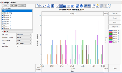
I think the problem is that there are 365 days being displayed along the x-axis. So the space is divided by 365 and then each bar takes up about 1/2 of that space. That makes for some pretty small bars. Even if you did change the width proportion to 1, it wouldn't/doesn't make much difference.
Your data is pretty sparse so there is a lot of empty space between the thin bars that are drawn which makes it appear as though the bars could be bigger. However, the bars can't really get any bigger because they are constrained by the amount of space available per day.
I didn't have your original data, but I manufactured something similar.
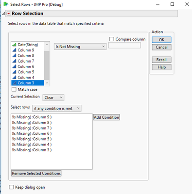
To utilize all of the available space, I got rid of the rows which contained all missing values. I did this using a row selection and then subsetting the data table. You could also exclude the points. Here is my example from Rows->Row Selection->Select Where...
After the rows with any non-missing value were selected, I went to Table->Subset and did a subset by selected rows.
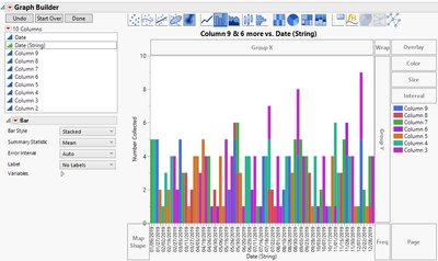
Finally, I created a copy of the Date column which was Character type and Ordinal and had a column formula: Format(:Date)
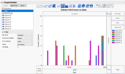
I then plotted my new date string column against my measures to get something like this:
Since I only had 78 days with non-missing data compared to the full 365 days, there is more room along the axis for each bar. The disadvantage is that I lose the date characteristics of my data. Jan 9 is right next to Jan22 which is right next to Jan27 rather than being spaced out linearly along the axis. The advantage is that you only see the dates which have some data and the bars are readable.
Of course, in the first example, I could have achieved more readable bars by simply zooming on the x-axis into the areas of the year that I'm interested in. For example:
- Mark as New
- Bookmark
- Subscribe
- Mute
- Subscribe to RSS Feed
- Get Direct Link
- Report Inappropriate Content
Re: Stacked Bar Graph Bar Width
Thank you @Mark_Bailey and @paul_vezzetti for your help. Paul, you were right about the x-axis being too crowded. I am trying to plot my data per week so I consolidated the data into one day per week and got rid of the rest leaving only 52 entries on the x-axis instead of 365 and that took care of it. Thanks again!
Recommended Articles
- © 2026 JMP Statistical Discovery LLC. All Rights Reserved.
- Terms of Use
- Privacy Statement
- Contact Us
