- New to JMP? Let the Data Analysis Director guide you through selecting an analysis task, an analysis goal, and a data type. Available now in the JMP Marketplace!
- See how to install JMP Marketplace extensions to customize and enhance JMP.
- Subscribe to RSS Feed
- Mark Topic as New
- Mark Topic as Read
- Float this Topic for Current User
- Bookmark
- Subscribe
- Mute
- Printer Friendly Page
Discussions
Solve problems, and share tips and tricks with other JMP users.- JMP User Community
- :
- Discussions
- :
- Smoother graph with confidence levels

- Mark as New
- Bookmark
- Subscribe
- Mute
- Subscribe to RSS Feed
- Get Direct Link
- Report Inappropriate Content
Smoother graph with confidence levels
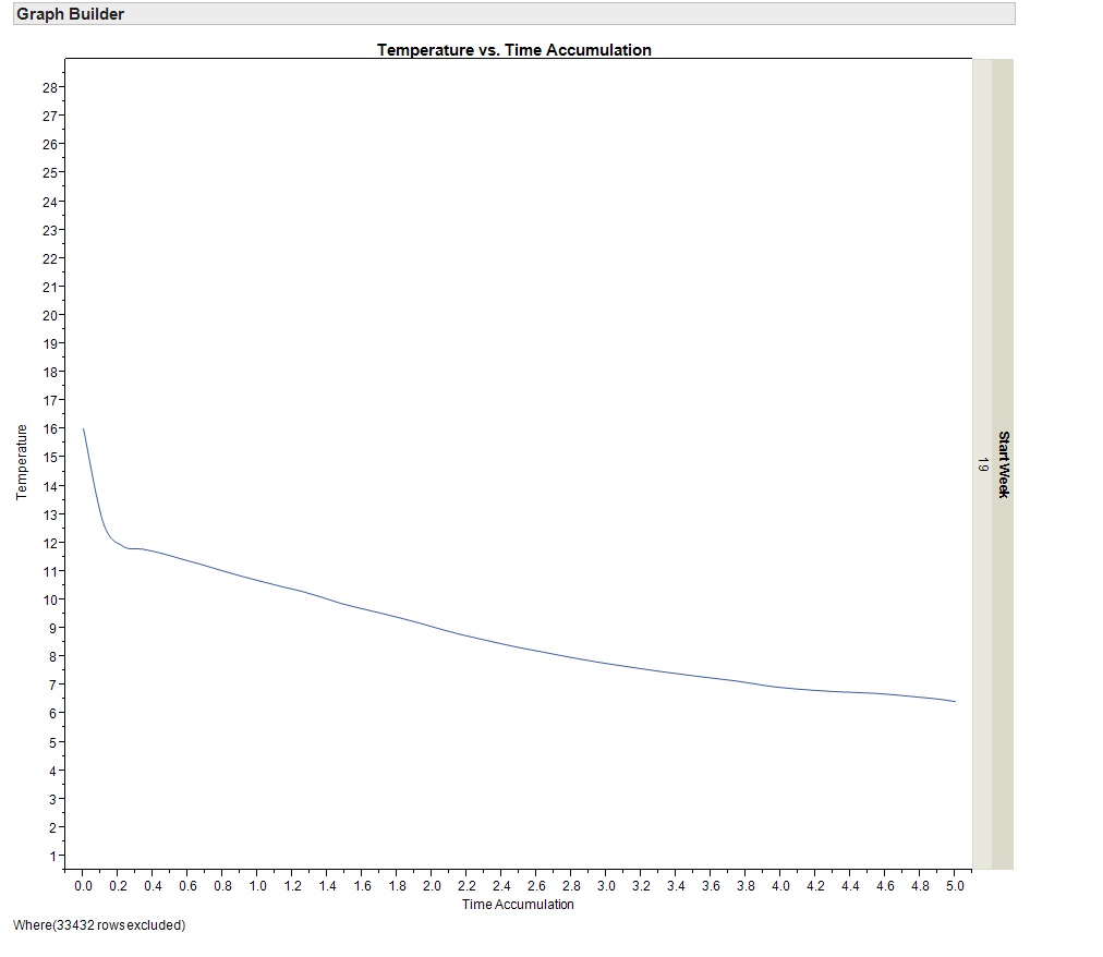
I have attached a couple of images of graphs I have created.
The raw data is a series of temperature probe measurements showing cooling curves by pallet. The image 'data trends' shows each trend, the image 'smoother' shows a summary curve. I want to be able to represent the distribution on this summary curve. A suggestion has been to have a shaded area around the line that indicates 95% confidence, but we have no idea how to construct this graph. Any ideas?
Phill

- Mark as New
- Bookmark
- Subscribe
- Mute
- Subscribe to RSS Feed
- Get Direct Link
- Report Inappropriate Content
Re: Smoother graph with confidence levels
Hello Phill,
If you are asking how to generate a shaded area, you could use the BAND statement in PROC SGPLOT which is part of ODS graphics.
Here is an example:
ods graphics on;
data toplot;
set sashelp.air;
L95 = air - 0.30*air;
U95 = air + 0.30*air;
run;
proc sgplot data=toplot;
band x=date lower=L95 upper=U95 / fillattrs=GraphConfidence legendlabel="Confidence" name="band";
series x=date y=air / legendlabel="Summary Curve" name="series";
keylegend "series" "band"/ location=outside position=bottom;
run;
Note that the order of the BAND and the SERIES statements is important. If reverted, the line produced by the series is not seen.
HTH
Daniel

- Mark as New
- Bookmark
- Subscribe
- Mute
- Subscribe to RSS Feed
- Get Direct Link
- Report Inappropriate Content
Re: Smoother graph with confidence levels
I'm not aware of a good definition of a confidence interval for a spline smoother. (There is no real parameter being estimated.) Your data may suggest a definition -- it looks like it's made up of multiple series. For instance, you might take the 95% confidence interval of the mean for each X. With some effort, you can plot such an interval in GB using the Area element in Range mode. You have to make a plot with 3 Ys (data, upper and lower) and use the right-click > element > Y submenu to turn off the data Y for the Area element and turn off the upper/lower Ys for the Smoother element.

Another technique is to make lots of copies of the variable using random samples, and plot smoothers for the copies transparently. Here's an attempt at that with 30 resamples:

- Mark as New
- Bookmark
- Subscribe
- Mute
- Subscribe to RSS Feed
- Get Direct Link
- Report Inappropriate Content
Re: Smoother graph with confidence levels
Thanks for the ideas. We'll have a look at whether we can apply this to what we're doing. Phill
Recommended Articles
- © 2026 JMP Statistical Discovery LLC. All Rights Reserved.
- Terms of Use
- Privacy Statement
- Contact Us