- New to JMP? Let the Data Analysis Director guide you through selecting an analysis task, an analysis goal, and a data type. Available now in the JMP Marketplace!
- See how to install JMP Marketplace extensions to customize and enhance JMP.
- Subscribe to RSS Feed
- Mark Topic as New
- Mark Topic as Read
- Float this Topic for Current User
- Bookmark
- Subscribe
- Mute
- Printer Friendly Page
Discussions
Solve problems, and share tips and tricks with other JMP users.- JMP User Community
- :
- Discussions
- :
- Re: Significance circle in correlation matrix
- Mark as New
- Bookmark
- Subscribe
- Mute
- Subscribe to RSS Feed
- Get Direct Link
- Report Inappropriate Content
Significance circle in correlation matrix
Hello, I'm sending you a message regarding the correlation matrix
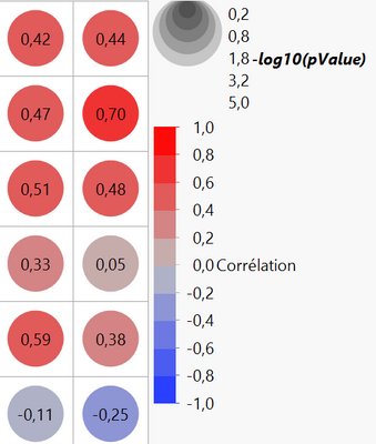
It is possible to display circles of significance in this matrix (as below in the photo)
Inside these circles is displayed the correlation value between two variables and the color corresponds to a more or less strong correlation
However, I don't understand the size of the circles and the scale used (log10 (pvalue))
Does anyone have an explanation? I did not find anything on the community
Thank you
Accepted Solutions
- Mark as New
- Bookmark
- Subscribe
- Mute
- Subscribe to RSS Feed
- Get Direct Link
- Report Inappropriate Content
Re: Significance circle in correlation matrix
Definitely not sure about this but:
Significance Circles
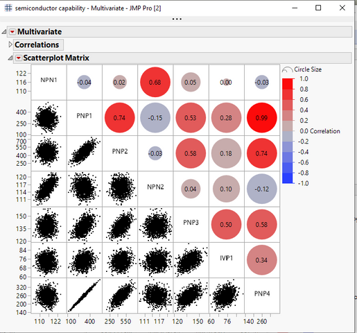
Shows or hides correlation circles in the upper right triangle of the scatterplot matrix. The color of each circle represents the correlation between each pair of variables on a scale from red (+1) to blue (-1). The size of each circle represents the significance test between the variables. A larger circle indicates a more significant relationship.
- Mark as New
- Bookmark
- Subscribe
- Mute
- Subscribe to RSS Feed
- Get Direct Link
- Report Inappropriate Content
Re: Significance circle in correlation matrix
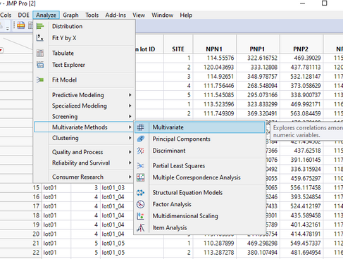
@jthi Points you towards the current solution in JMP 15.2 for the creation of your correlation circles. You can find it under Analyze pull down menu.
It can produce output close to what you want
Lacking is the consistent circle size and the -log circles. JMP 16 will bring some good enhancements.
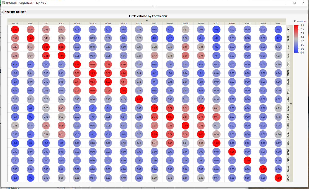
However, just for fun, I wanted to see if I could get JMP to create a solution with static circle size.
This was all done interactively.....no scripting
The basic steps were:
- Run the Multivariate Platform to create the correlation matrix.
- Create a data table from the correlation matrix by right clicking on the matrix, and selecting Make into Data Table
- Stacked all of the correlations into one column using Tables=>Stack
- Created a new shape map of a circle using the JMP Addin Custom Map Creator available from the JMP File Exchange
- Saved the created map tables
- Registered the map to the stacked table
- Ran Graph Builder to produce the desired output seen above
Recommended Articles
- © 2026 JMP Statistical Discovery LLC. All Rights Reserved.
- Terms of Use
- Privacy Statement
- Contact Us


