- Instantly extract effect sizes, F-ratios, and FDR-adjusted p-values from your models with the Calculate Effects Sizes extension, available now in the JMP Marketplace!
- New to JMP? Join us Sept. 23-24 for the Early User Edition of Discovery Summit, tailor-made for new users. Register now for free!
- Your voice matters! Tell us how you prefer to receive JMP updates, so we can tailor our communication to your needs. Take short survey.
- Subscribe to RSS Feed
- Mark Topic as New
- Mark Topic as Read
- Float this Topic for Current User
- Bookmark
- Subscribe
- Mute
- Printer Friendly Page
Discussions
Solve problems, and share tips and tricks with other JMP users.- JMP User Community
- :
- Discussions
- :
- Run chart - label data on X axis instead of index

- Mark as New
- Bookmark
- Subscribe
- Mute
- Subscribe to RSS Feed
- Get Direct Link
- Report Inappropriate Content
Run chart - label data on X axis instead of index
Hi,
I would need to get in JM something I got from Minitab from value¨s:
| Values | Date |
| 31,44206 | 20.01.2024 |
| 31,60417 | 20.01.2024 |
| 29,80781 | 20.01.2024 |
| 30,41956 | 20.01.2024 |
| 31,16545 | 20.01.2024 |
| 30,84149 | 20.01.2024 |
| 30,93325 | 20.01.2024 |
| 30,96718 | 20.01.2024 |
| 30,64789 | 20.01.2024 |
| 30,9339 | 20.01.2024 |
| 30,86228 | 20.01.2024 |
| 30,70391 | 22.01.2024 |
| 30,74697 | 22.01.2024 |
| 30,87636 | 22.01.2024 |
| 30,50128 | 22.01.2024 |
| 31,53337 | 22.01.2024 |
| 31,45764 | 22.01.2024 |
| 30,65879 | 22.01.2024 |
| 31,00759 | 28.01.2024 |
| 30,61617 | 28.01.2024 |
| 30,90196 | 28.01.2024 |
| 31,18419 | 28.01.2024 |
| 30,5932 | 28.01.2024 |
| 30,66666 | 28.01.2024 |
| 30,91367 | 28.01.2024 |
| 30,19596 | 28.01.2024 |
| 30,94168 | 28.01.2024 |
| 31,41659 | 28.01.2024 |
| 31,10544 | 28.01.2024 |
| 31,48151 | 28.01.2024 |
- Tags:
- windows
Accepted Solutions

- Mark as New
- Bookmark
- Subscribe
- Mute
- Subscribe to RSS Feed
- Get Direct Link
- Report Inappropriate Content
Re: Run chart - label data on X axis instead of index
I took a run at replicating your chart from Minitab. I don't believe there is a set chart in JMP that will label the Index variable with the date values, however, there are methods in JMP that will allow for the changing of the displayed values of columns. What I first did, was to create an a new column called Index, which is simply a sequence number from the top of the data table to the bottom.

I then added the Value Label Column Property to the column,

Which changed the displayed data to

I then used two different JMP Platforms to interactively create the chart, Graph Builder and Run Chart


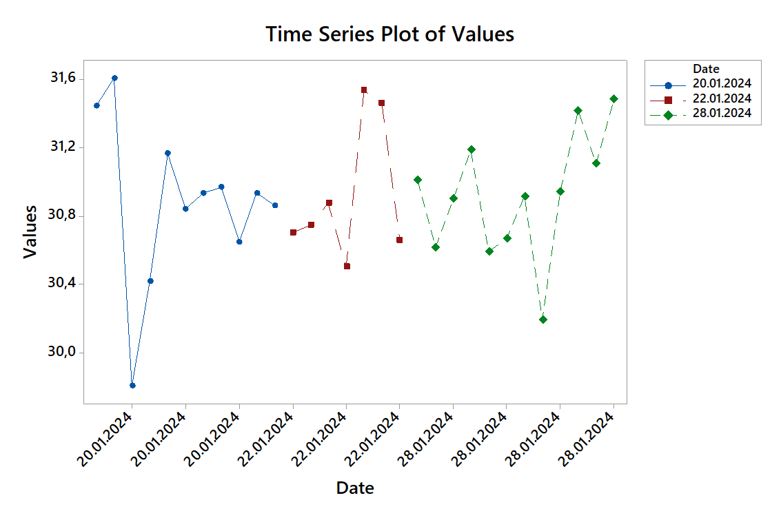
Below is the script that JMP created from the interactive steps I took. In the script, you can see the different setting I chose to generate the output displays.
The script looks very large in first viewing it, however the script starts by first creating your example data table, then followed by the Graph Builder and Run Chart JSL.
names default to here(1);
dt =
New Table( "Example",
	Add Rows( 30 ),
	New Column( "Values",
		Numeric,
		"Continuous",
		Format( "Best", 12 ),
		Set Values(
			[31.44206, 31.60417, 29.80781, 30.41956, 31.16545, 30.84149, 30.93325,
			30.96718, 30.64789, 30.9339, 30.86228, 30.70391, 30.74697, 30.87636,
			30.50128, 31.53337, 31.45764, 30.65879, 31.00759, 30.61617, 30.90196,
			31.18419, 30.5932, 30.66666, 30.91367, 30.19596, 30.94168, 31.41659,
			31.10544, 31.48151]
		)
	),
	New Column( "Date",
		Numeric,
		"Continuous",
		Format( "d/m/y", 12 ),
		Input Format( "d/m/y" ),
		Set Values(
			[3788553600, 3788553600, 3788553600, 3788553600, 3788553600, 3788553600,
			3788553600, 3788553600, 3788553600, 3788553600, 3788553600, 3788726400,
			3788726400, 3788726400, 3788726400, 3788726400, 3788726400, 3788726400,
			3789244800, 3789244800, 3789244800, 3789244800, 3789244800, 3789244800,
			3789244800, 3789244800, 3789244800, 3789244800, 3789244800, 3789244800]
		)
	),
	New Column( "index",
		Numeric,
		"Continuous",
		Format( "Best", 12 ),
		Value Labels(
			{0 <= "20.01.2024" < 11.5, 12 <= "22.01.2024" < 18.5, 19 <= "28.01.2024"
			 < 30.5}
		),
		Use Value Labels( 1 ),
		Set Selected,
		Set Values(
			[1, 2, 3, 4, 5, 6, 7, 8, 9, 10, 11, 12, 13, 14, 15, 16, 17, 18, 19, 20,
			21, 22, 23, 24, 25, 26, 27, 28, 29, 30]
		)
	),
	Set Row States(
		[13760, 13760, 13760, 13760, 13760, 13760, 13760, 13760, 13760, 13760, 13760,
		13248, 13248, 13248, 13248, 13248, 13248, 13248, 13504, 13504, 13504, 13504,
		13504, 13504, 13504, 13504, 13504, 13504, 13504, 13504]
	)
);

Graph Builder(
	Size( 534, 453 ),
	Show Control Panel( 0 ),
	Variables( X( :index ), Y( :Values ), Overlay( :Date ) ),
	Elements(
		Points( X, Y, Legend( 20 ) ),
		Line( X, Y, Legend( 21 ), Row order( 1 ) )
	),
	SendToReport(
		Dispatch(
			{},
			"Values",
			ScaleBox,
			{Min( 29.6 ), Max( 32 ), Inc( 0.4 ), Minor Ticks( 0 )}
		),
		Dispatch(
			{},
			"400",
			ScaleBox,
			{Legend Model(
				20,
				Base( 0, 0, 0, Item ID( "20/01/2024", 1 ) ),
				Base( 1, 0, 0, Item ID( "22/01/2024", 1 ) ),
				Base( 2, 0, 0, Item ID( "28/01/2024", 1 ) ),
				Properties( 0, {Marker Size( 6 )}, Item ID( "20/01/2024", 1 ) ),
				Properties( 1, {Marker Size( 6 )}, Item ID( "22/01/2024", 1 ) ),
				Properties( 2, {Marker Size( 6 )}, Item ID( "28/01/2024", 1 ) )
			)}
		),
		Dispatch(
			{},
			"graph title",
			TextEditBox,
			{Set Text( "Time Series Plot of Values" )}
		),
		Dispatch( {}, "X title", TextEditBox, {Set Text( "Date" )} ),
		Dispatch(
			{},
			"400",
			LegendBox,
			{Legend Position( {20, [0, 1, 2], 21, [-1, -1, -1]} )}
		)
	)
);

Control Chart Builder(
	Show Two Shewhart Charts( 0 ),
	Show Limit Summaries( 0 ),
	Variables( Subgroup( :index ), Y( :Values ), Phase( :Date ) ),
	Chart(
		Points( Statistic( "Individual" ) ),
		Limits(
			Sigma( "Moving Range" ),
			Show Center Line( 0 ),
			Show Lower Limit( 0 ),
			Show Upper Limit( 0 )
		)
	),
	Show Control Panel( 0 ),
	SendToReport(
		Dispatch( {}, "index", ScaleBox, {Label Row( 1, Show Major Labels( 0 ) )} ),
		Dispatch(
			{},
			"Values",
			ScaleBox,
			{Min( 29.75 ), Max( 31.649079 ), Inc( 0.4 ), Minor Ticks( 0 )}
		),
		Dispatch(
			{},
			"graph display 1 title",
			TextEditBox,
			{Set Text( "Time Series Plot of Values" )}
		),
		Dispatch(
			{},
			"Subgroup display 1 title",
			TextEditBox,
			{Set Text( "Date" )}
		)
	)
);
- Mark as New
- Bookmark
- Subscribe
- Mute
- Subscribe to RSS Feed
- Get Direct Link
- Report Inappropriate Content
Re: Run chart - label data on X axis instead of index
Hi did you get colors for second chart - the Run chart over the builder please? Thank you.
- Mark as New
- Bookmark
- Subscribe
- Mute
- Subscribe to RSS Feed
- Get Direct Link
- Report Inappropriate Content
Re: Run chart - label data on X axis instead of index
The colors for the Run Chart are set by setting the color for each of the rows in the data table.
See
Color or Mark by Column
- Mark as New
- Bookmark
- Subscribe
- Mute
- Subscribe to RSS Feed
- Get Direct Link
- Report Inappropriate Content
Re: Run chart - label data on X axis instead of index
I took a run at replicating your chart from Minitab. I don't believe there is a set chart in JMP that will label the Index variable with the date values, however, there are methods in JMP that will allow for the changing of the displayed values of columns. What I first did, was to create an a new column called Index, which is simply a sequence number from the top of the data table to the bottom.
I then added the Value Label Column Property to the column,
Which changed the displayed data to
I then used two different JMP Platforms to interactively create the chart, Graph Builder and Run Chart
Below is the script that JMP created from the interactive steps I took. In the script, you can see the different setting I chose to generate the output displays.
The script looks very large in first viewing it, however the script starts by first creating your example data table, then followed by the Graph Builder and Run Chart JSL.
names default to here(1);
dt =
New Table( "Example",
	Add Rows( 30 ),
	New Column( "Values",
		Numeric,
		"Continuous",
		Format( "Best", 12 ),
		Set Values(
			[31.44206, 31.60417, 29.80781, 30.41956, 31.16545, 30.84149, 30.93325,
			30.96718, 30.64789, 30.9339, 30.86228, 30.70391, 30.74697, 30.87636,
			30.50128, 31.53337, 31.45764, 30.65879, 31.00759, 30.61617, 30.90196,
			31.18419, 30.5932, 30.66666, 30.91367, 30.19596, 30.94168, 31.41659,
			31.10544, 31.48151]
		)
	),
	New Column( "Date",
		Numeric,
		"Continuous",
		Format( "d/m/y", 12 ),
		Input Format( "d/m/y" ),
		Set Values(
			[3788553600, 3788553600, 3788553600, 3788553600, 3788553600, 3788553600,
			3788553600, 3788553600, 3788553600, 3788553600, 3788553600, 3788726400,
			3788726400, 3788726400, 3788726400, 3788726400, 3788726400, 3788726400,
			3789244800, 3789244800, 3789244800, 3789244800, 3789244800, 3789244800,
			3789244800, 3789244800, 3789244800, 3789244800, 3789244800, 3789244800]
		)
	),
	New Column( "index",
		Numeric,
		"Continuous",
		Format( "Best", 12 ),
		Value Labels(
			{0 <= "20.01.2024" < 11.5, 12 <= "22.01.2024" < 18.5, 19 <= "28.01.2024"
			 < 30.5}
		),
		Use Value Labels( 1 ),
		Set Selected,
		Set Values(
			[1, 2, 3, 4, 5, 6, 7, 8, 9, 10, 11, 12, 13, 14, 15, 16, 17, 18, 19, 20,
			21, 22, 23, 24, 25, 26, 27, 28, 29, 30]
		)
	),
	Set Row States(
		[13760, 13760, 13760, 13760, 13760, 13760, 13760, 13760, 13760, 13760, 13760,
		13248, 13248, 13248, 13248, 13248, 13248, 13248, 13504, 13504, 13504, 13504,
		13504, 13504, 13504, 13504, 13504, 13504, 13504, 13504]
	)
);

Graph Builder(
	Size( 534, 453 ),
	Show Control Panel( 0 ),
	Variables( X( :index ), Y( :Values ), Overlay( :Date ) ),
	Elements(
		Points( X, Y, Legend( 20 ) ),
		Line( X, Y, Legend( 21 ), Row order( 1 ) )
	),
	SendToReport(
		Dispatch(
			{},
			"Values",
			ScaleBox,
			{Min( 29.6 ), Max( 32 ), Inc( 0.4 ), Minor Ticks( 0 )}
		),
		Dispatch(
			{},
			"400",
			ScaleBox,
			{Legend Model(
				20,
				Base( 0, 0, 0, Item ID( "20/01/2024", 1 ) ),
				Base( 1, 0, 0, Item ID( "22/01/2024", 1 ) ),
				Base( 2, 0, 0, Item ID( "28/01/2024", 1 ) ),
				Properties( 0, {Marker Size( 6 )}, Item ID( "20/01/2024", 1 ) ),
				Properties( 1, {Marker Size( 6 )}, Item ID( "22/01/2024", 1 ) ),
				Properties( 2, {Marker Size( 6 )}, Item ID( "28/01/2024", 1 ) )
			)}
		),
		Dispatch(
			{},
			"graph title",
			TextEditBox,
			{Set Text( "Time Series Plot of Values" )}
		),
		Dispatch( {}, "X title", TextEditBox, {Set Text( "Date" )} ),
		Dispatch(
			{},
			"400",
			LegendBox,
			{Legend Position( {20, [0, 1, 2], 21, [-1, -1, -1]} )}
		)
	)
);

Control Chart Builder(
	Show Two Shewhart Charts( 0 ),
	Show Limit Summaries( 0 ),
	Variables( Subgroup( :index ), Y( :Values ), Phase( :Date ) ),
	Chart(
		Points( Statistic( "Individual" ) ),
		Limits(
			Sigma( "Moving Range" ),
			Show Center Line( 0 ),
			Show Lower Limit( 0 ),
			Show Upper Limit( 0 )
		)
	),
	Show Control Panel( 0 ),
	SendToReport(
		Dispatch( {}, "index", ScaleBox, {Label Row( 1, Show Major Labels( 0 ) )} ),
		Dispatch(
			{},
			"Values",
			ScaleBox,
			{Min( 29.75 ), Max( 31.649079 ), Inc( 0.4 ), Minor Ticks( 0 )}
		),
		Dispatch(
			{},
			"graph display 1 title",
			TextEditBox,
			{Set Text( "Time Series Plot of Values" )}
		),
		Dispatch(
			{},
			"Subgroup display 1 title",
			TextEditBox,
			{Set Text( "Date" )}
		)
	)
);
- Mark as New
- Bookmark
- Subscribe
- Mute
- Subscribe to RSS Feed
- Get Direct Link
- Report Inappropriate Content
Re: Run chart - label data on X axis instead of index
Hi did you get colors for second chart - the Run chart over the builder please? Thank you.
- Mark as New
- Bookmark
- Subscribe
- Mute
- Subscribe to RSS Feed
- Get Direct Link
- Report Inappropriate Content
Re: Run chart - label data on X axis instead of index
The colors for the Run Chart are set by setting the color for each of the rows in the data table.
See
Color or Mark by Column
- Mark as New
- Bookmark
- Subscribe
- Mute
- Subscribe to RSS Feed
- Get Direct Link
- Report Inappropriate Content
Re: Run chart - label data on X axis instead of index
Thank you
Recommended Articles
- © 2026 JMP Statistical Discovery LLC. All Rights Reserved.
- Terms of Use
- Privacy Statement
- Contact Us