- New to JMP? Let the Data Analysis Director guide you through selecting an analysis task, an analysis goal, and a data type. Available now in the JMP Marketplace!
- See how to install JMP Marketplace extensions to customize and enhance JMP.
- Subscribe to RSS Feed
- Mark Topic as New
- Mark Topic as Read
- Float this Topic for Current User
- Bookmark
- Subscribe
- Mute
- Printer Friendly Page
Discussions
Solve problems, and share tips and tricks with other JMP users.- JMP User Community
- :
- Discussions
- :
- Re: Reducing 80 Unique Values to 10 Unique Values
- Mark as New
- Bookmark
- Subscribe
- Mute
- Subscribe to RSS Feed
- Get Direct Link
- Report Inappropriate Content
Reducing 80 Unique Values to 10 Unique Values
I have a column in my data table that has over 80 unique (nominal) text values. I would like to take these 80 nominal values and reduce them to 10 in JSL by combing values that are not into the top ten (by amount of occurances) into a group called "other." What is the simplest way to accomplish this in JSL? Thanks for your help!
Accepted Solutions
- Mark as New
- Bookmark
- Subscribe
- Mute
- Subscribe to RSS Feed
- Get Direct Link
- Report Inappropriate Content
Re: Reducing 80 Unique Values to 10 Unique Values
Hi @twillkickers,
I’m not sure what the ultimate goal is for your request, but if it was to create a pareto-style chart, you can accomplish this without scripting or creating a new column.
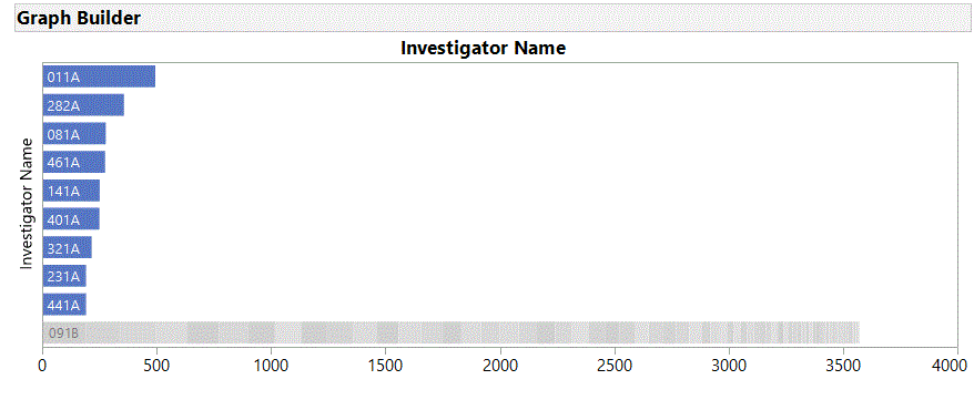
If you have version 14, the new “Packed Bars” element in Graph Builder will do what you are describing. Using the Nicardipine.jmp data table from the Sample Data directory, drag the Investigator Name column to the Y-role, then select “Packed” as the Bar Style, type 9 into the Packed Primaries, and finally, select “Separate Stack” from the Packed Placement dropdown:
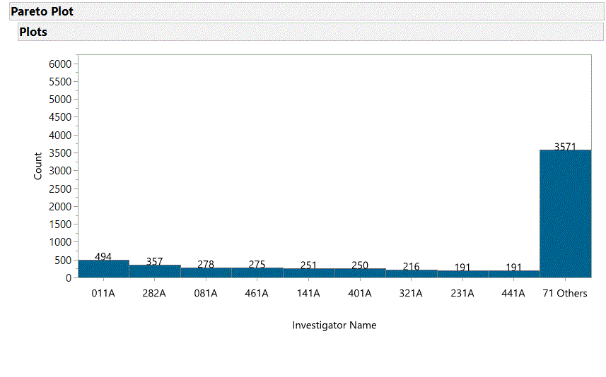
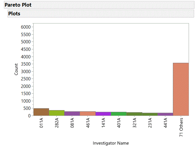
Another option, particularly for versions prior to v14, you can select the Pareto Plot from the Quality and Process menu. From the Red Triangle menu in the plot, select Causes=>Combine Causes menu item, choose the “Last causes” radio button, and enter 71 into the number box:
If you really do want a script to create a new column with levels 1-10, the following (using the Distribution Platform) is one way. Just substitute your data table and column names where appropriate:
Names Default to Here( 1 );
dt = Open("$Sample_Data/Nicardipine.jmp");
dist = Distribution( Nominal Distribution( Column( :Investigator Name ) ) );
dist << Order By( Count Descending );
dist << Save( Level Numbers );
dist << Close Window;
therows = dt << Get Rows Where( :Level Investigator Name >= 10 );
dt:Level Investigator Name[ therows ] = 10;
Hope this helps.
- Mark as New
- Bookmark
- Subscribe
- Mute
- Subscribe to RSS Feed
- Get Direct Link
- Report Inappropriate Content
Re: Reducing 80 Unique Values to 10 Unique Values
@twillkickers,
Do you also have a column which lists the frequency or the number of occurences of each of the unique text values ? If you don't the first step is to get that data into your data table. Once this is available you can sort the column in descending order and select the top 10 rows. Here is how I would do it :
// Open Sample Data Table
dt = Open( "$SAMPLE_DATA/Big Class.jmp" );

// Let us assume weight column in this data table represents the frequency in your case
dt1 = dt << Sort(By(:weight),Order(descending));

// Select only top 10
dt1 << Select Rows(Index(1,10));

// If you want to hide and exclude the remaining
dt1 << Invert Row Selection << hide and exclude ;

// OR

// If you want to delete the rows
dt1 << Delete Rows; Uday
- Mark as New
- Bookmark
- Subscribe
- Mute
- Subscribe to RSS Feed
- Get Direct Link
- Report Inappropriate Content
Re: Reducing 80 Unique Values to 10 Unique Values
How do I create a column which lists frequency of the unique text values?
- Mark as New
- Bookmark
- Subscribe
- Mute
- Subscribe to RSS Feed
- Get Direct Link
- Report Inappropriate Content
Re: Reducing 80 Unique Values to 10 Unique Values
There are many ways to do what you want. Like Tabulate, Distribution or Summary. I will show you how to implement using the summary approach
// Open Sample Data Table
dt = Open( "$SAMPLE_DATA/Big Class.jmp" );

// Get frequency
dt1 = dt << Summary(
		    Group( :name ),
		    Freq( "None" ),
		    Weight( "None" )
		  );

// Let us assume weight column in this data table represents the frequency in your case
dt2 = dt1 << Sort(By(:N Rows),Order(descending));

// Select only top 10
dt2 << Select Rows(Index(1,10));

// If you want to hide and exclude the remaining
dt2 << Invert Row Selection << hide and exclude ;

// OR

// If you want to delete the rows
dt2 << Delete Rows; Uday
- Mark as New
- Bookmark
- Subscribe
- Mute
- Subscribe to RSS Feed
- Get Direct Link
- Report Inappropriate Content
Re: Reducing 80 Unique Values to 10 Unique Values
Hi @twillkickers,
I’m not sure what the ultimate goal is for your request, but if it was to create a pareto-style chart, you can accomplish this without scripting or creating a new column.
If you have version 14, the new “Packed Bars” element in Graph Builder will do what you are describing. Using the Nicardipine.jmp data table from the Sample Data directory, drag the Investigator Name column to the Y-role, then select “Packed” as the Bar Style, type 9 into the Packed Primaries, and finally, select “Separate Stack” from the Packed Placement dropdown:
Another option, particularly for versions prior to v14, you can select the Pareto Plot from the Quality and Process menu. From the Red Triangle menu in the plot, select Causes=>Combine Causes menu item, choose the “Last causes” radio button, and enter 71 into the number box:
If you really do want a script to create a new column with levels 1-10, the following (using the Distribution Platform) is one way. Just substitute your data table and column names where appropriate:
Names Default to Here( 1 );
dt = Open("$Sample_Data/Nicardipine.jmp");
dist = Distribution( Nominal Distribution( Column( :Investigator Name ) ) );
dist << Order By( Count Descending );
dist << Save( Level Numbers );
dist << Close Window;
therows = dt << Get Rows Where( :Level Investigator Name >= 10 );
dt:Level Investigator Name[ therows ] = 10;
Hope this helps.
- Mark as New
- Bookmark
- Subscribe
- Mute
- Subscribe to RSS Feed
- Get Direct Link
- Report Inappropriate Content
Re: Reducing 80 Unique Values to 10 Unique Values
@jerry_cooper, thanks for your help! When using the "Packed" bar style, is there a way to label the bar with the other categories? My quantity labels for each bar only appear on the non-packed bars. Thanks for your help.
- Mark as New
- Bookmark
- Subscribe
- Mute
- Subscribe to RSS Feed
- Get Direct Link
- Report Inappropriate Content
Re: Reducing 80 Unique Values to 10 Unique Values
@twillkickers, you are correct, the Packed Bars chart will only display the values for the primary bars. If you must have the values displayed, the simplest approach may be to use the Pareto Plot option (note that I've turned off the cumulative percent curve and chosen Labels and a uniform color from the Causes red triangle menu):

- Mark as New
- Bookmark
- Subscribe
- Mute
- Subscribe to RSS Feed
- Get Direct Link
- Report Inappropriate Content
Re: Reducing 80 Unique Values to 10 Unique Values
@jerry_cooper thank you. I have a question about the Pareto Plot. Can JSL automatically take everything other than the top ten causes and group them into an "Other" bar, instead of me having to specify the causes I want grouped together individually? When I tell graph builder to group together everything other than the first 10 values, the JSL code ends up looking like this:
Pareto Plot(
	Cause( :Cause ),
	Show **bleep** Percent Curve( 0 ),
	Combine Causes(
		{"Cause1","Cause2","Cause3","Cause4","Cause5","Cause6"}
	),
	SendToReport(
		Dispatch( {"Plots"}, "102", ScaleBox, {Max( 4512.67559361611 )} ),
		Dispatch( {"Plots"}, "106", ScaleBox, {Max( 100.059325800801 )} ),
		Dispatch( {"Plots"}, "Pareto Report", FrameBox, {Frame Size( 1061, 702 )} )
	)
);
For my application, the causes may change in priority from time to time. I would like JSL to automatically recalculate the top ten causes each time the Pareto Plot is generated.
- Mark as New
- Bookmark
- Subscribe
- Mute
- Subscribe to RSS Feed
- Get Direct Link
- Report Inappropriate Content
Re: Reducing 80 Unique Values to 10 Unique Values
@twillkickers, the answer to your question is “yes”, with JSL you can manipulate either the Graph Builder or the Pareto Plot to provide the display you are looking for. However, the Packed Bar option in Graph Builder gets you almost everything you want (except the label for the combined total of your bottom causes). To display this total will require some manipulation as mentioned previously. Something to consider before deciding whether the additional manipulations are worth the effort is that this total is actually redundant information – the relative bar height and the y-axis visually convey this information.
That said, if you still require the total for the “other” columns to be displayed, here is an approach you might take (still using Nicardipine.jmp as an example):
Use the Distribution platform script provided previously to create a column for the cause levels (1-9 and 10+)
Create a formula column for your new categories, i.e.:
If( :Level Investigator Name < 10, :Investigator Name, "Other")
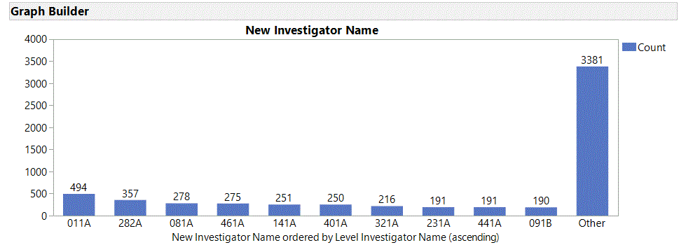
Use Graph Builder to create a bar chart for the new categories ordered by the Levels column (assuming you want the “Other” category to the right, otherwise, just right-click the axis and select order by count to see where “Other” fits within your top 9 causes):
Graph Builder(
     Size( 869, 318 ),
     Show Control Panel( 0 ),
     Variables(
           X(
                :New Investigator Name,
                Order By(
                     :Level Investigator Name,
                     Ascending,
                     Order Statistic( "Sum" )
                )
           )
     ),
     Elements( Bar( X, Legend( 3 ), Label( "Label by Value" ) ) )
);

All of these actions can be pasted together to create a script. If you need help with this, I would suggest consulting the Help->Books->Scripting Guide and the Help->Scripting Index and search for “New Column” to get the syntax for creating a new formula column in your data table.
Recommended Articles
- © 2026 JMP Statistical Discovery LLC. All Rights Reserved.
- Terms of Use
- Privacy Statement
- Contact Us


