- New to JMP? Let the Data Analysis Director guide you through selecting an analysis task, an analysis goal, and a data type. Available now in the JMP Marketplace!
- See how to install JMP Marketplace extensions to customize and enhance JMP.
- Subscribe to RSS Feed
- Mark Topic as New
- Mark Topic as Read
- Float this Topic for Current User
- Bookmark
- Subscribe
- Mute
- Printer Friendly Page
Discussions
Solve problems, and share tips and tricks with other JMP users.- JMP User Community
- :
- Discussions
- :
- Re: Range plot in JMP
- Mark as New
- Bookmark
- Subscribe
- Mute
- Subscribe to RSS Feed
- Get Direct Link
- Report Inappropriate Content
Range plot in JMP
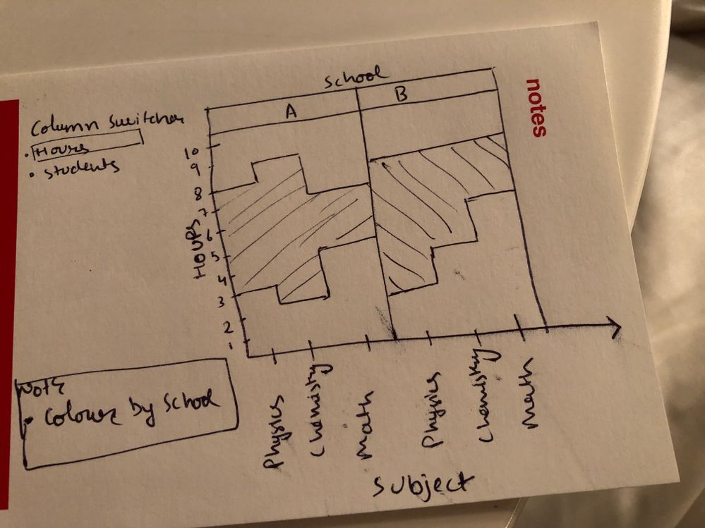
I have a data with all min and max values. How would I plot the range for each variable in graph builder. I want my output as shown in attached image. Below is the sample data.
| School | Subject | Min(Hours) | Max(Hours) | Min(Students) | Max(Students) |
| A | Physics | 3 | 8 | 30 | 55 |
| A | Chemistry | 2 | 9 | 34 | 52 |
| A | Math | 5 | 7 | 32 | 53 |
| B | Physics | 2 | 8 | 30 | 60 |
| B | Chemistry | 4 | 8 | 30 | 65 |
| B | Math | 6 | 8 | 31 | 63 |
If you can share the procedure or JSL script, that would be great help.
Thanks
Accepted Solutions
- Mark as New
- Bookmark
- Subscribe
- Mute
- Subscribe to RSS Feed
- Get Direct Link
- Report Inappropriate Content
Re: Range plot in JMP
This basic chart type is one of many that is covered in the JMP guide. See Help > Books > Essential Graphing.
- Mark as New
- Bookmark
- Subscribe
- Mute
- Subscribe to RSS Feed
- Get Direct Link
- Report Inappropriate Content
Re: Range plot in JMP
Hi @Rajat,
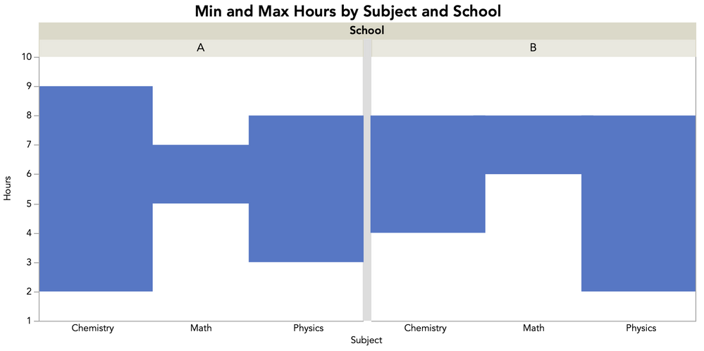
As @Mark_Bailey suggested, the Essentials of Graphing book is a great read and will explain in more detail this and other plots. But, I see there being two complexities in your plot that might take a little extra work, which is that you want a range area plot with steps not a polygon fill, and you want a column switcher operational for switching a pair of variables. Here's how I would approach this.
First, for the basic plot, you can accomplish this using the Bar element with a Range style. Here's what that will look like:
Here's a video showing the steps:
and the JSL, also saved to the attached table:
Graph Builder(
	Show Control Panel( 0 ),
	Show Legend( 0 ),
	Graph Spacing( 10 ),
	Variables(
		X( :Subject ),
		Y( :Name( "Min(Hours)" ) ),
		Y( :Name( "Max(Hours)" ), Position( 1 ) ),
		Group X( :School )
	),
	Elements( Bar( X, Y( 1 ), Y( 2 ), Legend( 4 ), Bar Style( "Range" ) ) ),
	SendToReport(
		Dispatch( {}, "graph title", TextEditBox, {Set Text( "Min and Max Hours by Subject and School" )} ),
		Dispatch( {}, "Y title", TextEditBox, {Set Text( "Hours" )} ),
		Dispatch( {}, "Graph Builder", FrameBox, {DispatchSeg( BarSeg( 1 ), Set Width Proportion( 1 ) )} ),
		Dispatch( {}, "Graph Builder", FrameBox( 2 ), {DispatchSeg( BarSeg( 1 ), Set Width Proportion( 1 ) )} )
	)
);
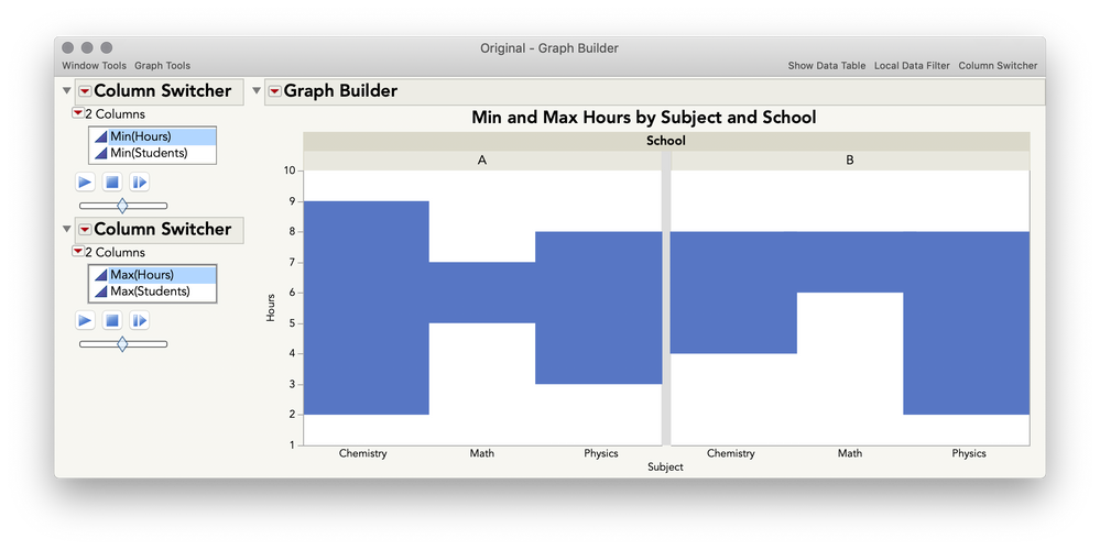
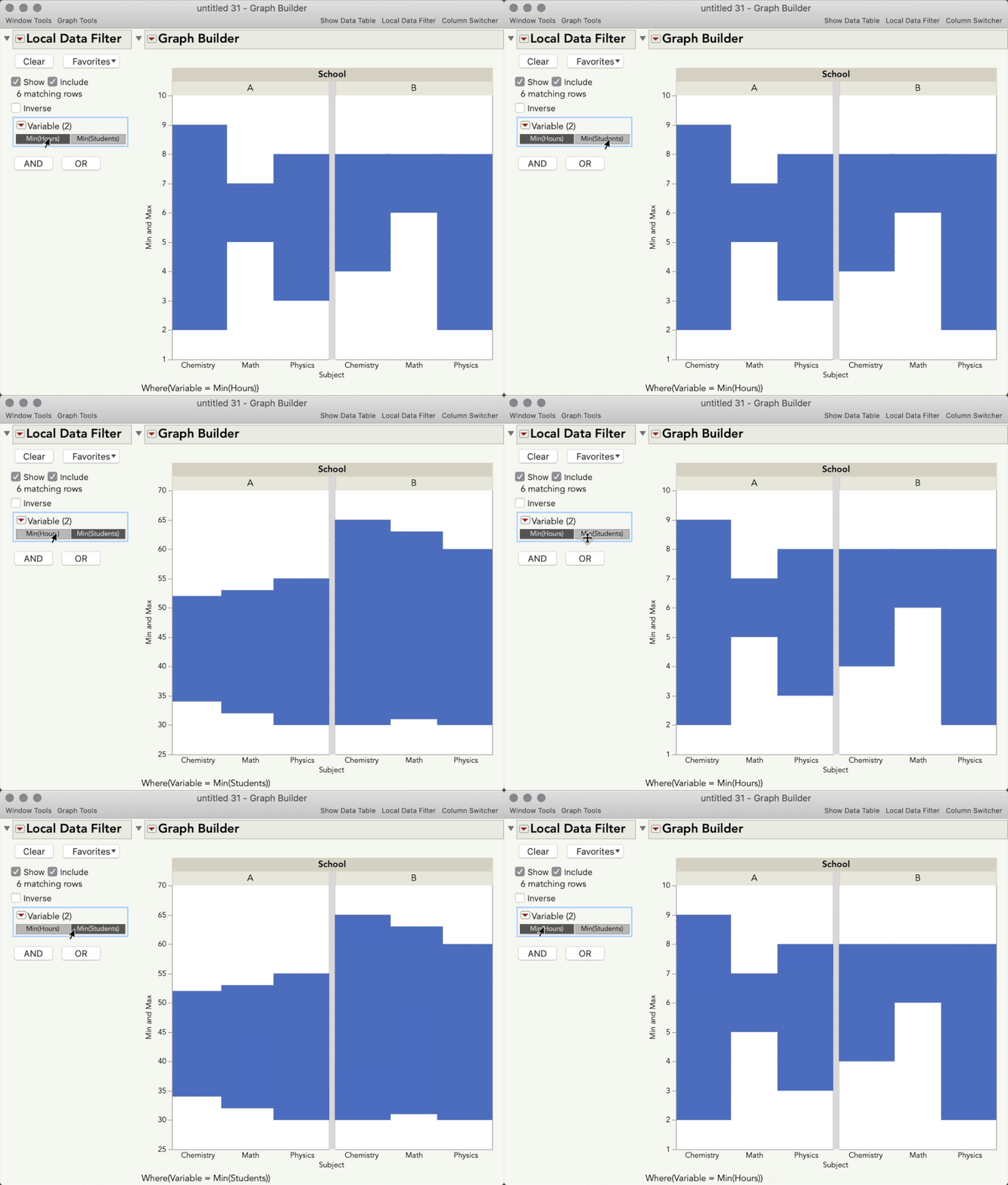
However, what you'll notice is that if you try to add a column switcher, you have the option to switch only one variable, but in your case, you need to switch out two, since that is what defines your range. You could add two Column Switchers, but I tend to not like that method, as it ends up looking like this, where you need to toggle two separate items:
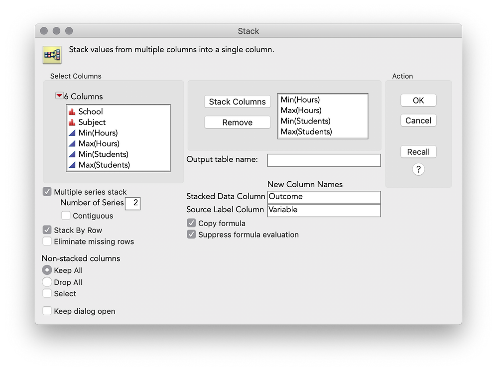
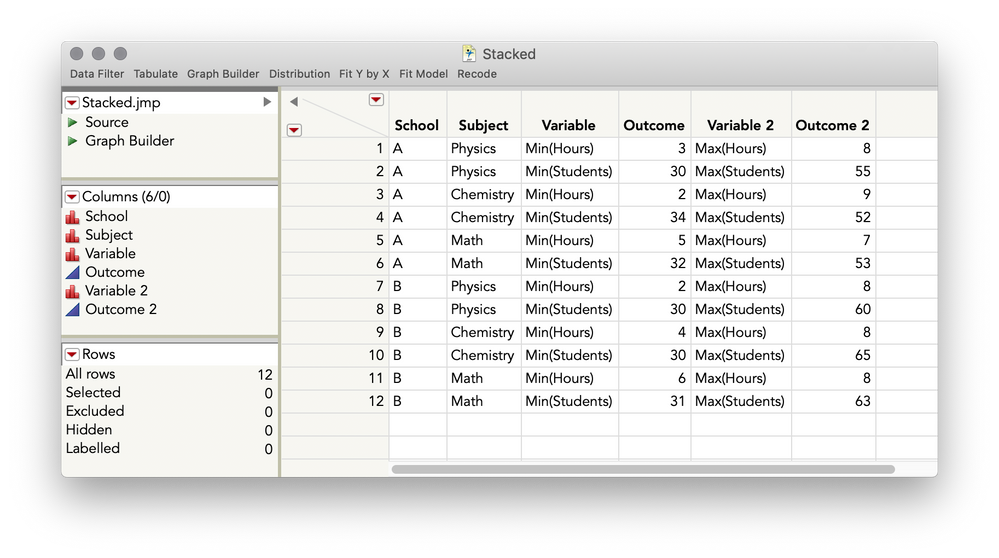
You can make this plot work with a single Column Switcher-like operation, but need to do a little restructuring of your table via Tables > Stack. Here's how you will set that up:
This will give you the following table, which you will notice has taken your pairs of columns that represent the different outcome variable and stacked them on top of each other (and you'll see I had to use the multiple series stack here, series being the term for a set of columns that define a variable):
I hope this helps
- Mark as New
- Bookmark
- Subscribe
- Mute
- Subscribe to RSS Feed
- Get Direct Link
- Report Inappropriate Content
Re: Range plot in JMP
This basic chart type is one of many that is covered in the JMP guide. See Help > Books > Essential Graphing.
- Mark as New
- Bookmark
- Subscribe
- Mute
- Subscribe to RSS Feed
- Get Direct Link
- Report Inappropriate Content
Re: Range plot in JMP
Hi @Rajat,
As @Mark_Bailey suggested, the Essentials of Graphing book is a great read and will explain in more detail this and other plots. But, I see there being two complexities in your plot that might take a little extra work, which is that you want a range area plot with steps not a polygon fill, and you want a column switcher operational for switching a pair of variables. Here's how I would approach this.
First, for the basic plot, you can accomplish this using the Bar element with a Range style. Here's what that will look like:
Here's a video showing the steps:
and the JSL, also saved to the attached table:
Graph Builder(
	Show Control Panel( 0 ),
	Show Legend( 0 ),
	Graph Spacing( 10 ),
	Variables(
		X( :Subject ),
		Y( :Name( "Min(Hours)" ) ),
		Y( :Name( "Max(Hours)" ), Position( 1 ) ),
		Group X( :School )
	),
	Elements( Bar( X, Y( 1 ), Y( 2 ), Legend( 4 ), Bar Style( "Range" ) ) ),
	SendToReport(
		Dispatch( {}, "graph title", TextEditBox, {Set Text( "Min and Max Hours by Subject and School" )} ),
		Dispatch( {}, "Y title", TextEditBox, {Set Text( "Hours" )} ),
		Dispatch( {}, "Graph Builder", FrameBox, {DispatchSeg( BarSeg( 1 ), Set Width Proportion( 1 ) )} ),
		Dispatch( {}, "Graph Builder", FrameBox( 2 ), {DispatchSeg( BarSeg( 1 ), Set Width Proportion( 1 ) )} )
	)
);
However, what you'll notice is that if you try to add a column switcher, you have the option to switch only one variable, but in your case, you need to switch out two, since that is what defines your range. You could add two Column Switchers, but I tend to not like that method, as it ends up looking like this, where you need to toggle two separate items:
You can make this plot work with a single Column Switcher-like operation, but need to do a little restructuring of your table via Tables > Stack. Here's how you will set that up:
This will give you the following table, which you will notice has taken your pairs of columns that represent the different outcome variable and stacked them on top of each other (and you'll see I had to use the multiple series stack here, series being the term for a set of columns that define a variable):

I hope this helps
- Mark as New
- Bookmark
- Subscribe
- Mute
- Subscribe to RSS Feed
- Get Direct Link
- Report Inappropriate Content
Re: Range plot in JMP
Its a great help.
Recommended Articles
- © 2026 JMP Statistical Discovery LLC. All Rights Reserved.
- Terms of Use
- Privacy Statement
- Contact Us
