- Don’t miss your chance to experience Discovery Summit Europe at our best available rate! Early bird registration through 31 Oct.
- Graph Builder Toolbar streamlines interactive graphing. Creates shortcuts on Report and GraphBuilder Helpers toolbars. Download and install the extension.
- Subscribe to RSS Feed
- Mark Topic as New
- Mark Topic as Read
- Float this Topic for Current User
- Bookmark
- Subscribe
- Mute
- Printer Friendly Page
Discussions
Solve problems, and share tips and tricks with other JMP users.- User Community
- :
- Discussions
- :
- Re: Prediction profiler prediction values do not match with the actual data

- Mark as New
- Bookmark
- Subscribe
- Mute
- Subscribe to RSS Feed
- Get Direct Link
- Report Inappropriate Content
Prediction profiler prediction values do not match with the actual data
Hello,
Please allow me to ask a stupid question.
I just realized that prediction profiler Y-axis values do not match with the actual data.
I ran factorial analysis with actual data and had prediction profilers.
When I compared actual data with the prediction values, the values are different.
For example, I have actual data 5% for 100 g of A, 50 g of B, and 100 ug of C condition. However, on the prediction profilers with the same condition, the value is 20%.
In this case how I can analyze and utilize prediction profilers? and is my prediction profilers are reliable?
My apologies for the lack of examples or screen shots. I am not allow to share my data.
Happy New Year!
Accepted Solutions


- Mark as New
- Bookmark
- Subscribe
- Mute
- Subscribe to RSS Feed
- Get Direct Link
- Report Inappropriate Content
Re: Prediction profiler prediction values do not match with the actual data
You might try to apply the Logit transform in the Fit Model launch dialog to the response. Be sure that the actual numerical data values are 0 to 1, not 0% to 100%. You can enter 0 to 1 values and then change the format (select Cols > Column Info > Format > Percent) to see 0% to 100%.
The Logit function should make the linear regression happy (it assumes that -infinity < Y < infinity) but the back transform will be limited to 0 to 1.
- Mark as New
- Bookmark
- Subscribe
- Mute
- Subscribe to RSS Feed
- Get Direct Link
- Report Inappropriate Content
Re: Prediction profiler prediction values do not match with the actual data
The prediction profiler is based on a model, either the current model in one of the fitting platforms or on a model that was saved as a column formula. Do you mean by 'factorial analysis' that you used the Fit Least Squares fitting platform and opened the prediction profiler in that platform?
Assuming that your answer is "yes," then two thoughts:
- The predictions rarely match the observed values because the observation includes statistical error (individual) and the prediction is the expected mean response.
- if the difference seems unusually large, then perhaps your model is biased or the estimates of the parameters are biased. Are you modeling percent response versus continuous factors A, B, and C, or are you treating them as categorical factors? Is there an interaction or non-linear effect on the response that is not modeled?
- Mark as New
- Bookmark
- Subscribe
- Mute
- Subscribe to RSS Feed
- Get Direct Link
- Report Inappropriate Content
Re: Prediction profiler prediction values do not match with the actual data
Yes it's the Fit Lease Squares. My apologies for the confusion.
Yes I'm looking at percent response (whether how much % of cells are live or dead) after continuous factors of A, B, and C.
There are synergistic effects of drugs but we don't know the effects are linear or non-linear correlations
I have follow up questions
1. Even if I do the prediction profilers with the observed data, the prediction profilers would be different? (The profilers shows really small confidential intervals but the observed values are out of the range)
2. I want to know how I can fix this profilers. Could you please advise me how to do that?
Regards,
- Mark as New
- Bookmark
- Subscribe
- Mute
- Subscribe to RSS Feed
- Get Direct Link
- Report Inappropriate Content
Re: Prediction profiler prediction values do not match with the actual data
You might try to apply the Logit transform in the Fit Model launch dialog to the response. Be sure that the actual numerical data values are 0 to 1, not 0% to 100%. You can enter 0 to 1 values and then change the format (select Cols > Column Info > Format > Percent) to see 0% to 100%.
The Logit function should make the linear regression happy (it assumes that -infinity < Y < infinity) but the back transform will be limited to 0 to 1.
- Mark as New
- Bookmark
- Subscribe
- Mute
- Subscribe to RSS Feed
- Get Direct Link
- Report Inappropriate Content
Re: Prediction profiler prediction values do not match with the actual data
Thank you! I tried different transformation as well. Weirdly, reciprocal transformation shows prediction values close to the observed values.
I checked each equation but reciprocal does not make sense to drug toxicity data.
Does this mean my prediction profilers would not be applicable for the future experimental data?
I leave the link for JMP help for Transformation columns for the future reference
.


- Mark as New
- Bookmark
- Subscribe
- Mute
- Subscribe to RSS Feed
- Get Direct Link
- Report Inappropriate Content
Re: Prediction profiler prediction values do not match with the actual data
I would like to chime in here on something that you mentioned earlier. You wanted to use the profiler on "actual data." To be clear, that is not really possible. Think of this simple example:
X Y
10 90
10 94
20 70
20 74
At what value of Y should the profiler be at when X=10? The logical choice is 92, but that is the expected mean for the response based on a model. Similarly, what would should the Y value be when X=15? No way to get that without a model.
So the proper abbreviated process, at a very high level, is to:
1) Collect your data (there should be many steps ahead of this to ensure the proper data is collected in the proper fashion, etc.).
2) Fit a model to your data (the model will be based on step #1 and all of your assumptions and issues discussed prior to step 1),
3) Assess the fit of your model. If the model does not fit well, you should not be using the profiler because it will not be accurate.
4) If the model does fit well, use the profiler to generate some predictions.
5) **** VERY IMPORTANT STEP ***** VERIFY that the model is predicting the future data. Your model may fit the data used to build the model -- it should based on step #3. But will it predict future observations? Don't know until you verify it. There are several possible approaches to doing this depending on situation and circumstance, but those would be topics covered in many books on predictive modeling.
- Mark as New
- Bookmark
- Subscribe
- Mute
- Subscribe to RSS Feed
- Get Direct Link
- Report Inappropriate Content
Re: Prediction profiler prediction values do not match with the actual data
Thank you for advising me! I understood better.
I was expecting the prediction profilers have actual data points for example:
X Y
10 90
10 94
20 70
20 74
Then on the prediction profilers, if I set X for 10 then Y would be in the range of 90-94 or may be wider with its confidential intervals.
But when I typed in actual data point, the Y values are very deviated from the observed values. I've done two experiments to have more data points (X and Y) within the range (for example: X; 10, 12, 14, 16,18, and 20) but still the prediction values are very far from the observed values.
My experiment data is looking into cell survival in response to multi-drugs synergistic effects.
I wish I could use the Fit Y by X. I think that'd work for the best.
Is there way I can use the Fit Y by X for multiple Xs and analyze for synergistic effects?
Regards,
- Mark as New
- Bookmark
- Subscribe
- Mute
- Subscribe to RSS Feed
- Get Direct Link
- Report Inappropriate Content
Re: Prediction profiler prediction values do not match with the actual data
You must use a model with A, B, and A*B terms in order to estimate and test the effects of factors A and B. You can't use such a model with any of the four platforms launched by the Fit Y by X dialog. You must use the Fit Model dialog to launch one of the available fitting personalities with the linear predictor that includes the term for the interaction.
- Mark as New
- Bookmark
- Subscribe
- Mute
- Subscribe to RSS Feed
- Get Direct Link
- Report Inappropriate Content
Re: Prediction profiler prediction values do not match with the actual data
It sounds to me like you are looking for scatterplots of your data. Complicated systems with many factors/independent variables will naturally require a more sophisticated analysis. With multiple changing factors, a simple scatterplot may hide the effects.
Here is another simple example:
X1 X2 Y
10 1 80
10 2 90
20 1 90
20 2 80
A plot of this data shows that X1 has no impact:
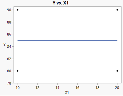
But this is naïve. If I color the points based on X2, I get a very different picture (which is a way for you to see how Fit Y by X can show synergies -- you can use the Group By option in Fit Y by X to get one additional variable):
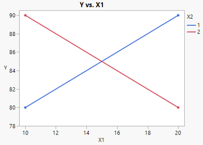
X1 does have an effect, it just depends on what the value of X2 is to see it. But what if you have THREE factors (for example, an X3)? The coloring of the points will get more complex and make the relationships hard to see.
Just plotting the data will not do. You need to switch to a modeling approach.
Even your comment on my very first example of wanting the profiler to say that the response is 90-94 (by the way, what would you actually predict?) when X=10 or maybe wider based on confidence intervals. Those confidence intervals are based on a model. Working with a modeling mindset will make graphs much clearer (the profiler gives an actual prediction). Models naturally extend to more complicated situations and larger datasets which graphs of the raw data cannot do (or at least not do well). The models will QUANTIFY how large the synergistic effects are as well as provide a method to TEST if they are significant or larger than the random error in the data. Good models allow you to explore the "what if" scenarios without having to constantly do more testing in a laboratory.
I recommend the modeling approach with graphs of the model rather than graphs of just the raw data. The models will give you more insights into what the data is telling you. Work on improving your model rather than looking for a different way to "graph the data". If the models are not telling you much, then the data may not have much to say. That is where you can consider things such as perhaps measurement error has not been accounted for properly or the ranges of your factors were not wide enough to demonstrate the variable effects. Good luck on your journey to achieve some insights in your data!
Recommended Articles
- © 2026 JMP Statistical Discovery LLC. All Rights Reserved.
- Terms of Use
- Privacy Statement
- Contact Us