- Don’t miss your chance to experience Discovery Summit Europe at our best available rate! Early bird registration through 31 Oct.
- Graph Builder Toolbar streamlines interactive graphing. Creates shortcuts on Report and GraphBuilder Helpers toolbars. Download and install the extension.
- Subscribe to RSS Feed
- Mark Topic as New
- Mark Topic as Read
- Float this Topic for Current User
- Bookmark
- Subscribe
- Mute
- Printer Friendly Page
Discussions
Solve problems, and share tips and tricks with other JMP users.- User Community
- :
- Discussions
- :
- Re: Post-hoc test after Two-Way ANOVA: How to apply Bonferroni in JMP

- Mark as New
- Bookmark
- Subscribe
- Mute
- Subscribe to RSS Feed
- Get Direct Link
- Report Inappropriate Content
Post-hoc test after Two-Way ANOVA: How to apply Bonferroni in JMP
I am currently analyzing multi-group data using a two-way ANOVA (Group × Time), and I would like to know how to perform a post-hoc test using the Bonferroni method in JMP.
Normally, I use Tukey’s HSD for multiple comparisons, I am required to report the results using Bonferroni-adjusted comparisons as well.
I have checked the JMP help documentation and found explanations for multiple comparison methods in one-way ANOVA (Tukey, Dunnett, etc.).
However, I could not find a clear description of how to apply Bonferroni adjustment after a two-way ANOVA, especially from the “Least Squares Means” platform.
Could you please advise on the following points?
When the interaction is significant, what is the correct procedure in JMP to perform simple effects comparisons with Bonferroni adjustment after a two-way ANOVA (Fit Model)?
In nonparametric explanations, Bonferroni is sometimes described as “multiplying each t‑test p-value by the number of comparisons.”
Is this interpretation acceptable in JMP as well, or is there a recommended built‑in method for Bonferroni adjustment?
Any guidance would be greatly appreciated.
Thank you very much.
Best regards,


- Mark as New
- Bookmark
- Subscribe
- Mute
- Subscribe to RSS Feed
- Get Direct Link
- Report Inappropriate Content
Re: Post-hoc test after Two-Way ANOVA: How to apply Bonferroni in JMP
Hi @LossMarmot707 : Yes, “multiplying each t‑test p-value by the number of comparisons.” is the same as the Bonferroni adjustment, no matter what software you are using. But, why do you want to compare simple effects in the presence of an interaction? This could be very misleading. e.g., there could be a large difference between a pair of groups at each respective timepoint, but when averaged over the timepoints that difference is very small.
Edit: Or, another way to make the Bonferroni adjustment would be to change alpha (to alpha/k, where k is number of comarisons) in the Fit Model platform (red triangle next to "Model Specification"), and then use the Student's t intervals.
- Mark as New
- Bookmark
- Subscribe
- Mute
- Subscribe to RSS Feed
- Get Direct Link
- Report Inappropriate Content
Re: Post-hoc test after Two-Way ANOVA: How to apply Bonferroni in JMP
Thank you for your comment.
I understand Bonferroni adjustment as a standard approach to control Type I error when multiple comparisons are performed.
Even when an interaction is significant, interpreting only the main effects can lead to a misleading understanding of the overall pattern. For this reason, it is generally recommended to examine the effects separately for each condition (i.e., to compare simple effects), such as at each time point or concentration level.
The presence of an interaction indicates that
“the effect of one factor changes depending on the level of the other factor,”
which means that looking only at the overall averages may obscure important patterns in the data.
Therefore, in the present analysis, I examined the differences between groups within each condition using post hoc comparisons following the two-way ANOVA, in order to clarify these patterns.
In addition, my original question here was specifically about how to perform post hoc tests with Bonferroni adjustment using the statistical software JMP.
That said, as you mentioned, adjusting alpha to α/k and using the Student’s t intervals may indeed be a convenient alternative way to implement the Bonferroni correction.


- Mark as New
- Bookmark
- Subscribe
- Mute
- Subscribe to RSS Feed
- Get Direct Link
- Report Inappropriate Content
Re: Post-hoc test after Two-Way ANOVA: How to apply Bonferroni in JMP
You can perform "simple effect test" by [Test Slices] option at the red triangle menu for the interection term, and you can output the p-values into a data table by [Make Combined Data Table].
(1) Select [Analyze] > [Fit Model].
(2) Set the Y variable, and set two-factors interactions (say, "A, B and A*B").
In the default setting, you can see leverage plots in the right side ("A", "B" and "A*B").
(3) Click the red triangle menu at "A*B", and select [Test Slice].

You can see F Ratios and the p-values of "simple effect tests". But these p-values are not adjusted for multiplicity.
(4) Right-click on a table for a simple effect test, and select [Make Combined Data Table].

Now you can see test resutls in a JMP data table.
(5) Delete rows which you are not interested in, and leave only rows what you are interested in.
(6) Right-click on the column header for "Prob>F", and select [New Formula Column] > [Formula...]. The formula editor window is invoked.
(7) Type the following formua.

Min(:"Prob > F"n * N Row(), 1);
Click [OK] to apply the formula and close the window.
(8) Change the column name, like "Adj. Prob > F".
(9) Select [Edit] > [Journal]. Now you can make the table of Bonferroni adjusted p-values.

P.S.
I personally (and strongly) do not recommend "only calculating p-values" or "p-values-are-all philosophy". You can create more informative graphs for seeing the two-factor interaction.
(A) After #2 in the above, click the red triangle at the top outline, and select [Factor Profiling] > [Interaction Plots]. You can see the interacton plot.

(B) After #2 in the above, click the red triangle at the top outline, and select [Factor Profiling] > [Profiler]. Select [Overlaid Interaction] at Prediction Profiler. This plot is same as Interaction Plot when there are only two factors. But the Prediction Profiler is interactive and you can see more than two factors interactively.

(C) You can make more graphs by the Graph Builder.

I also think that you needed to clarify which contrasts you would test before you gathered data if you are really wanted to adjust multiplicity. If you select which contrasts you test after you see your data, the multiplicity will not be adjusted correctly.
- Mark as New
- Bookmark
- Subscribe
- Mute
- Subscribe to RSS Feed
- Get Direct Link
- Report Inappropriate Content
Re: Post-hoc test after Two-Way ANOVA: How to apply Bonferroni in JMP
Thank you very much for your detailed explanation on how to perform the Test Slice procedure.
I sincerely appreciate your clear guidance, and I have been proceeding with my analysis based on the steps you provided.
I would like to ask an additional question regarding my current analysis.
At present, I am analyzing animal experiment data (blood pressure, pulse rate, etc.) obtained from drug administration studies using JMP.
Measurements are taken weekly, and I am working with 20 weeks of data.
For the analysis,
I am performing a two-way ANOVA with the type of administered drug (group) and the measurement week as factors.
When significant group differences are detected, I would like to conduct Bonferroni post hoc tests (simple effect tests using Test Slice).
However, although I am able to run the two-way ANOVA itself,
I am unable to perform the post hoc tests afterward, as the weekly group comparisons using Test Slice do not appear as expected.
In particular,
JMP does not display the plots in the analysis window with the measurement values on the Y‑axis and the measurement week on the X‑axis for each treatment group,
and I feel that this may be the root of the issue.
If possible, I would greatly appreciate any advice on
what potential causes I should consider or which settings I should check
in order to resolve this situation.
Thank you for your assistance.
- Mark as New
- Bookmark
- Subscribe
- Mute
- Subscribe to RSS Feed
- Get Direct Link
- Report Inappropriate Content
Re: Post-hoc test after Two-Way ANOVA: How to apply Bonferroni in JMP
I denote two main fixed effects as Week and Group, and the two-factor interaction term as Week*Group. I guess that you also include the random effect of animals. I denote it as Animal ID.
Y = Week Group Week*Group Animal ID&Random Effect
If you include random effects in your model, the default Emphasis becomes Minimal Report. If so, you need to open the Effect Details outline. There is Group*Week outline in it.
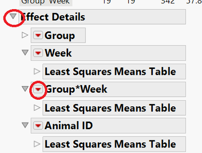
Or, you need to select Effect Leverage for Emphasis in the launch dialog.
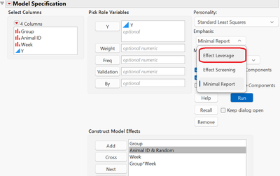
Before you try your own data, please try the analysis for the following fake data.
(1) Select File > New > JSL Script. The script editor is open.
(2) Copy and paste the following code to the script editor.
Names Default To Here(1);
Random Reset(1111111);

n group = 2;
n animals per group = 10;
n week = 20;

data = [];
id = 0;
For(group = 1, group <= n group, group++,
	For(i=1, i <= n animals per group, i++,
		id++;
		f = Random Normal();
		For(week = 1, week <= n week, week++,
			y = week + group + f + Random Normal();
			If(week>=10 & group==1, y += 10 - week);
			data|/=group||id||week||y;
		);
	);
);

dt = As Table(data, <<Column Names({"Group", "Animal ID", "Week", "Y"}));

Column(dt, "Group")<<Modeling Type("Nominal");
Column(dt, "Animal ID")<<Modeling Type("Nominal");
Column(dt, "Week")<<Modeling Type("Nominal");

Graph Builder(
	Size( 654, 507 ),
	Show Control Panel( 0 ),
	Variables( X( :Week ), Y( :Y ), Overlay( :Animal ID ), Color( :Group ) ),
	Elements( Line( X, Y, Legend( 14 ) ) )
);
(3) In the script editor, select Edit > Run Script.
(4) Do the above analsis, and see whether it is what you want.
If the number of groups is two, you can use Multiple Comparisons option for performing simple effect tests
(1) Select the red triangle icon and select Multiple Comparisons.
(2) Select Group*Week in Choose an Effect.
(3) Check Show Least Squares Means Plot.
(4) Check Create an Interaction Plot.
(5) Select Group in Choose Terms for Overlay.
(6) Click OK. The Interaction plot with confidence intervals is shown.
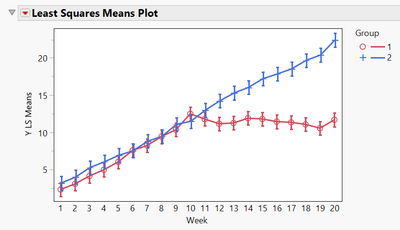
(7) Again, select the red triangle icon and select Multiple Comparisons.
(8) Select Least Squares Means Slice Estimates in Type of Estimates.
(9) Select Specify Slice Terms in Slice Options.
(10) Select Week in Choose Slice Terms.
(11) (If you want to do Bonferroni's correction) Select All Pairwise Comparisons - Student's.
(12) Click OK. Note that all results are not adjusted for multiplicity.
(13) Right-click inside the All Pairwise Differences table, and select Make Combined Data Table.
(14) Calculate Bonferroni adujusted p-values and confidence intervals.
Min( :"Prob>|t|"n * N Row(), 1 ):Difference - :Std Error * t Quantile( 1 - 0.05 / (2 * N Row()), :DF ):Difference + :Std Error * t Quantile( 1 - 0.05 / (2 * N Row()), :DF )
<Japanese>
2つの固定効果である主効果を Week および Group とし、それらの2因子間交互作用項を Week*Groupとします。おそらく、これらの固定効果だけではなく、動物の各個体がもつ変量効果もモデルに含めているものと思います。この変量効果を、Animal IDとします。つまり、モデルの効果として、次の4つが含まれているとします。
Y = Week Group Week*Group Animal ID&Random Effect
「モデルのあてはめ」にて変量効果を含めた場合、デフォルトの強調点が最小レポートになります. その場合、レポートの効果の詳細アウトラインを開く必要があります。開くと、そのなかにGroup*Weekアウトラインがあります。
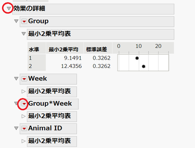
もしくは、起動ダイアログにおいて、強調点を効果てこ比にしてください。
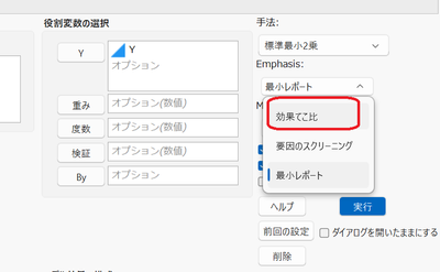
自分自身のデータを試す前に、まずは綺麗な疑似データでうまくいくかどうかを試すことをお勧めしたいです。
(1) ファイル > 新規作成 > JSLスクリプトを選択します。 スクリプトエディタが開きます。
(2) 次のコードを、スクリプトエディタにコピペします。
Names Default To Here(1);
Random Reset(1111111);

n group = 2;
n animals per group = 10;
n week = 20;

data = [];
id = 0;
For(group = 1, group <= n group, group++,
	For(i=1, i <= n animals per group, i++,
		id++;
		f = Random Normal();
		For(week = 1, week <= n week, week++,
			y = week + group + f + Random Normal();
			If(week>=10 & group==1, y += 10 - week);
			data|/=group||id||week||y;
		);
	);
);

dt = As Table(data, <<Column Names({"Group", "Animal ID", "Week", "Y"}));

Column(dt, "Group")<<Modeling Type("Nominal");
Column(dt, "Animal ID")<<Modeling Type("Nominal");
Column(dt, "Week")<<Modeling Type("Nominal");

Graph Builder(
	Size( 654, 507 ),
	Show Control Panel( 0 ),
	Variables( X( :Week ), Y( :Y ), Overlay( :Animal ID ), Color( :Group ) ),
	Elements( Line( X, Y, Legend( 14 ) ) )
);
(3) スクリプトエディタにて、編集 > スクリプトの実行を選択します。
(4) 前述の分析をしてみて、望みの結果が得られるかを試してください。
もし2群の場合ならば、多重比較オプションを使うことも考えられます。
(1) レポート先頭の赤い三角ボタンをクリックし、多重比較を選択します。
(2) 呼び出されたウィンドウの効果の選択にて、Group*Weekを選択します。
(3) 最小2乗平均プロットの表示をチェックします。
(4) 交互作用プロットを作成するをチェックします。
(5) 重ね合わせるモデル項を選択にて、Groupを選択します。
(6) OKをクリックすると、信頼区間も描かれた交互作用プロットが作成されます。」

(7) 再び、レポート先頭の赤い三角ボタンから、多重比較を選択します。
(8) 推定値の種類で、最小2乗平均の輪切り推定値を選択します。
(9) 輪切りのオプションにて、輪切りする項を指定するを選択します。
(10) 輪切りする項の選択にて、Weekを選択します。
(11) (もし後ほどBonferroni調整を適用するのであれば) 各ペアの比較 - Studentのt検定を選択します。
(12) OKをクリックします. この結果は多重調整がなされていない点にご注意ください。
(13) すべてのペアの平均差の表にて右クリックして、連結したデータテーブルの作成を選択します。
(14) Bonferroni調整したp値と信頼区間を求める計算式を作成してください。
Min( :"Prob>|t|"n * N Row(), 1 ):Difference - :Std Error * t Quantile( 1 - 0.05 / (2 * N Row()), :DF ):Difference + :Std Error * t Quantile( 1 - 0.05 / (2 * N Row()), :DF )<以下は日本語のみでの説明>
20時点もある場合、その20時点で輪切りをすると、(群が2群であり、その2群での差を求めるだけであれば)調整したp値は元のp値を20倍することになります。もしデータを取る前に多重調整を宣言するのであれば、固定順序法(fixed order method)などの方法によっても多重性は調整できます。
20時点もある場合には、時点の効果をカテゴリカルデータではなく、連続変数としてモデル化することも考えられます。
先日の回答でも述べましたが、個人的にはp値を求めて終わりではなく、グラフビルダーなどで全体の傾向を見ることを強くお勧めいたします。上記のスクリプトを実行すると、週を横軸、測定値を縦軸にして、群ごとに色分けした各個体ごとの折れ線が描かれます。
- Mark as New
- Bookmark
- Subscribe
- Mute
- Subscribe to RSS Feed
- Get Direct Link
- Report Inappropriate Content
Re: Post-hoc test after Two-Way ANOVA: How to apply Bonferroni in JMP
I now come to mind and I am afraid that you set Animial ID as a fixed effect or you select EMS (Traditional) for Method. If so, Animal ID is treated as a fixed effect.
Even if you apply Random Effect to Animal ID, and if you set EMS (Traditional), many results are based on a fixed-effect model. Only Expected Mean Squares, Variance Component Estimates, Test Denominator Synthesis, and Test wrt Random Effects are based on a mixed-effect model.
Although I do not think what you want to do, if you really want to treat Animal ID as a fixed effect, you need to set Animial ID as a nested effect from Group (,i.e. Animal ID[Group]).
If Animial ID is numbered within each group as below, and the animal with Animal ID=1 in Group=1 is different from Animal ID=1 in Group=2, then you always need to set Animal ID as a nested effect from Group (,i.e. you need to set Animal ID[Group]) (even if you treat Animal ID as a random effect in REML estimation).
Group Animal ID
1 1
1 2
1 3
1 4
1 5
2 1
2 2
2 3
2 4
2 5
If your data is like below, and if you perform REML estimation, you do not need to specify the nested effect.
(It is also OK that you specify Animal ID as the nested effect.)
Group Animal ID
1 1
1 2
1 3
1 4
1 5
2 6
2 7
2 8
2 9
2 10
Note that the above model, Y = Group Week Group*Week Animal ID&Random Effect with nominal Group and Week, is only one possibility among many statistical models. I just showed how to set and perform in JMP software, and I do not think about the validness of this model
Anyway, I think that the first step is to draw the plot.

<Japanese>
いま少し思い付いたのですが、Animal IDを固定効果として扱っているか、もしくは、手法をEMS(従来)にしていないかと思いました。その場合、Animal IDは固定効果として扱われます。
Animal IDを変量効果として設定しても、EMS(従来)にすると、多くの結果はAnimal IDを固定効果として扱った固定効果モデルに基づいています。期待平均平方、分散成分推定値、F検定の分母、変量効果を考慮した検定だけが、Animal IDを変量効果として扱った混合効果モデルに基づきます。
分析したいことではないと思いますが、万が一、本当にAnimal IDを固定効果として分析をしたいのであれば、Animal IDをGroupから枝分かれした効果「Animal ID[Group]」として設定する必要があります。
もし、以下のようにAnimal IDが各群で番号付けされていて、また、第1群のAnimal ID=1が、第2群のAnimal ID=1と違う個体の場合には、その場合にはAnimal IDを枝分かれ効果(つまり、Animal ID[Group])としなければいけません。(これはAnimal IDを変量効果として扱ってREML推定する場合にも、そう設定する必要があります。)
Group Animal ID
1 1
1 2
1 3
1 4
1 5
2 1
2 2
2 3
2 4
2 5
もしデータが次のようになっていて、Animal IDが変量効果として設定されていて、REML推定を行う場合には、Animal IDを枝分かれ効果として指定する必要はありません。(別に枝分かれ効果として指定しても構いません。データが以下のような場合で、REML推定を用いる場合には、どっちでも構いません。)
Group Animal ID
1 1
1 2
1 3
1 4
1 5
2 6
2 7
2 8
2 9
2 10
なお、Y = Group Week Group*Week Animal ID&変量効果 でGroupやWeekを名義尺度として扱うモデルは、他にもいろいろと考えられるモデルのうちの1つにすぎず、上記のことはソフトウェア上の設定方法や操作方法だけを述べているだけで、このモデルが妥当なものかは考えていません。
いずれにしても、まずはグラフを描いてみるのが最初のステップだと思います。

Recommended Articles
- © 2026 JMP Statistical Discovery LLC. All Rights Reserved.
- Terms of Use
- Privacy Statement
- Contact Us