- New to JMP? Let the Data Analysis Director guide you through selecting an analysis task, an analysis goal, and a data type. Available now in the JMP Marketplace!
- See how to install JMP Marketplace extensions to customize and enhance JMP.
- Subscribe to RSS Feed
- Mark Topic as New
- Mark Topic as Read
- Float this Topic for Current User
- Bookmark
- Subscribe
- Mute
- Printer Friendly Page
Discussions
Solve problems, and share tips and tricks with other JMP users.- JMP User Community
- :
- Discussions
- :
- Re: Plotting Summary Statistics
- Mark as New
- Bookmark
- Subscribe
- Mute
- Subscribe to RSS Feed
- Get Direct Link
- Report Inappropriate Content
Plotting Summary Statistics
All,
I have data that is broken down by lot, site, and then individual product. Thus, a lot might have 9 sites, with each site containing 9 products. Statistics are collected for each product.
The data might vary site to site over a large number of lots. To check this, I tabulate aggregate statistics by site, such as median and range. I then convert the tabulated data into a data table and plot the statistics by site. I typically use heat maps or Map Builder maps with the X-axis denoting SiteX, Y-axis denoting SiteY, and the color of the data linked to the aggregate statistic.
Creating aggregate statistics via the Tabulate Platform is cumbersome. Is there any way to do this without the added steps of tabulating the data and creating new data tables?
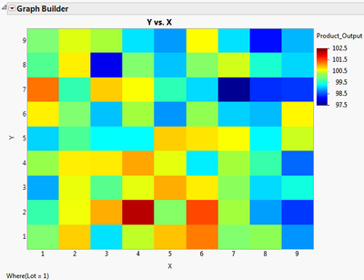
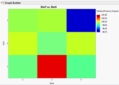
I have attached an example data set to illustrate what I am currently doing. The test file has 6 lots with 9 sites, and 9 products per site. Any given lot's Product_Output data is fairly unremarkable when plotted against X and Y (see below). If, however, you tabulate the median Product_Output by SiteX and SiteY, and plot that data by SiteX and SiteY, it will become obvious that SiteX = 2, SiteY = 1 has a higher median than average, while SiteX = 3, SiteY = 3 has a lower median than average (see below).
Any help would be greatly appreciated!
Brian
Lot 1 Product_Output by X and Y
Median Product_Output by SiteX and SiteY
Accepted Solutions
- Mark as New
- Bookmark
- Subscribe
- Mute
- Subscribe to RSS Feed
- Get Direct Link
- Report Inappropriate Content
Re: Plotting Summary Statistics
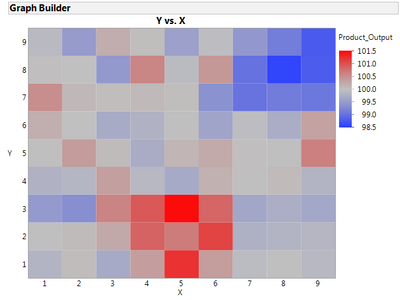
Maybe I am missing something. If so, please let me know. Could you not use the Graph Builder and drag the X (or sites) into the X role, the Y (or products) into the Y role, drag the Product_Output into the color role, and change to a heatmap? This is what I get when I do this:
This shows that X values of 4, 5, and 6 with Y's of 1, 2, and 3 are higher than the others. I can also see that X's 7, 8, and 9 with Y's of 7, 8, and 9 are lower than the others.
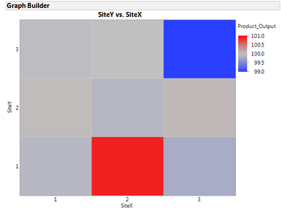
If you want to see the grouping as with your summarized graph, you need to tell JMP what those groupings are. It would be easy to Recode your X and Y columns into the 1, 2, and 3 values you had in your SiteX and SiteY variables. Then follow the same Graph Builder steps using SiteX and SiteY to get this picture:
No summary tables are needed.
- Mark as New
- Bookmark
- Subscribe
- Mute
- Subscribe to RSS Feed
- Get Direct Link
- Report Inappropriate Content
Re: Plotting Summary Statistics
For many graphs the graph builder does offer you a choice of summary statistics. However, the heat map does not appear to be one of them. It looks like a script might be needed to perform the calculations you want without generating a new data table.
- Mark as New
- Bookmark
- Subscribe
- Mute
- Subscribe to RSS Feed
- Get Direct Link
- Report Inappropriate Content
Re: Plotting Summary Statistics
An easy way to get the median would involve 3 steps
(1) Use the distribution platform to create histograms by x Y combination
(2) Use Row Select where to select all rows NE Median
(3) Use Rows Delete Rows to deleted all rows NE Median
- Mark as New
- Bookmark
- Subscribe
- Mute
- Subscribe to RSS Feed
- Get Direct Link
- Report Inappropriate Content
Re: Plotting Summary Statistics
This has worked for me in the past. In order to get this to work, after step (1) I have to right-click the the Quantiles area and select Make Combined Data Table. Then, with a few manipulations, I can create the aggregate maps.
The issue with this method is the overhead of running the Distribution platform. If the number of Sites and Products increases dramatically, the Distribution platform slows down (I assume due to the large number of graphics...). In the end, I found the Tabulate platform more efficient.
- Mark as New
- Bookmark
- Subscribe
- Mute
- Subscribe to RSS Feed
- Get Direct Link
- Report Inappropriate Content
Re: Plotting Summary Statistics
Maybe I am missing something. If so, please let me know. Could you not use the Graph Builder and drag the X (or sites) into the X role, the Y (or products) into the Y role, drag the Product_Output into the color role, and change to a heatmap? This is what I get when I do this:
This shows that X values of 4, 5, and 6 with Y's of 1, 2, and 3 are higher than the others. I can also see that X's 7, 8, and 9 with Y's of 7, 8, and 9 are lower than the others.
If you want to see the grouping as with your summarized graph, you need to tell JMP what those groupings are. It would be easy to Recode your X and Y columns into the 1, 2, and 3 values you had in your SiteX and SiteY variables. Then follow the same Graph Builder steps using SiteX and SiteY to get this picture:
No summary tables are needed.
- Mark as New
- Bookmark
- Subscribe
- Mute
- Subscribe to RSS Feed
- Get Direct Link
- Report Inappropriate Content
Re: Plotting Summary Statistics
In both graphs, there are many data points for each (X, Y) and (SiteX, SiteY) pairs. The question becomes: what value does Graph Builder use to determine the color displayed?
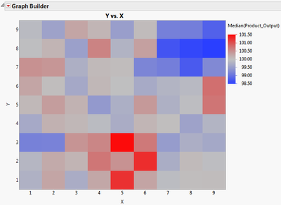
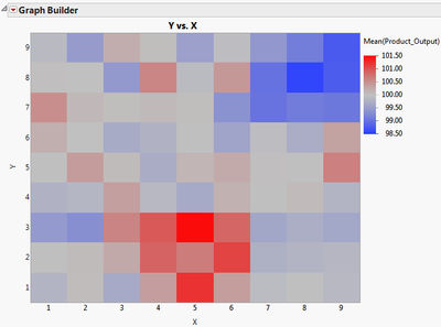
After a bit of trial and error, I believe Graph Builder uses the average of all points. I compared the median of all points, and it matches your graphs closely, but not exactly. When I plot the averages of all points, it matches exactly (as far as I can see ... check out the pictures below).
Is there a way to control which aggregate statistic Graph Builder chooses to display? For example: median, quantile, or range? If not, then I am still stuck with the tabulate method, as I don't often want to display just averages.
- Mark as New
- Bookmark
- Subscribe
- Mute
- Subscribe to RSS Feed
- Get Direct Link
- Report Inappropriate Content
Re: Plotting Summary Statistics
For many graphs the graph builder does offer you a choice of summary statistics. However, the heat map does not appear to be one of them. It looks like a script might be needed to perform the calculations you want without generating a new data table.
- Mark as New
- Bookmark
- Subscribe
- Mute
- Subscribe to RSS Feed
- Get Direct Link
- Report Inappropriate Content
Re: Plotting Summary Statistics
I suspect you are correct. Someone had mentioned that Transform Columns might help with what I am trying to achieve. I have not been able to get those to work as I would like, though.
Assuming there are no other answers, then the correct answer is:
JMP cannot plot a third variable aggregate statistic except for Average (Graph Builder) and N (Heat Map). For other statistics, like median, range, etc., the user needs to create intermediate tables via scripting or other methods.
Thanks everybody!
Recommended Articles
- © 2026 JMP Statistical Discovery LLC. All Rights Reserved.
- Terms of Use
- Privacy Statement
- Contact Us

