- Subscribe to RSS Feed
- Mark Topic as New
- Mark Topic as Read
- Float this Topic for Current User
- Bookmark
- Subscribe
- Mute
- Printer Friendly Page
Discussions
Solve problems, and share tips and tricks with other JMP users.- JMP User Community
- :
- Discussions
- :
- Plot conventional and reverse CDF on same plot by grouping variable
- Mark as New
- Bookmark
- Subscribe
- Mute
- Subscribe to RSS Feed
- Get Direct Link
- Report Inappropriate Content
Plot conventional and reverse CDF on same plot by grouping variable
Hello,
Have a question on CDF plots on the distribution platform
I would like to plot the CDF of two variables say Y1 and Y2 which are on the same numerical scale but differ by the range/. For example Y1 from 0-100 and Y2 from 0 to 1000. I want to plot Y1like a regular CDF plot with the CumProb going from 0 to 1 and X1 values increasing from 0 to 100.
For Y2, I want the X2 to be in decreasing order from 1000 to 0 but the cumprob of Y2 runs from 0 to Y increasing in the Y axis direction.
I want to essentially reverse cdf(Y2) and overplot with cdf(Y1) and plot both on the same cdf plot window. Eventually I want to shade specific areas under the curves based on X1 and X2 values but before that I want to know how I could accomplish this task?
I started with getting the probability score and adding a column for 1-P(X2 > x) for Y2 but was little stuck on how I could get 1-P(X2>x) and P(X1<=x1) on the same X axis and was running around circles with how I could approach this in general. Any thoughts and pointers would be really helpful. I have 5 different categories of a grouping variable and do not mind having 5 different such cdf plots.
- Mark as New
- Bookmark
- Subscribe
- Mute
- Subscribe to RSS Feed
- Get Direct Link
- Report Inappropriate Content
Re: Plot conventional and reverse CDF on same plot by grouping variable
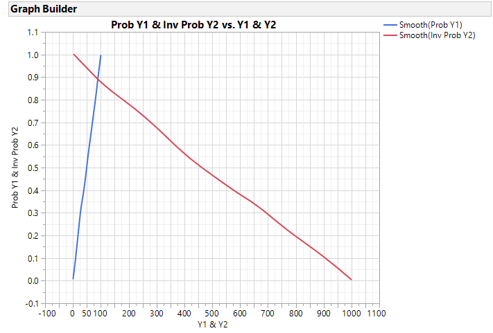
Attached is a script that I believe simulates your data setup and two methods to create the graph you described. One uses unstacked data ( two columns) and another with stacked data. If you are looking for rows where the Inv Prob of Y2 > Prob Y1 the unstacked (raw) data would be easier to use.
Note, Y1 and Y2 were simulated as uniform distributions.
Names Default to Here(1);

dt = New Table("Demo - Raw", Add rows(1000),
        New Column("Y1", Numeric, Continuous, <<Set Each Value(Random Integer(0,100)) ),
        New Column("Y2", Numeric, Continuous, <<Set Each Value(Random Integer(0,1000)) )
     );

dist = dt << Distribution(
	Continuous Distribution( Column( :Y1 ) ),
	Continuous Distribution( Column( :Y2 ) )
);

dist << Save(Prob Scores);

dist << close window();

dt << New Column("Inv Prob Y2", numeric, continuous, <<Set Each Value(1-:Prob Y2));


//Using Unstacked data and GraphBuilder
gb = dt << Graph Builder(
	Size( 534, 454 ),
	Show Control Panel( 0 ),
	Variables(
		X( :Y1 ),
		X( :Y2, Position( 1 ) ),
		Y( :Prob Y1 ),
		Y( :Inv Prob Y2, Position( 1 ) )
	),
	Elements(
		Smoother( X( 1 ), Y( 1 ), Legend( 25 ) ),
		Smoother( X( 2 ), Y( 2 ), Legend( 27 ) )
	),
	SendToReport(
		Dispatch(
			{},
			"Y1",
			ScaleBox,
			{Min( -100 ), Max( 1100 ), Inc( 50 ), Minor Ticks( 1 ),
			Label Row( {Show Major Grid( 1 ), Show Minor Grid( 1 )} )}
		),
		Dispatch(
			{},
			"Prob Y1",
			ScaleBox,
			{Min( -0.1 ), Max( 1.1 ), Inc( 0.1 ), Minor Ticks( 1 ),
			Label Row( {Show Major Grid( 1 ), Show Minor Grid( 1 )} )}
		)
	)
);


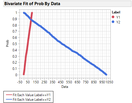
//Sometimes it is easier to stack the data and use Bivariate instead of GraphBuilder

dtstck = dt << Stack(
	columns( :Y1, :Y2, :Prob Y1, :Inv Prob Y2 ),
	Source Label Column( "Label" ),
	Stacked Data Column( "Data" ),
	Stack By Row( 0 ),
	Number of Series( 2 ),
	Contiguous,
	Output Table Name("Demo - Stacked")
);

dtstck:Data2 << set name("Prob");

//this creates one graph with 2 curves
biv = dtstck << Bivariate(
	Y( :Prob ),
	X( :Data ),
	Group By(:Label),
	Fit Each Value( {Report(0)}),
	SendToReport(
		Dispatch(
			{},
			"1",
			ScaleBox,
			{Min( -50 ), Max( 1050 ), Inc( 50 ), Minor Ticks( 1 ),
			Label Row( {Show Major Grid( 1 ), Show Minor Grid( 1 )} )}
		),
		Dispatch(
			{},
			"2",
			ScaleBox,
			{Label Row( {Show Major Grid( 1 ), Show Minor Grid( 1 )} )}
		),

		Dispatch(
			{},
			"Bivar Plot",
			FrameBox,
			{Row Legend(
				Label,
				Color( 1 ),
				Color Theme( "JMP Default" ),
				Marker( 0 ),
				Marker Theme( "" ),
				Continuous Scale( 0 ),
				Reverse Scale( 0 ),
				Excluded Rows( 0 )
			)}
		)
	)
);
Here are the two graphs:
- Mark as New
- Bookmark
- Subscribe
- Mute
- Subscribe to RSS Feed
- Get Direct Link
- Report Inappropriate Content
Re: Plot conventional and reverse CDF on same plot by grouping variable
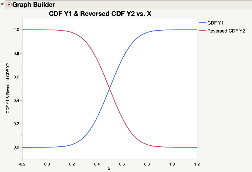
I like Georgia's solution a lot. Here is a simpler and different approach: normalizing the two data sets before combining the plot. It might not be as satisfying.
I used two normal distributions with different parameters to illustrate this approach. You could save the fitted model for a distribution of sample data as a column formula instread of making up the data as I did. Here is the resulting plot:
I attached the data table that I made to produce this plot.
Recommended Articles
- © 2026 JMP Statistical Discovery LLC. All Rights Reserved.
- Terms of Use
- Privacy Statement
- Contact Us


