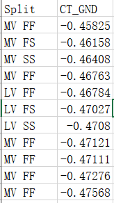
I have the following data that need to draw the CT_GND data as a normal probability distribution curve, and group it with the Split column, draw it in one graph, color difference, such as bellow graph, how should I operate? and I have many columns need to draw, automated builds are best.


