- Subscribe to RSS Feed
- Mark Topic as New
- Mark Topic as Read
- Float this Topic for Current User
- Bookmark
- Subscribe
- Mute
- Printer Friendly Page
Discussions
Solve problems, and share tips and tricks with other JMP users.- JMP User Community
- :
- Discussions
- :
- Re: Normal Quantile Plot axes
- Mark as New
- Bookmark
- Subscribe
- Mute
- Subscribe to RSS Feed
- Get Direct Link
- Report Inappropriate Content
Normal Quantile Plot axes
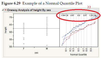
When making a Normal Quantile Plot (Analyze -> Fit Y by X and turn on "Plot Quantile by Actual"), there are a few small numbers on the right-hand-side axis opposite from the quantile (cumulative probability) amounts that are on the left-hand axis. I'd like to find out what the right-hand axis represents. It looks like 0 on the right side seems to line up with the .5 quantile (median). The right-hand axis usually displays values +/- 0.67, 1.28, 1.64, and 2.33. Does the right-hand axis indicate the standard deviation from the median? Is there a constant one-to-one formula between the quantile amounts and this other axis?
The same is observed when you do "Plot Actual by Quantile" which is shown in the JMP "Basic Analysis" book page 198 (Figure 6.29, Example of a Normal Quantile Plot), in which the quantiles are on the bottom axis and these "other" numbers are on the top.
Also, when you do a Distribution plot (Analyze -> Distribution), the quantile amounts are on the outside right axis, and these other numbers are on the inside right axis.
Besides knowing the theory behind what this other axis is, I was wondering if JMP provides an option to turn the display of it off in any of these chart types, so that you would only see the "actuals" axis and the quantiles axis for the Normal Quantile Plot?
Accepted Solutions
- Mark as New
- Bookmark
- Subscribe
- Mute
- Subscribe to RSS Feed
- Get Direct Link
- Report Inappropriate Content
Re: Normal Quantile Plot axes
The Normal Quantile Plot above plots the data value (e.g., height) on the vertical axis and the probability (0 to 1) from the CDF on the horizontal axis. So the horizontal scale is the probability that you would observe a value up to the data value using the CDF of the normal distribution. The secondary scale (inset at the top of the plot and called out with the red ellipse above) are the quantiles from the standard normal distribution (mean 0, standard deviation 1)..
- Mark as New
- Bookmark
- Subscribe
- Mute
- Subscribe to RSS Feed
- Get Direct Link
- Report Inappropriate Content
Re: Normal Quantile Plot axes
Hi Mark, I am using the Normal Quantile Plot a lot at work. One thing that I have been having trouble is setting the probability axis. Could you let me know how to generate a symmetric scale (centered at 50%) for the probability axis? Below is an example I generated from Minitab. I haven't found a way to do the same in Jmp. I am using JMP 11.
Many Thanks,,
Liang
- Mark as New
- Bookmark
- Subscribe
- Mute
- Subscribe to RSS Feed
- Get Direct Link
- Report Inappropriate Content
Re: Normal Quantile Plot axes
Right Click on the Axis of interest, select Axis Settings. In the "Scale" area of the Axis Settings Dialog there is an pull down menu that says "Type". It will probably say "Linear" by default. At the bottom of the pull down list is a group of options for "Probability Scales." The first one is Normal Probability.
Best,
Mike Anderson
- Mark as New
- Bookmark
- Subscribe
- Mute
- Subscribe to RSS Feed
- Get Direct Link
- Report Inappropriate Content
Re: Normal Quantile Plot axes
Quick question: Is this the same as or similar to z-score?
- Mark as New
- Bookmark
- Subscribe
- Mute
- Subscribe to RSS Feed
- Get Direct Link
- Report Inappropriate Content
Re: Normal Quantile Plot axes
Yes, assuming the normal distribution.
Recommended Articles
- © 2026 JMP Statistical Discovery LLC. All Rights Reserved.
- Terms of Use
- Privacy Statement
- Contact Us


