- New to JMP? Let the Data Analysis Director guide you through selecting an analysis task, an analysis goal, and a data type. Available now in the JMP Marketplace!
- See how to install JMP Marketplace extensions to customize and enhance JMP.
- Subscribe to RSS Feed
- Mark Topic as New
- Mark Topic as Read
- Float this Topic for Current User
- Bookmark
- Subscribe
- Mute
- Printer Friendly Page
Discussions
Solve problems, and share tips and tricks with other JMP users.- JMP User Community
- :
- Discussions
- :
- Re: Non-numeric Pass/Fail Rate Analysis
- Mark as New
- Bookmark
- Subscribe
- Mute
- Subscribe to RSS Feed
- Get Direct Link
- Report Inappropriate Content
Non-numeric Pass/Fail Rate Analysis
I'm a long time JMP user, but a first time poster. I’ve searched and searched and cannot find a means to analyze data the way I’d really like.
Attached is an Example data table that I’m using.
For my specific example, each “ID” has ~700 unique X/Y coordinate locations. And each one of those X/Y coordinate locations is tested for Pass/Fail. (Pass = “.”; Fail = “F”).
Ideally, I’d like:
- A Contour Plot, with a color gradient associated to the Pass and/or Fail rate for all ID’s. (e.g. if -9/+13 passes 1% of the time it would be blue, and if -9/+14 passes 99% of the time it would be red).
- Or a 3-dimensional chart indicating pass/fail rates similar to above.
- Or, if I can convert my X/Y coordinates into a distance-like measurement (radius, for example), a plot of Pass/Fail rate vs. distance.
The Example data table I have here (~30k rows) is a relative small subset of my larger data table (>>1 million rows).
Although I'm not opposed to working with scripts, can JMP do the above without scripts? That is, does JMP have built-in functions to accomplish this task?
Help or advice is much appreciated. Thanks.
- Mark as New
- Bookmark
- Subscribe
- Mute
- Subscribe to RSS Feed
- Get Direct Link
- Report Inappropriate Content
Re: Non-numeric Pass/Fail Rate Analysis
I think the key to your analysis is "data prep work". Meaning that you if you had a table that had a %pass for each x-y coordinate then you could use any number of graphics to explore your data. I would recode your pass/fail column to a numeric column with 0 = fail and 1 = pass. Then you can summarize your table (your x and y go into the "Group" and then you want the mean for the P/F column. Once you have that table try graph builder with x = x, y = y and the mean column (%pass) as the color and try the contour or heat map from there.
Karen
- Mark as New
- Bookmark
- Subscribe
- Mute
- Subscribe to RSS Feed
- Get Direct Link
- Report Inappropriate Content
Re: Non-numeric Pass/Fail Rate Analysis
Thank you very much. This works beautifully.
- Mark as New
- Bookmark
- Subscribe
- Mute
- Subscribe to RSS Feed
- Get Direct Link
- Report Inappropriate Content
Re: Non-numeric Pass/Fail Rate Analysis
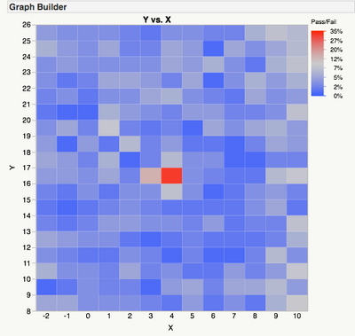
JMP appears to automatically interpret the Pass/Fail as a binary variable and show the proportion of "F" for each coordinate without summarizing. Recoding 0/1 gives the same result.
Set X and Y to Ordinal data type to get a heat map as below.
Recommended Articles
- © 2026 JMP Statistical Discovery LLC. All Rights Reserved.
- Terms of Use
- Privacy Statement
- Contact Us


