- DownloadSemiconductor Toolkit: Tools to create wafer maps, add wafer geometry to graphics, explore die defects & compare wafers.
- Discovery Summit 2026: Early User Edition - September 23-24.Register. It's free.
- Use JMP Clinical with CDISC-compliant data. Review studies, ID safety and efficacy signals & communicate findings with interactive graphics. Register to see how. Aug. 27, 2 pm US ET.
- Subscribe to RSS Feed
- Mark Topic as New
- Mark Topic as Read
- Float this Topic for Current User
- Bookmark
- Subscribe
- Mute
- Printer Friendly Page
Discussions
Solve problems, and share tips and tricks with other JMP users.- JMP User Community
- :
- Discussions
- :
- Re: Need help to "Connect cell Means" in Variability Chart

- Mark as New
- Bookmark
- Subscribe
- Mute
- Subscribe to RSS Feed
- Get Direct Link
- Report Inappropriate Content
Need help to "Connect cell Means" in Variability Chart
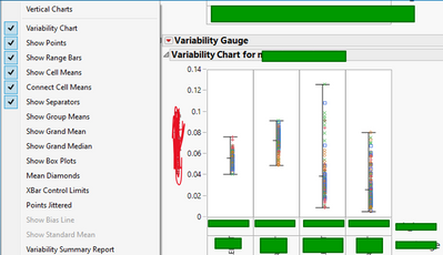
Unable to "connect cell means" in variability chart even after I selected this option in the drop down menu. Is there anything I'm missing?
Accepted Solutions

- Mark as New
- Bookmark
- Subscribe
- Mute
- Subscribe to RSS Feed
- Get Direct Link
- Report Inappropriate Content
Re: Need help to "Connect cell Means" in Variability Chart
The "connect cell means" will draw lines between the means within each group. In your example there is only one set of values in each group therefore there is no line.
This simple example should illustrate (copy and paste into a script window, then run it):
New Table( "Untitled",
	New Column( "value",
		Numeric,
		"Continuous",
		Format( "Best", 12 ),
		Set Values( [1, 2, 3, 4, 3, 2] )
	),
	New Column( "group1",
		Character,
		"Nominal",
		Set Values( {"a", "a", "b", "b", "a", "b"} )
	),
	New Column( "group2",
		Character,
		"Nominal",
		Set Values( {"c", "c", "c", "c", "d", "d"} )
	)
);
Variability Chart(
	Y( :value ),
	X( :group1, :group2 ),
	Connect Cell Means( 1 )
);- Mark as New
- Bookmark
- Subscribe
- Mute
- Subscribe to RSS Feed
- Get Direct Link
- Report Inappropriate Content
Re: Need help to "Connect cell Means" in Variability Chart
The "connect cell means" will draw lines between the means within each group. In your example there is only one set of values in each group therefore there is no line.
This simple example should illustrate (copy and paste into a script window, then run it):
New Table( "Untitled",
	New Column( "value",
		Numeric,
		"Continuous",
		Format( "Best", 12 ),
		Set Values( [1, 2, 3, 4, 3, 2] )
	),
	New Column( "group1",
		Character,
		"Nominal",
		Set Values( {"a", "a", "b", "b", "a", "b"} )
	),
	New Column( "group2",
		Character,
		"Nominal",
		Set Values( {"c", "c", "c", "c", "d", "d"} )
	)
);
Variability Chart(
	Y( :value ),
	X( :group1, :group2 ),
	Connect Cell Means( 1 )
);- Mark as New
- Bookmark
- Subscribe
- Mute
- Subscribe to RSS Feed
- Get Direct Link
- Report Inappropriate Content
Re: Need help to "Connect cell Means" in Variability Chart
Thanks. It made sense! Is there other example you could recommend me to show the mean graph? I was thinking a boxplot
Recommended Articles
- © 2026 JMP Statistical Discovery LLC. All Rights Reserved.
- Terms of Use
- Privacy Statement
- Contact Us