- New to JMP? Let the Data Analysis Director guide you through selecting an analysis task, an analysis goal, and a data type. Available now in the JMP Marketplace!
- See how to install JMP Marketplace extensions to customize and enhance JMP.
- Subscribe to RSS Feed
- Mark Topic as New
- Mark Topic as Read
- Float this Topic for Current User
- Bookmark
- Subscribe
- Mute
- Printer Friendly Page
Discussions
Solve problems, and share tips and tricks with other JMP users.- JMP User Community
- :
- Discussions
- :
- Multiple Y axis in a chart. (Multiple Y axis scales)
- Mark as New
- Bookmark
- Subscribe
- Mute
- Subscribe to RSS Feed
- Get Direct Link
- Report Inappropriate Content
Multiple Y axis in a chart. (Multiple Y axis scales)
Good Morning~ : )
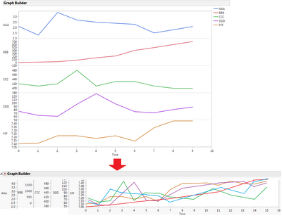
I need your help. I'd like to draw an overlay plot with multiple Y axis as below. (It is commonly used in bioprocess.)
(I'm currently use JMP 12.2.)
- Is there a way to draw like this way? (I can add right Y axis, but I need more.)
- JMP script is also okay for me.
- Hope multiple Y axis drawing feature is supported in JMP 13Graph builder.
- Mark as New
- Bookmark
- Subscribe
- Mute
- Subscribe to RSS Feed
- Get Direct Link
- Report Inappropriate Content
Re: Multiple Y axis in a chart. (Multiple Y axis scales)
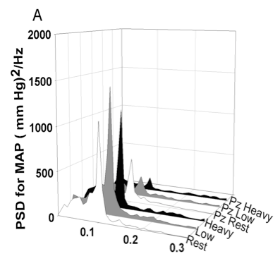
I need to make a 3D graph (with 3 axes) something similar to this below. I have JMP Pro version 12. Is it possible to make a graph like this with JMP?
If yes, can somebody please guide me through the process.
Thanks,
- Mark as New
- Bookmark
- Subscribe
- Mute
- Subscribe to RSS Feed
- Get Direct Link
- Report Inappropriate Content
Re: Multiple Y axis in a chart. (Multiple Y axis scales)
Peter, I agree that it may not be the most attractive graph in its current state. But I work in the same field as James, and frequently it's important to see both the absolute values and the timecourse behavior of multiple (5-6) variables. At the moment, it's difficult to display this type of data in JMP. It would be convenient if multiple Y-axis support and scaling were added in a future JMP version.
One way to address some of the aesthetics of this graph would be to move the y-axis labels to the top or bottom, so that the multiple axis labels could be compressed into a smaller space.
- Mark as New
- Bookmark
- Subscribe
- Mute
- Subscribe to RSS Feed
- Get Direct Link
- Report Inappropriate Content
Re: Multiple Y axis in a chart. (Multiple Y axis scales)
This is my favorite graph not in JMP, so I took a stab at scripting an automated approach to making the graph.
Byron Wingerd Blog/Multiple-Y-Axis-Graphs
- « Previous
-
- 1
- 2
- Next »
Recommended Articles
- © 2026 JMP Statistical Discovery LLC. All Rights Reserved.
- Terms of Use
- Privacy Statement
- Contact Us


