- New to JMP? Let the Data Analysis Director guide you through selecting an analysis task, an analysis goal, and a data type. Available now in the JMP Marketplace!
- See how to install JMP Marketplace extensions to customize and enhance JMP.
- Subscribe to RSS Feed
- Mark Topic as New
- Mark Topic as Read
- Float this Topic for Current User
- Bookmark
- Subscribe
- Mute
- Printer Friendly Page
Discussions
Solve problems, and share tips and tricks with other JMP users.- JMP User Community
- :
- Discussions
- :
- Re: Multiple Y axis in a chart.
- Mark as New
- Bookmark
- Subscribe
- Mute
- Subscribe to RSS Feed
- Get Direct Link
- Report Inappropriate Content
Multiple Y axis in a chart. (Multiple Y axis scales)
Good Morning~ : )
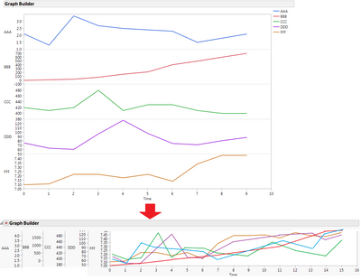
I need your help. I'd like to draw an overlay plot with multiple Y axis as below. (It is commonly used in bioprocess.)
(I'm currently use JMP 12.2.)
- Is there a way to draw like this way? (I can add right Y axis, but I need more.)
- JMP script is also okay for me.
- Hope multiple Y axis drawing feature is supported in JMP 13Graph builder.
Accepted Solutions
- Mark as New
- Bookmark
- Subscribe
- Mute
- Subscribe to RSS Feed
- Get Direct Link
- Report Inappropriate Content
Re: Multiple Y axis in a chart.
I can imagine how this can be done in JMP, but it would take a fairly complex script.
Roughly, this is what would have to be done:
1. A separate Graph Builder would have to be run for all but one of the columns
2. Each of the columns would have to be transformed to where the new values fit within the min and max range of the one column not charted in the above step.
3. The columns would have to be stacked.
4. A Chart Builder platform needs to be run on the stacked data, with the overlay set to the label column from the stacked data table
5. The Y axis label, and the Y Axis Box() from each of the individually run Graph Builders would have to be prepended to the last Graph Builder chart.
6. Delete the individual Graph Builder chart outputs.
Getting all of this to fit together properly would be doable. Lots of gotchas would have to be worked around, but it could be done.
- Mark as New
- Bookmark
- Subscribe
- Mute
- Subscribe to RSS Feed
- Get Direct Link
- Report Inappropriate Content
Re: Multiple Y axis in a chart.
Yes, I got your point. Thank you for your answer. I will use graph builder overlay plot by adjusting Y-axis scale. ( I can comment units on the legend) : )
I knew PI or SIMCA software supports this customized overlay feature, but hope JMP 13 or later version support it. haha Thank you.
- Mark as New
- Bookmark
- Subscribe
- Mute
- Subscribe to RSS Feed
- Get Direct Link
- Report Inappropriate Content
Re: Multiple Y axis in a chart.
I totally agree, lots and lots of gotchas in this process, but maybe its possible.
- Mark as New
- Bookmark
- Subscribe
- Mute
- Subscribe to RSS Feed
- Get Direct Link
- Report Inappropriate Content
Re: Multiple Y axis in a chart.
here's a script to do it
https://community.jmp.com/t5/Byron-Wingerd-s-Blog/Multiple-Y-Axis-Graphs/ba-p/52000
- Mark as New
- Bookmark
- Subscribe
- Mute
- Subscribe to RSS Feed
- Get Direct Link
- Report Inappropriate Content
Re: Multiple Y axis in a chart.
JMP is wonderful for statistics and I use it every day. However, for complex graphs and customization, especially for publications, there are other programs which do a better job. My favorite is Igor Pro (www.wavemetrics.com).
- Mark as New
- Bookmark
- Subscribe
- Mute
- Subscribe to RSS Feed
- Get Direct Link
- Report Inappropriate Content
Re: Multiple Y axis in a chart.
Thank you for your suggestion. : )
- Mark as New
- Bookmark
- Subscribe
- Mute
- Subscribe to RSS Feed
- Get Direct Link
- Report Inappropriate Content
Re: Multiple Y axis in a chart.
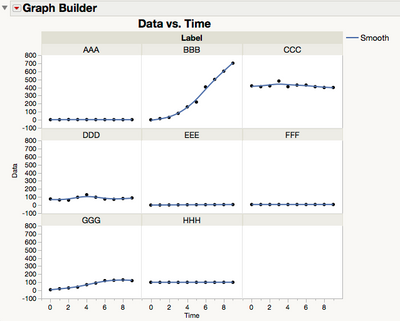
Another alternative is to use Graph Builder's GROUP Y feature. As txnelson stated, you'll have to stack the data.
- Mark as New
- Bookmark
- Subscribe
- Mute
- Subscribe to RSS Feed
- Get Direct Link
- Report Inappropriate Content
Re: Multiple Y axis in a chart.
Try this script on your table:
Overlay Plot(
    X( :Time ),
    Y( :AAA, :BBB, :CCC, :DDD, :EEE, :FFF, :GGG, :HHH ),
    Overlay( 0 ),
    Connect Points( 1 ),
    Show Points( 0 )
);
You can also do it interactively using Overlay Plot.
Hmmm... I see that you are really after the lower plot in your original post with multiple axes shown to the left and the plots directly overlaid as others have addressed.
- Mark as New
- Bookmark
- Subscribe
- Mute
- Subscribe to RSS Feed
- Get Direct Link
- Report Inappropriate Content
Re: Multiple Y axis in a chart. (Multiple Y axis scales)
JamesKim: Maybe I can offer an alternative idea for you? Rather than have multiple y axes as you show above, taking up 1/2 of your visual space, with a spaghetti chart of lines to the right, why not this idea?
Make an index value for each time series where the first observation in time = 100. Then each value is (observation at time t)/(observation at time 1) x 100. This way you can have one y axis, scaled according to the lowest and highest index values. The added interpretational value is that the slopes of the lines will now all be on an even footing and if varying slope is important on a relative % scale, this will add that level of insight. Then you can have a legend to help identify which variable is which by color scheme.
We would show this index style graph all the time when % change was what was most important for variables over time...not the absolute values. Much cleaner graph.
Recommended Articles
- © 2026 JMP Statistical Discovery LLC. All Rights Reserved.
- Terms of Use
- Privacy Statement
- Contact Us


