- Instantly extract effect sizes, F-ratios, and FDR-adjusted p-values from your models with the Calculate Effects Sizes extension, available now in the JMP Marketplace!
- New to JMP? Join us Sept. 23-24 for the Early User Edition of Discovery Summit, tailor-made for new users. Register now for free!
- See how to use the JMP Marketplace – Free tools to expand JMP capabilities. Register. July 10, 2 pm US Eastern Time.
- Subscribe to RSS Feed
- Mark Topic as New
- Mark Topic as Read
- Float this Topic for Current User
- Bookmark
- Subscribe
- Mute
- Printer Friendly Page
Discussions
Solve problems, and share tips and tricks with other JMP users.- JMP User Community
- :
- Discussions
- :
- Re: Lollipop graph

- Mark as New
- Bookmark
- Subscribe
- Mute
- Subscribe to RSS Feed
- Get Direct Link
- Report Inappropriate Content
Lollipop graph
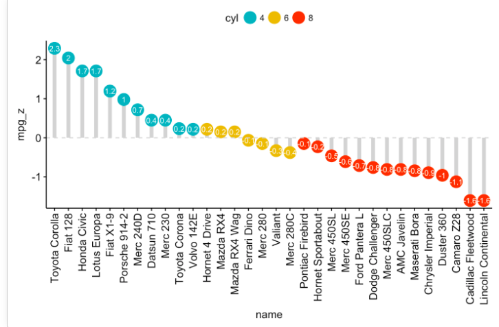
Is it possible via GraphBuilder to make a lollipop plot? See example I've posted. I know you can get something akin to this when looking at time series data (under the time series platform). The control chart very nearly does this, too, but it is obviously to be used for other sorts of analyses, and the lines are not drawn directly below the points. What I want is for the point plotted to have a line drawn above or below it that connects it to the mean (to emphasize deviation from the mean). I feel like all the elements for making such a plot are there!

Accepted Solutions

- Mark as New
- Bookmark
- Subscribe
- Mute
- Subscribe to RSS Feed
- Get Direct Link
- Report Inappropriate Content
Re: Lollipop graph
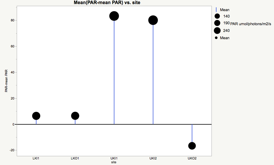
Here is a graph using the Big Class data table, with an added column that has positive and negative random values.

And here is the script
Graph Builder(
	Size( 534, 450 ),
	Show Control Panel( 0 ),
	Variables(
		X( :age, Order By( :Column 6, Descending, Order Statistic( "Mean" ) ) ),
		Y( :Column 6 ),
		Color( :age )
	),
	Elements(
		Points( X, Y, Legend( 5 ), Summary Statistic( "Mean" ) ),
		Bar( X, Y, Legend( 6 ), Bar Style( "Needle" ) )
	),
	SendToReport(
		Dispatch(
			{},
			"400",
			ScaleBox,
			{Legend Model(
				5,
				Properties( 0, {Marker Size( 20 )}, Item ID( "12", 1 ) ),
				Properties( 1, {Marker Size( 20 )}, Item ID( "13", 1 ) ),
				Properties( 2, {Marker Size( 20 )}, Item ID( "14", 1 ) ),
				Properties( 3, {Marker Size( 20 )}, Item ID( "15", 1 ) ),
				Properties( 4, {Marker Size( 20 )}, Item ID( "16", 1 ) ),
				Properties( 5, {Marker Size( 29 )}, Item ID( "17", 1 ) ),
				Properties( -1, {Marker Size( 20 )}, Item ID( "Mean", 1 ) )
			)}
		)
	)
);- Mark as New
- Bookmark
- Subscribe
- Mute
- Subscribe to RSS Feed
- Get Direct Link
- Report Inappropriate Content
Re: Lollipop graph
Here is a graph using the Big Class data table, with an added column that has positive and negative random values.
And here is the script
Graph Builder(
	Size( 534, 450 ),
	Show Control Panel( 0 ),
	Variables(
		X( :age, Order By( :Column 6, Descending, Order Statistic( "Mean" ) ) ),
		Y( :Column 6 ),
		Color( :age )
	),
	Elements(
		Points( X, Y, Legend( 5 ), Summary Statistic( "Mean" ) ),
		Bar( X, Y, Legend( 6 ), Bar Style( "Needle" ) )
	),
	SendToReport(
		Dispatch(
			{},
			"400",
			ScaleBox,
			{Legend Model(
				5,
				Properties( 0, {Marker Size( 20 )}, Item ID( "12", 1 ) ),
				Properties( 1, {Marker Size( 20 )}, Item ID( "13", 1 ) ),
				Properties( 2, {Marker Size( 20 )}, Item ID( "14", 1 ) ),
				Properties( 3, {Marker Size( 20 )}, Item ID( "15", 1 ) ),
				Properties( 4, {Marker Size( 20 )}, Item ID( "16", 1 ) ),
				Properties( 5, {Marker Size( 29 )}, Item ID( "17", 1 ) ),
				Properties( -1, {Marker Size( 20 )}, Item ID( "Mean", 1 ) )
			)}
		)
	)
);- Mark as New
- Bookmark
- Subscribe
- Mute
- Subscribe to RSS Feed
- Get Direct Link
- Report Inappropriate Content
Re: Lollipop graph
Jim,
Wow, thanks so much. That's exactly what I wanted. I didn't even think to integrate a "needle" bar graph with a "mean" point sitting on top, but for those who want to do it all through GraphBuilder (i.e., without scripting), that's how you do it. If you additionally want to interactively size the dots in proportion to the response variable of interest, simply drag the parameter to the "size" drop zone on GraphBuilder. I am attaching my first lollipop plot as an additional example. Thanks so much and hopefully this may help others who stumbled across this post.

- Mark as New
- Bookmark
- Subscribe
- Mute
- Subscribe to RSS Feed
- Get Direct Link
- Report Inappropriate Content
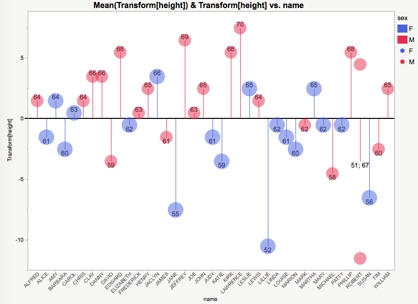
Re: Lollipop graph
Another approach, requiring more JSL for custom Markers.

There are two Roberts in Big Class; the Needle is the average. The points are shown for both.
dt = Open( "$sample_data/big class.jmp" );
dt << New Column( "height-mean", formula( height - Col Mean( height ) ) );
dt << Color by Column( :Age );

// build the floating round marker...
dt << New Column( "marker",
	expression,
	formula(

		box = (Graph Box(
			// make a small drawing space 100x100 pixels, scaled from -1 to 1. Black background becomes transparent below
			framesize( 100, 100 ), X Scale( -1, 1 ), Y Scale( -1, 1 ), <<backgroundcolor( RGB Color( 0, 0, 0 ) ),
			// use the row's color. it is pretty dark when filled
			Fill Color( Color Of( Row State() ) );
			Circle( {0, 0}, .75, "FILL" );
			Text Color( RGB Color( 1, 1, 1 ) );//white
			Text Size( 40 );// adjust as needed
			Text( CenterJustified, {0, -.35/*adjust as needed for v-center*/}, Char( height ) );

		));
		// trim the frame edges and make a transparent background
		{r, g, b} = ((box[FrameBox( 1 )]) << getimage) << getpixels( "rgb" );
		r = r[4 :: (N Rows( r ) - 5), 4 :: (N Cols( r ) - 5)];//trim
		g = g[4 :: (N Rows( g ) - 5), 4 :: (N Cols( g ) - 5)];//trim
		b = b[4 :: (N Rows( b ) - 5), 4 :: (N Cols( b ) - 5)];//trim
		a = r + g + b != 0;
		Show( r, g, b, a );
		New Image( "rgba", {r, g, b, a} );

	),
	<<useformarker // use this column for markers
);

dt << Graph Builder(
	Size( 1200, 500 ),
	Show Control Panel( 0 ),
	Show Legend( 0 ),
	Variables( X( :name ), Y( :Name( "height-mean" ) ) ),
	Elements( Bar( X, Y, Legend( 5 ), Bar Style( "Needle" ) ), Points( X, Y, Legend( 7 ) ) ),
	SendToReport(
		Dispatch(
			{},
			"height-mean",
			ScaleBox,
			{Min( -15 ), Max( 11 ), Inc( 5 ), Minor Ticks( 1 ), Add Ref Line( 0, "Solid", "Gray", "", 1 )}
		),
		Dispatch( {}, "400", ScaleBox, {Legend Model( 5, Properties( 0, {Line Color( 82 )}, Item ID( "Mean", 1 ) ) )} ),
		Dispatch( {}, "graph title", TextEditBox, {Set Text( "difference from mean" )} ),
		Dispatch( {}, "X title", TextEditBox, {Set Text( "" )} )
	)
);
- Mark as New
- Bookmark
- Subscribe
- Mute
- Subscribe to RSS Feed
- Get Direct Link
- Report Inappropriate Content
Re: Lollipop graph
Love it!
- Mark as New
- Bookmark
- Subscribe
- Mute
- Subscribe to RSS Feed
- Get Direct Link
- Report Inappropriate Content
Re: Lollipop graph
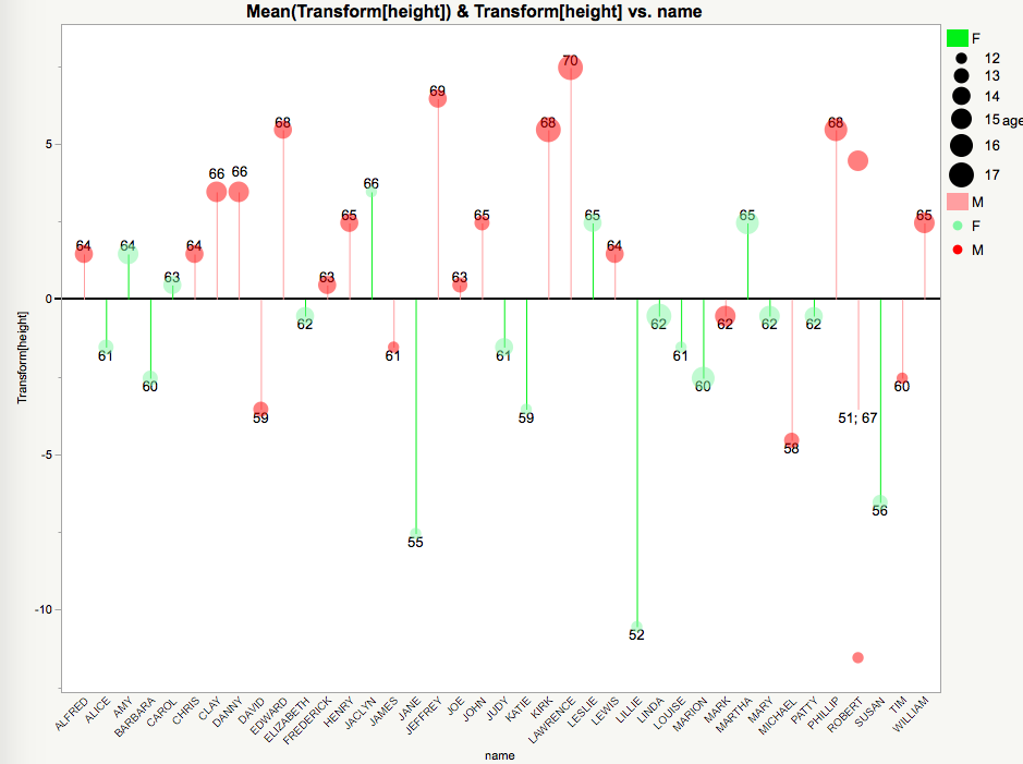
You can actually reproduce this interactively (albeit less beautifully) by increasing the marker size, labeling by height, then reducing the marker transparency (I halved it). In this example, I just colored by gender.
The only issue I can see is that, if you want to have the icon sizes scale with something (like age in this second example) AND have the labels (for height in this example), you may need to manually drag the labels around so that they don't fall in a weird place (see second plot, in which case I manually changed the location of Clay and Danny's labels). There might be a work-around though (I tried messing around with the marker sizing options and failed).
- Mark as New
- Bookmark
- Subscribe
- Mute
- Subscribe to RSS Feed
- Get Direct Link
- Report Inappropriate Content
Re: Lollipop graph
Nice! You can probably order the marker segments so the numbers draw on top of the circles. And you might be able to make the numbers be markers as well (UseForMarker attribute on a column). That would center the number in the circle. Avoiding the JSL in my example would be a good choice; it is pretty slow to make a graph and take its picture for each data point.

- Mark as New
- Bookmark
- Subscribe
- Mute
- Subscribe to RSS Feed
- Get Direct Link
- Report Inappropriate Content
Re: Lollipop graph
Loughlin Consulting
- Mark as New
- Bookmark
- Subscribe
- Mute
- Subscribe to RSS Feed
- Get Direct Link
- Report Inappropriate Content
Re: Lollipop graph
The "<<useformarker" message is not known in JMP 13.2.1. However, you can right click on the graph and select "Custom" and then go to the Marker entry and right click on the marker, and change the marker size.
- Mark as New
- Bookmark
- Subscribe
- Mute
- Subscribe to RSS Feed
- Get Direct Link
- Report Inappropriate Content
Re: Lollipop graph
Loughlin Consulting
Recommended Articles
- © 2026 JMP Statistical Discovery LLC. All Rights Reserved.
- Terms of Use
- Privacy Statement
- Contact Us