- New to JMP? Let the Data Analysis Director guide you through selecting an analysis task, an analysis goal, and a data type. Available now in the JMP Marketplace!
- See how to install JMP Marketplace extensions to customize and enhance JMP.
- Subscribe to RSS Feed
- Mark Topic as New
- Mark Topic as Read
- Float this Topic for Current User
- Bookmark
- Subscribe
- Mute
- Printer Friendly Page
Discussions
Solve problems, and share tips and tricks with other JMP users.- JMP User Community
- :
- Discussions
- :
- Re: Logistic Fit Graph Wrong?
- Mark as New
- Bookmark
- Subscribe
- Mute
- Subscribe to RSS Feed
- Get Direct Link
- Report Inappropriate Content
Logistic Fit Graph Wrong?
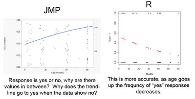
Doing a logistic fit of age in months versus a yes or no response. I do not understand the graph produced. It shows values between yes and no. It also doesn't follow the pattern of the data. As age goes up, the trendline goes to the "yes" response when the data clearly shows the inverse. When graphed in R it is the exact opposite of the graph produced in JMP. Same parameter estimates in both programs, but R seems to have a correct graph. Very confused! Here is a visual.
Accepted Solutions
- Mark as New
- Bookmark
- Subscribe
- Mute
- Subscribe to RSS Feed
- Get Direct Link
- Report Inappropriate Content
Re: Logistic Fit Graph Wrong?
Hi jcampbell-smith,
I can certainly see how that might seem confusing! JMP is not plotting incorrectly though, but is rather plotting something different, and importantly, generalizable to plots for more complicated logistic models. In your example above, any observation above the line is a "yes" response, and any observation below the line is a "no" response. The location of the points in X space reflects what was measured for that observation, but the exact location in Y space, other than being above or below the line, is arbitrary. This last point is important… JMP is space-filling to convey in a very visual way where observations are, and how the probability of being above or below the line (answering Yes or No) depends on your X. The line partitioning the area is showing the probability of a "no" response at a given X value. As you can see, the probability of a yes response is decreasing (no response increasing) as you increase X since you can see there are far fewer Y responses above the line at higher values of X, and many more values above the line at low values for X, something that is very hard to see without the jittering within each space (as is done in R or other software).
For more information, here is the basic documentation on the logistic report:
and here are some additional examples:
Additional Examples of Logistic Regression
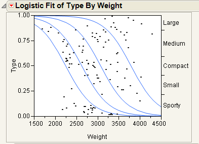
In the second link you will see some examples with ordinal and multinomial logistic regression, something I haven't seen another piece of software display well graphically.
e.g.:
I hope this helps!
Julian
- Mark as New
- Bookmark
- Subscribe
- Mute
- Subscribe to RSS Feed
- Get Direct Link
- Report Inappropriate Content
Re: Logistic Fit Graph Wrong?
As a follow-up to Julian's note, JMP actually builds the model (and the graph) for the probability of a "no" response since an alphabetical ordering is used (no comes before yes). You can change this by adding a Value Ordering column property to your response column and specifying "yes" first. This would then result in the picture you would expect to see.
- Mark as New
- Bookmark
- Subscribe
- Mute
- Subscribe to RSS Feed
- Get Direct Link
- Report Inappropriate Content
Re: Logistic Fit Graph Wrong?
Thanks for adding that, DanO! That is a pretty important point to mention that I completely skipped over!
- Mark as New
- Bookmark
- Subscribe
- Mute
- Subscribe to RSS Feed
- Get Direct Link
- Report Inappropriate Content
Re: Logistic Fit Graph Wrong?
Thank you!!
- Mark as New
- Bookmark
- Subscribe
- Mute
- Subscribe to RSS Feed
- Get Direct Link
- Report Inappropriate Content
Re: Logistic Fit Graph Wrong?
Thank you so much!!! I really appreciate your help
- Mark as New
- Bookmark
- Subscribe
- Mute
- Subscribe to RSS Feed
- Get Direct Link
- Report Inappropriate Content
Re: Logistic Fit Graph Wrong?
One other point to be made here: At any given value of X, the total probability of the Y responses (Yes and No) is 100%. Thus at Age = 0, the Yes is at about 50% and the No is at about 50% a well. At Age = 60, the Yes is about 20% and the No is about 80%. I always remind people when showing them a logistic regression plot to think of it as a probability plot rather than as a correlation plot.
- Mark as New
- Bookmark
- Subscribe
- Mute
- Subscribe to RSS Feed
- Get Direct Link
- Report Inappropriate Content
Re: Logistic Fit Graph Wrong?
Thank you! Yes, this was described to me as a general way to look at logistic regressions, but the figure/plot was just confusing the heck out of me. It makes sense now. I really appreciate your input!
Recommended Articles
- © 2026 JMP Statistical Discovery LLC. All Rights Reserved.
- Terms of Use
- Privacy Statement
- Contact Us


