- Mark as New
- Bookmark
- Subscribe
- Mute
- Subscribe to RSS Feed
- Get Direct Link
- Report Inappropriate Content
Linking data table with Scatterplot and question in RSM
Hi community,
I have two questions two; one jmp specific implementation question and the other on DOE strategic question.
I vaguely remember that there is a way to look at Scatterplot and data table more interactively.
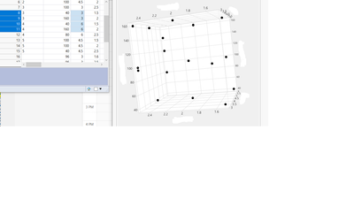
For instance, below I selected 4 rows that contain the variables on data table. I would like to have these conditions highlighted in the scatter plot on the right.
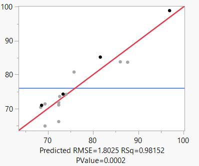
Another question is validation of model built from RSM. I was able to built pretty good predictive model through RSM.
I still want to validate this. Do you suggest to just pick random data points from design space to validate the model or use Augmentation?
Any pros and cons and something to consider on it?
Thank you all!
Accepted Solutions
- Mark as New
- Bookmark
- Subscribe
- Mute
- Subscribe to RSS Feed
- Get Direct Link
- Report Inappropriate Content
Re: Linking data table with Scatterplot and question in RSM
Hey BJK,
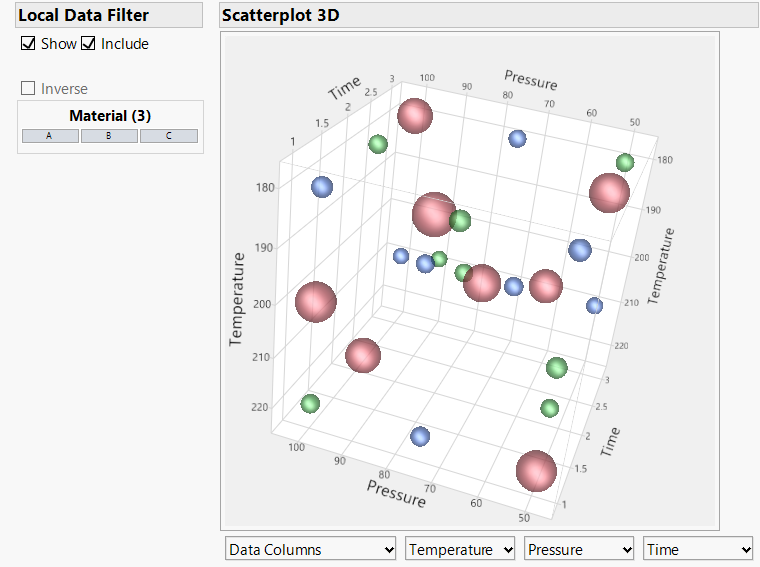
I neglected to mention that I set the row states in the underlying data table to achieve that effect.
Select all the rows in the data table and then choose Rows > Markers to modify the graph markers. I like using the spherical points for this, but play around with other options.
The other thing I did was assigning different colors to the three different values for the Material. Select the Material column in the data table then choose Rows > Color or Mark by Column.
I'm not sure exactly what you mean about the surface plot. Can you provide more details?
Jordan
- Mark as New
- Bookmark
- Subscribe
- Mute
- Subscribe to RSS Feed
- Get Direct Link
- Report Inappropriate Content
Re: Linking data table with Scatterplot and question in RSM
Perhaps you mean something like this for the points on the surface?
- Chapters
- descriptions off, selected
- captions settings, opens captions settings dialog
- captions off, selected
- en (Main), selected
This is a modal window.
Beginning of dialog window. Escape will cancel and close the window.
End of dialog window.
This is a modal window. This modal can be closed by pressing the Escape key or activating the close button.
This was done not with the surface plot tool found in the graph menu , but with the surface profiler in the Fit Least Squares platform. The trick is to turn on the data points in the "Appearance" section. Then you can adjust the marker settings as described previously.
Please be aware that it can be a little challenging to interpret the position of the points on a surface like this, particularly when there are more variables in the model than can be displayed in the plot. Consider the choice between "Surface plus Residual" and "Actual" carefully.
Data with script to produce this result is attached.
- Mark as New
- Bookmark
- Subscribe
- Mute
- Subscribe to RSS Feed
- Get Direct Link
- Report Inappropriate Content
Re: Linking data table with Scatterplot and question in RSM
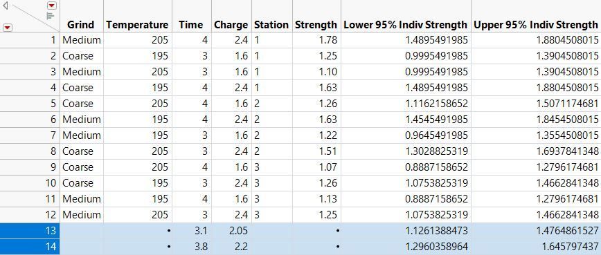
I will illustrate the method using the Coffee Data data table in the Sample Data folder. I selected a model predicting coffee Strength from the Time and Charge factors.
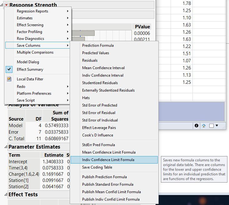
Click the red triangle at the top of Fit Least Squares (the window you show at the start of your discussion) and select Save Columns > Indiv Confidence Limit Formula.
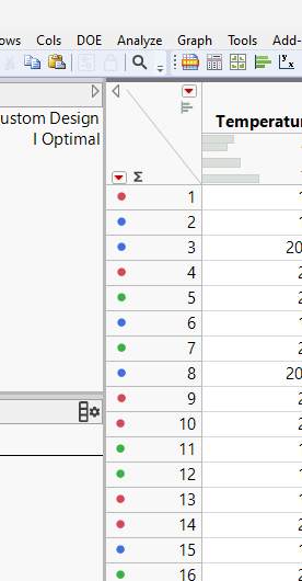
Determine the factor settings for which you want to verify the prediction. I chose settings predicted to yield the optimum and too strong responses. I enter those levels in two new rows of the original data table:
Note the target and tolerance for each condition.
| Condition | Target | Tolerance |
| Optimum | 1.30 | 0.175 |
| Too Strong | 1.47 | 0.175 |
The target is the predicted mean response from the Prediction Profiler or mid-point of the individual confidence interval. The tolerance is the half-width of the individual confidence interval.
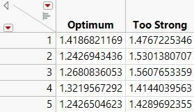
I conduct 5 runs for each condition and save the observed responses in a new data table:
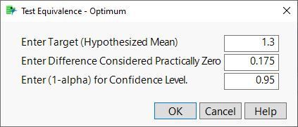
Select Analyze > Distribution and cast both data columns in the Y role. Click the red triangle next to Optimum and select Test Equivalence. Enter the target in the first box and the tolerance in the second box:
Click OK.
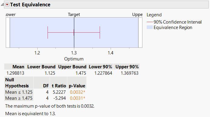
The mean is simultaneously significantly greater than the lower limit and less than the upper limit. These two one-sided tests (TOST) demonstrate that the 5 replicates under optimum conditions confirm the model's prediction. Do the same test for the other response.
- Mark as New
- Bookmark
- Subscribe
- Mute
- Subscribe to RSS Feed
- Get Direct Link
- Report Inappropriate Content
Re: Linking data table with Scatterplot and question in RSM
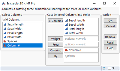
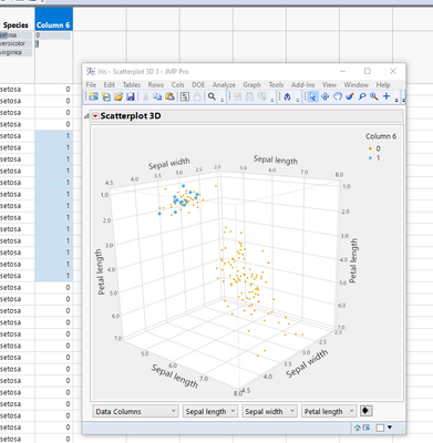
I think when you select rows those will be slightly bigger in 3D scatterplot. If that isn't enough, you could create a Numeric, Nominal formula column with
Selected()as the formula. Then when you run scatterplot use that as the Coloring column (Column 6 in my case). Do note that this will most likely add extra "lag" to your 3d scatterplot when row selection is being changed
- Mark as New
- Bookmark
- Subscribe
- Mute
- Subscribe to RSS Feed
- Get Direct Link
- Report Inappropriate Content
Re: Linking data table with Scatterplot and question in RSM
Agree with @jthi . Also, I find that it helps to modify the marker size and marker quality settings (right-click in the scatterplot and choose Settings...). Data table with script attached.
- Mark as New
- Bookmark
- Subscribe
- Mute
- Subscribe to RSS Feed
- Get Direct Link
- Report Inappropriate Content
Re: Linking data table with Scatterplot and question in RSM
Thank you @Jordan_Hiller,
Could you walk me through what you did from the scratch (just black data points from 3D scatter plot).
All I can do is to change the size of marker in the setting but still do not know how to make the 3D scatter plot look cool and distinguishable between different groups as you did.
Additionally, is there any way to have Surface plot to present the data points you select from the data table on the surface?
Thank you!
- Mark as New
- Bookmark
- Subscribe
- Mute
- Subscribe to RSS Feed
- Get Direct Link
- Report Inappropriate Content
Re: Linking data table with Scatterplot and question in RSM
Hey BJK,
I neglected to mention that I set the row states in the underlying data table to achieve that effect.
Select all the rows in the data table and then choose Rows > Markers to modify the graph markers. I like using the spherical points for this, but play around with other options.
The other thing I did was assigning different colors to the three different values for the Material. Select the Material column in the data table then choose Rows > Color or Mark by Column.
I'm not sure exactly what you mean about the surface plot. Can you provide more details?
Jordan
- Mark as New
- Bookmark
- Subscribe
- Mute
- Subscribe to RSS Feed
- Get Direct Link
- Report Inappropriate Content
Re: Linking data table with Scatterplot and question in RSM
Perhaps you mean something like this for the points on the surface?
- Chapters
- descriptions off, selected
- captions settings, opens captions settings dialog
- captions off, selected
- en (Main), selected
This is a modal window.
Beginning of dialog window. Escape will cancel and close the window.
End of dialog window.
This is a modal window. This modal can be closed by pressing the Escape key or activating the close button.
This was done not with the surface plot tool found in the graph menu , but with the surface profiler in the Fit Least Squares platform. The trick is to turn on the data points in the "Appearance" section. Then you can adjust the marker settings as described previously.
Please be aware that it can be a little challenging to interpret the position of the points on a surface like this, particularly when there are more variables in the model than can be displayed in the plot. Consider the choice between "Surface plus Residual" and "Actual" carefully.
Data with script to produce this result is attached.
- Mark as New
- Bookmark
- Subscribe
- Mute
- Subscribe to RSS Feed
- Get Direct Link
- Report Inappropriate Content
Re: Linking data table with Scatterplot and question in RSM
Great!! Yes, this is exactly what I wanted to do.
Thank you @Jordan_Hiller I am learning so much from you.
I have a naive follow up question. You mentioned that 'Consider the choice between "Surface plus Residual" and "Actual" carefully.'
Isn't the definition of Residual is the difference between actual (observed) value and predicted value? If so, what is the difference between "Surface plus residual" and "Actual". Isn't the surface plot built based on the prediction model (or formula)?
I am little bit confused on it.
- Mark as New
- Bookmark
- Subscribe
- Mute
- Subscribe to RSS Feed
- Get Direct Link
- Report Inappropriate Content
Re: Linking data table with Scatterplot and question in RSM
I'm glad you asked for clarification. It's confusing.
Yes, the predicted value plus the residual equals the actual (observed) value. The reason that there is a difference between “Surface plus residual” and “Actual” when we visualize this model is that the surface is not the whole model. It’s a simplification.
Our model in this example has three continuous factors and one categorical factor with three levels. Because we can’t visualize in more than three dimensions, any visual representation will be a simplification or compromise in some way. The approach that JMP profilers use is to show 2D or 3D slices of higher dimensional spaces. The surface we can visualize in three dimensions is a “slice” of a 4D surface (in truth the model is a set of three 4D surfaces, one for each level of the categorical factor, but let’s ignore that).
If you’d like to get a visual sense of what I’m describing, look what happens when you move the slider for the time factor:
- Chapters
- descriptions off, selected
- captions settings, opens captions settings dialog
- captions off, selected
- en (Main), selected
This is a modal window.
Beginning of dialog window. Escape will cancel and close the window.
End of dialog window.
This is a modal window. This modal can be closed by pressing the Escape key or activating the close button.
Time is not one of the dimensions of the 3D space in the surface profiler, so the surface we see is the part of the model where time is fixed at a certain level. Geometrically that amounts to a slice.
So to address your original question: the reason there is a difference is because we can’t see everything at the same time. If you want to emphasize the accuracy of the model predictions, choose “Surface plus Residual.” If you want to represent the true data values, choose “Actual”.
- Mark as New
- Bookmark
- Subscribe
- Mute
- Subscribe to RSS Feed
- Get Direct Link
- Report Inappropriate Content
Re: Linking data table with Scatterplot and question in RSM
I see the points and the Appearance menu in your data, but in my data I get no Appearance menu to select Datapoints. What am I doing wrong? JMP 18.
- Mark as New
- Bookmark
- Subscribe
- Mute
- Subscribe to RSS Feed
- Get Direct Link
- Report Inappropriate Content
Re: Linking data table with Scatterplot and question in RSM
More information is needed in order to help you.
What do you see? Can you include a screen capture? How did you try to generate the plot? From the graph menu or was it from the Fit Model platform?
