- New to JMP? Let the Data Analysis Director guide you through selecting an analysis task, an analysis goal, and a data type. Available now in the JMP Marketplace!
- See how to install JMP Marketplace extensions to customize and enhance JMP.
- Subscribe to RSS Feed
- Mark Topic as New
- Mark Topic as Read
- Float this Topic for Current User
- Bookmark
- Subscribe
- Mute
- Printer Friendly Page
Discussions
Solve problems, and share tips and tricks with other JMP users.- JMP User Community
- :
- Discussions
- :
- Link or lock axis together?
- Mark as New
- Bookmark
- Subscribe
- Mute
- Subscribe to RSS Feed
- Get Direct Link
- Report Inappropriate Content
Link or lock axis together?
Hi,
I am a relatively new JMP and JSL user, and I'm trying to produce a report with multiple graphs. I want to link the x-axis of both graphs together, so that when one x-axis is scaled or otherwise changed (reference line added, etc.), the other axis changes as well.
Some of the built-in platforms already do this, such as the Control Chart, which links the x-axis for the "Individual Measurement" and "Moving Range" graphs.
Names Default To Here( 1 );
dt = Open( "$SAMPLE_DATA/Big Class.jmp" );
dt << Control Chart( Chart Col( Height, "Individual
Measurement", "Moving Range" ), K Sigma( 3 ) );
How can I reproduce this for my own reports/custom platforms/etc.? I haven't been able to figure out how the Control Chart report is accomplishing this, despite looking at the tree structure and the properties for the display boxes.
For example, how could I link the two x-axis in the following report using JSL?
Names Default To Here( 1 );
dt = Open( "$SAMPLE_DATA/Big Class.jmp" );
dt << Distribution(
	Stack( 1 ),
	Continuous Distribution(
		Column( :height ),
		Horizontal Layout( 1 ),
		Vertical( 0 ),
		Count Axis( 1 )
	),
	By( :sex )
);
I am using JMP 13.2.
Thanks!
Accepted Solutions
- Mark as New
- Bookmark
- Subscribe
- Mute
- Subscribe to RSS Feed
- Get Direct Link
- Report Inappropriate Content
Re: Link or lock axis together?
You can attach a script to the frame box() that can detect changes in the Axis Box() and then reset all of the axes to the new values from the Axis Box() that was reset.
See the Scripting Index for details.
I typically use in the Frame Box << Add Graphics Script a check on the X Origin, and X Range changing in the Axis Box().
- Mark as New
- Bookmark
- Subscribe
- Mute
- Subscribe to RSS Feed
- Get Direct Link
- Report Inappropriate Content
Re: Link or lock axis together?
Hi @ErikSwan,
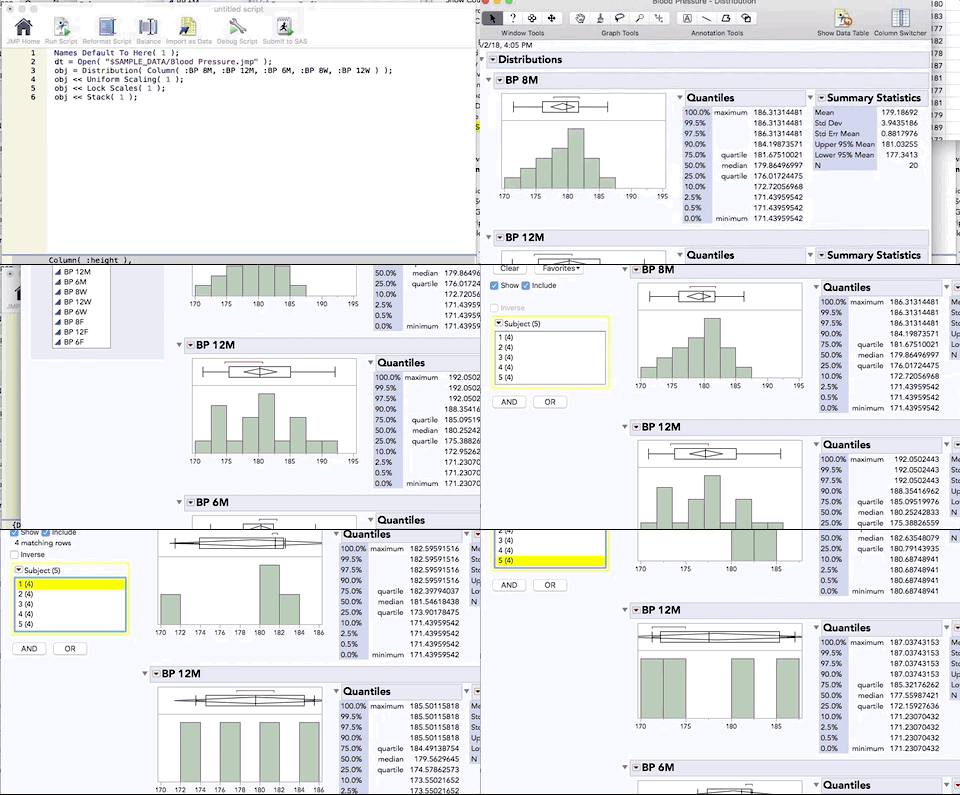
I think you might be able to use uniform scaling.
Names Default To Here( 1 );
dt = Open( "$SAMPLE_DATA/Blood Pressure.jmp" );
obj = Distribution( Column( :BP 8M, :BP 12M, :BP 6M, :BP 8W, :BP 12W ) );
obj << Uniform Scaling( 1 );
obj << Lock Scales( 1 );
obj << Stack( 1 );
Cheers,
Stan
- Mark as New
- Bookmark
- Subscribe
- Mute
- Subscribe to RSS Feed
- Get Direct Link
- Report Inappropriate Content
Re: Link or lock axis together?
Stan,
Thanks for the response. This seems to set the scales to be the same initially, but if I grab one of the axes and change the scale, the other axes don't update, which is what I was trying to accomplish. I.e. I'm hoping to link them so that they are always in sync with each other, like with the Control Chart platform's report.
Any other ideas?
- Erik
- Mark as New
- Bookmark
- Subscribe
- Mute
- Subscribe to RSS Feed
- Get Direct Link
- Report Inappropriate Content
Re: Link or lock axis together?
Bump. Any other ideas on this? Surely there is some API/JSL that the built-in platforms are using to accomplish this?
- Mark as New
- Bookmark
- Subscribe
- Mute
- Subscribe to RSS Feed
- Get Direct Link
- Report Inappropriate Content
Re: Link or lock axis together?
You can attach a script to the frame box() that can detect changes in the Axis Box() and then reset all of the axes to the new values from the Axis Box() that was reset.
See the Scripting Index for details.
I typically use in the Frame Box << Add Graphics Script a check on the X Origin, and X Range changing in the Axis Box().
- Mark as New
- Bookmark
- Subscribe
- Mute
- Subscribe to RSS Feed
- Get Direct Link
- Report Inappropriate Content
Re: Link or lock axis together?
Jim, thanks.
I don't think this is the same method that the "built-in" reports and platforms are using, because I don't see any Graphics Scripts in the properties when I inspect the built-in plots and axis. I'm guessing they are using some hidden API that isn't documented.
However, I think your method is an acceptable workaround that should work in most cases. The performance isn't great, but it does work. Thanks!
- Mark as New
- Bookmark
- Subscribe
- Mute
- Subscribe to RSS Feed
- Get Direct Link
- Report Inappropriate Content
Re: Link or lock axis together?
Jim posted an excellent example solution here: A Simple Script to Illustrate Axis Changes in One Chart Controling the Axis in a Different Chart
Recommended Articles
- © 2026 JMP Statistical Discovery LLC. All Rights Reserved.
- Terms of Use
- Privacy Statement
- Contact Us


