- New to JMP? Let the Data Analysis Director guide you through selecting an analysis task, an analysis goal, and a data type. Available now in the JMP Marketplace!
- See how to install JMP Marketplace extensions to customize and enhance JMP.
- Subscribe to RSS Feed
- Mark Topic as New
- Mark Topic as Read
- Float this Topic for Current User
- Bookmark
- Subscribe
- Mute
- Printer Friendly Page
Discussions
Solve problems, and share tips and tricks with other JMP users.- JMP User Community
- :
- Discussions
- :
- Keep label of individual data points when adding mean and standard deviation
- Mark as New
- Bookmark
- Subscribe
- Mute
- Subscribe to RSS Feed
- Get Direct Link
- Report Inappropriate Content
Keep label of individual data points when adding mean and standard deviation
Hi,
I added labels to my data already in the table.
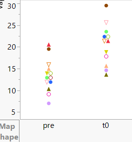
When I use graph builder to plot the data as individual points, I got individual data point as the label (marker) that I set in the Table.
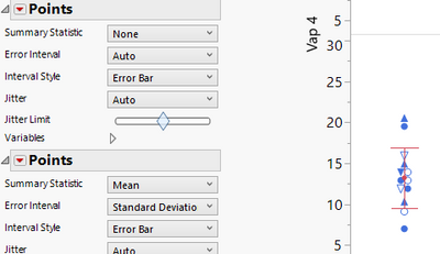
However, when I add mean and standard devidation, all the individual data points became the same.
I tried to overlay the data, I could get different labels but could not add mean and standard deviation
Looking forward for your help
- Mark as New
- Bookmark
- Subscribe
- Mute
- Subscribe to RSS Feed
- Get Direct Link
- Report Inappropriate Content
Re: Keep label of individual data points when adding mean and standard deviation
Hi, can you clarify your question, please?
- How are you adding labels to your data (are you labeling rows, columns, or both)?
- How are you adding mean and standard deviation (via caption box, or some other method)
Is there any way you could share either a sample data set or picture of your graph so far?
- Mark as New
- Bookmark
- Subscribe
- Mute
- Subscribe to RSS Feed
- Get Direct Link
- Report Inappropriate Content
Re: Keep label of individual data points when adding mean and standard deviation
Hi,
Yes I am labelling rows
Then I used graph builder to plot. First I got the data points as I labelled in the rows
Then when I added mean and standard deviation by adding another Points (as attached below), the colors of the points were changed
Hope I could clarify it
- Mark as New
- Bookmark
- Subscribe
- Mute
- Subscribe to RSS Feed
- Get Direct Link
- Report Inappropriate Content
Re: Keep label of individual data points when adding mean and standard deviation
I made an example of data set with labelled rows
Hope it will be easier for you to try
- Mark as New
- Bookmark
- Subscribe
- Mute
- Subscribe to RSS Feed
- Get Direct Link
- Report Inappropriate Content
Re: Keep label of individual data points when adding mean and standard deviation
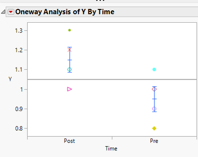
Thanks for the explanation and data. I'm not aware of a way to get the Graph Builder to do this (others might have better insight). However, the Fit Y by X platform can do this. Once you've run the platform, selecting Red Triangle...Display Options...Mean Error Bars gives you what you're looking for. I've attached an updated version of your table with the script saved to the table.
Recommended Articles
- © 2026 JMP Statistical Discovery LLC. All Rights Reserved.
- Terms of Use
- Privacy Statement
- Contact Us


