- New to JMP? Let the Data Analysis Director guide you through selecting an analysis task, an analysis goal, and a data type. Available now in the JMP Marketplace!
- See how to install JMP Marketplace extensions to customize and enhance JMP.
- Subscribe to RSS Feed
- Mark Topic as New
- Mark Topic as Read
- Float this Topic for Current User
- Bookmark
- Subscribe
- Mute
- Printer Friendly Page
Discussions
Solve problems, and share tips and tricks with other JMP users.- JMP User Community
- :
- Discussions
- :
- Re: JSL for confidence bands on model plots, better ideas?
- Mark as New
- Bookmark
- Subscribe
- Mute
- Subscribe to RSS Feed
- Get Direct Link
- Report Inappropriate Content
JSL for confidence bands on model plots, better ideas?
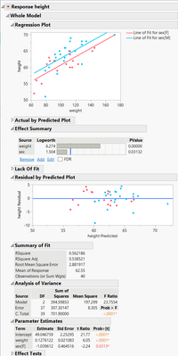
I would like to get a plot of my data, overlaid with the results from a model, with shaded confidence bands.
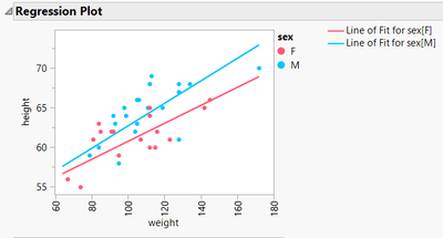
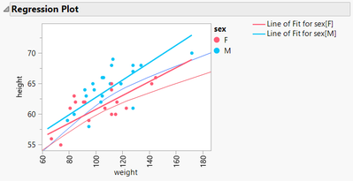
A plot like this one from Fit Model for example but with shaded confidence intervals around the lines of fit:
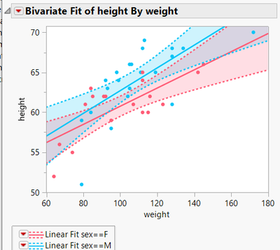
I'm aware that for this particular example I could get what I'm looking for in FitYbyX:
So that shows what I'm seeking but that doesn't work for some fits - for example if I wanted to do this fit and constrain it to same slope for each sex.
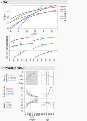
Also, I see some posts where others have requested similar things but also involving Fit Curve or Nonlinear fits:
Solved: How to add the confidence intervals to a logistic regression plot? - JMP User Community
plotting confidence intervals in JMP "fit curve" - JMP User Community
Two of the suggestions in those threads aren't entirely satisfying to me:
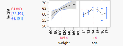
One is that there are confidence bands in the profiler. Nice, but that doesn't help this kind of example where I'd like the fits overlaid.
(I appreciate too that there could easily be too many factors for Fit Model to even make that Regression Plot, that may be why it's not that full featured -there's an expectation you'll be using this with more complex models you need to explore with profiler? But there are cases where the simple plot or one with overlaid curves is useful).
Another was a nice way to shade between curves in graph builder using saved predicted values.
Solved: How do I create a shaded confidence interval on a Graph Builder plot? - JMP User Community
Also nice in some cases but I want the predictions to be a smooth curve extending beyond the actual data.
That seems to leave capturing the formulas for the confidence bands from the platform, then using those in a graphics script.
I think I see the path to that, but it seems like enough of a pain that I'm wondering whether I'm missing a smarter way before I get too far into it. Or has this already been demonstrated somewhere?
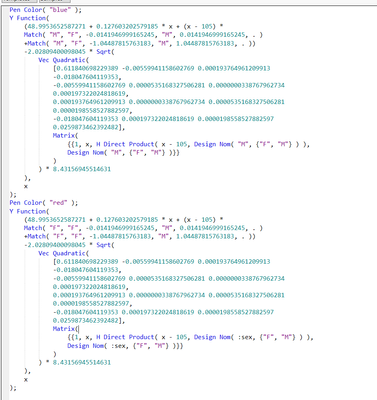
In my example, the formula looks like this (for the lower confidence limit only):
I need to do some substitution into that and make a Y curve for each sex:
Here's that just drawing those lower limit lines, so far so good...
I can repeat for the prediction itself and the upper confidence line and then to shade... I can make a polygon using a series of points from along each pair of curves... ugh, I see I can do that but it's seeming overly complicated... Am I missing some simpler way even for just this part of wanting to shade between Y functions? or is this really the right path?
In short:
Is there actually some way to get this type of plot out of these modeling platforms more directly? (if not, I'm thinking it might be a worthwhile wish list item.).
If not, better ideas on how to create the desired plot than the graphics scripts I described?
If not, am I missing something simpler than polygon for doing the shading between Y curves in a graphic script?
Thanks!
Accepted Solutions
- Mark as New
- Bookmark
- Subscribe
- Mute
- Subscribe to RSS Feed
- Get Direct Link
- Report Inappropriate Content
Re: JSL for confidence bands on model plots, better ideas?
Hi @hardner ,
I better understand your dilemma now, thanks for taking some time to rephrase the problem you're facing.
In short, I believe you are right, that Fit Y by X is the only platform that allows for the nice overlay of the fits where you can widen the plot to see how the confidence bands change. And, it tends to make sense that the prediction formulas that are saved to the data table only go to the number of rows in that data table.
There might, however be a workaround that is pretty close to what you want. It's not perfect, but it's likely the closest you can get because of the limitations of the different platforms that you're needing to use (such as other model fitting platforms that are not Fit Y by X).
The idea I came up with was to create some "dummy" columns with dummy rows in the data table where the values are the expected mean -- that way it shouldn't mess up your confidence bands.
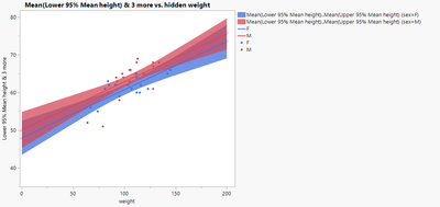
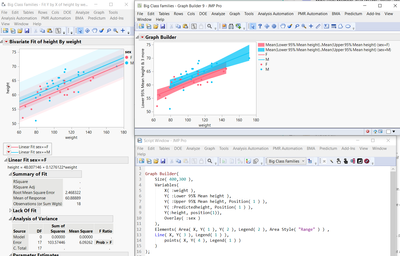
Here's the results using Graph Builder and the corresponding JSL code -- like what you showed.
Graph Builder(
	Graph Spacing( 4 ),
	Variables(
		X( :hidden weight ),
		Y( :Lower 95% Mean height ),
		Y( :Upper 95% Mean height, Position( 1 ) ),
		Y( :Pred Formula height, Position( 1 ) ),
		Y( :hidden height, Position( 1 ) ),
		Overlay( :sex )
	),
	Elements(
		Area( X, Y( 1 ), Y( 2 ), Legend( 2 ), Area Style( "Range" ) ),
		Line( X, Y( 3 ), Legend( 1 ) ),
		Points( X, Y( 4 ), Legend( 1 ) )
	),
	SendToReport( Dispatch( {}, "X title", TextEditBox, {Set Text( "weight" )} ) )
);
Here are the steps I took to get there (and of course, this can all be coded in JSL, but would take some time for each case that you might be working with).
1. After running fit model as you did previously, save the formula columns of interest (Pred Mean, and +/-95% Mean CIs).
2. Create two dummy columns -- I chose :hidden height and :hidden weight for the names.
2a. Add four rows to the data table -- this is so you can have two points (low and high values) for both M and F sexes.
3. Make each of those columns into a formula
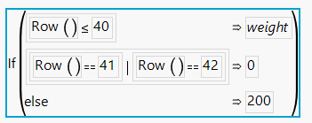
3a. For :hidden height, it looks like this:
3b. For :hidden weight it looks like this:
NOTE: I just chose 0 and 200 for values because they were easy (intercept is one) and the other I chose simply as a higher extreme, but these would be set to your needs.
4. Change the formulas for the prediction mean and +/-95% confidence intervals so that instead of using :weight to do the calculations, they're using :hidden weight for the calculations. An example for the prediction mean is below.
5. Go back and re-run your JSL code, but change the :height and :weight columns to the corresponding dummy columns so that it includes these extra four rows in the data table.
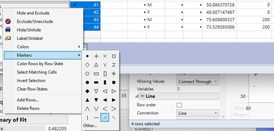
6. The last thing I did was change the last four rows from the default marker style to the "/" marker style so these mean value end points are less visible as the data itself. You do have the option of choosing Other... and use a different character. I just tried the double right pointing quotation marks (») from MS Word, and it worked just fine.
Notice that I also re-named the x-axis to "weight" so that "hidden weight" wasn't shown.
But, based on what you've described, I think this should handle what you're after. It's not the easiest or most elegant work around, but it does get the job done. I find it easier than trying to work with polygons in Graph Builder, for example.
Something to consider and think about.
Hope this helps,
DS
- Mark as New
- Bookmark
- Subscribe
- Mute
- Subscribe to RSS Feed
- Get Direct Link
- Report Inappropriate Content
Re: JSL for confidence bands on model plots, better ideas?
Hi @hardner ,
I think you should be able to do what you want through the Fit Y by X platform, at least how I understand what you're after. Not sure about the non-linear platform and if you can do the same.
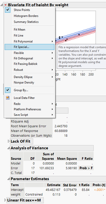
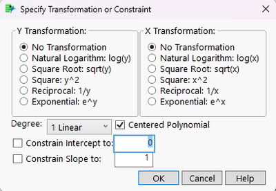
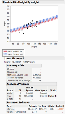
Anyway, if you go to the red triangle next to the Bivariate fit and select Fit Special... instead of Fit Line, then you can do transformations of the data or constrain linear fits to have a certain slope or intercept. Using your example, I did that using a slope of 0.113.
And, the confidence bands will extend beyond the data points, you just will have to adjust the range on the axes.
Based on what you were describing in your post, I think this is what you were after. Or maybe I'm not fully understanding what you want.
Hope this helps,
DS
- Mark as New
- Bookmark
- Subscribe
- Mute
- Subscribe to RSS Feed
- Get Direct Link
- Report Inappropriate Content
Re: JSL for confidence bands on model plots, better ideas?
Hi @SDF1 ,
Thanks! The problem with that is that those confidence bands are super tight because you told it what the slope was - it's very confident in that part and only fitted the intercept. You can fit the slope in fit model and then specify it here to see the fit lines overlaid nicely - and see the equations of fit nicely displayed compare to Fit Model. And it will draw confidence bands nicely. So, yes, that is very much the kind of image I was looking for and for some fits FitYbyX works - but those aren't the confidence bands I want.
- Mark as New
- Bookmark
- Subscribe
- Mute
- Subscribe to RSS Feed
- Get Direct Link
- Report Inappropriate Content
Re: JSL for confidence bands on model plots, better ideas?
Hi @hardner ,
I guess I still don't understand what you're after.
You mentioned in your original post: "...for example if I wanted to do this fit and constrain it to same slope for each sex." This is why in the example I gave I was doing exactly that, fixing the slope for each sex.
In your most recent post, you say: "but those aren't the confidence bands I want." Which confidence bands are you looking for? There are two confidence curves in the Fit Y by X platform: Confid Curves Fit -- for the expected value of the mean, and Confid Curves Indiv -- which are the confidence limits for an individual predicted value which reflects variation in the error and parameter estimates. (summarized from the JMP online help page). Is it the Indiv curves you're after?
DS
- Mark as New
- Bookmark
- Subscribe
- Mute
- Subscribe to RSS Feed
- Get Direct Link
- Report Inappropriate Content
Re: JSL for confidence bands on model plots, better ideas?
Hi @SDF1 ,
Thanks for continuing to think about my issue. Sorry I didn't make clearer my example where, as far as I can tell, Fit Y by X doesn't work for the confidence bands.
The issue is that for the case to constrain the slope to be the same for each sex I still want that slope to be fitted. In Fit Y by X you can constrain the slope but have to specify the value, not just that it's same per group (I think).
If I do the fit in Fit Model I can actually fit both slopes and intercepts while forcing it to make slopes (or intercepts) same for each sex.
Then I can (under "save columns") save values or a formula for mean confidence limits.
Below I've plotted those limits using graph builder at right (it's the solution to my problem I didn't like because it's limited to specific points in the table but it does show the confidence bands I want for this case, at least over a limited range). At left is the FitYby X where I just tell it to constrain to the slope value I got from Fit Model. Those confidence bands (I want the mean ones - the darker and tighter bands - but I added the Indiv as well) are linear - they don't fan out at higher or lower weight because there's 100% confidence in the specified slope. In the middle of the data they are very close because the Fit Y by X ones are all about the vertical variation - in the fit for the intercepts.
The Indiv curves are not what I want, confidence about individual points falling within the band. I do want confidence bands about the mean but I want them to be about the fit on the slope as well as intercepts.
It seems like FitYbyX is the one platform that does the nice overlay of the original data, the fits and the confidence bands but there are reasons you can't do all fitting there. I think the other platforms like Fit Model, Nonlinear and Fit Curve can do some fits that you can't do in FitYbyX (like this is just one example of), and for some cases where you could make such plots because there is just the one X, and instead they just have options to save the confidence limits on the fits but no overlay plot option.
- Mark as New
- Bookmark
- Subscribe
- Mute
- Subscribe to RSS Feed
- Get Direct Link
- Report Inappropriate Content
Re: JSL for confidence bands on model plots, better ideas?
Hi @hardner ,
I better understand your dilemma now, thanks for taking some time to rephrase the problem you're facing.
In short, I believe you are right, that Fit Y by X is the only platform that allows for the nice overlay of the fits where you can widen the plot to see how the confidence bands change. And, it tends to make sense that the prediction formulas that are saved to the data table only go to the number of rows in that data table.
There might, however be a workaround that is pretty close to what you want. It's not perfect, but it's likely the closest you can get because of the limitations of the different platforms that you're needing to use (such as other model fitting platforms that are not Fit Y by X).
The idea I came up with was to create some "dummy" columns with dummy rows in the data table where the values are the expected mean -- that way it shouldn't mess up your confidence bands.
Here's the results using Graph Builder and the corresponding JSL code -- like what you showed.
Graph Builder(
	Graph Spacing( 4 ),
	Variables(
		X( :hidden weight ),
		Y( :Lower 95% Mean height ),
		Y( :Upper 95% Mean height, Position( 1 ) ),
		Y( :Pred Formula height, Position( 1 ) ),
		Y( :hidden height, Position( 1 ) ),
		Overlay( :sex )
	),
	Elements(
		Area( X, Y( 1 ), Y( 2 ), Legend( 2 ), Area Style( "Range" ) ),
		Line( X, Y( 3 ), Legend( 1 ) ),
		Points( X, Y( 4 ), Legend( 1 ) )
	),
	SendToReport( Dispatch( {}, "X title", TextEditBox, {Set Text( "weight" )} ) )
);
Here are the steps I took to get there (and of course, this can all be coded in JSL, but would take some time for each case that you might be working with).
1. After running fit model as you did previously, save the formula columns of interest (Pred Mean, and +/-95% Mean CIs).
2. Create two dummy columns -- I chose :hidden height and :hidden weight for the names.
2a. Add four rows to the data table -- this is so you can have two points (low and high values) for both M and F sexes.
3. Make each of those columns into a formula
3a. For :hidden height, it looks like this:
3b. For :hidden weight it looks like this:
NOTE: I just chose 0 and 200 for values because they were easy (intercept is one) and the other I chose simply as a higher extreme, but these would be set to your needs.
4. Change the formulas for the prediction mean and +/-95% confidence intervals so that instead of using :weight to do the calculations, they're using :hidden weight for the calculations. An example for the prediction mean is below.
5. Go back and re-run your JSL code, but change the :height and :weight columns to the corresponding dummy columns so that it includes these extra four rows in the data table.
6. The last thing I did was change the last four rows from the default marker style to the "/" marker style so these mean value end points are less visible as the data itself. You do have the option of choosing Other... and use a different character. I just tried the double right pointing quotation marks (») from MS Word, and it worked just fine.
Notice that I also re-named the x-axis to "weight" so that "hidden weight" wasn't shown.
But, based on what you've described, I think this should handle what you're after. It's not the easiest or most elegant work around, but it does get the job done. I find it easier than trying to work with polygons in Graph Builder, for example.
Something to consider and think about.
Hope this helps,
DS
- Mark as New
- Bookmark
- Subscribe
- Mute
- Subscribe to RSS Feed
- Get Direct Link
- Report Inappropriate Content
Re: JSL for confidence bands on model plots, better ideas?
Thanks!
You made it look quite nice in graph builder! I really don't want to "adulterate" the table (my use case will be a tool for others) but a private copy of the table is a possibility. Something to think about anyway, even as I think I'll have to at least try the graphics script way, see if I can make polygons smooth enough to look as nice.
I especially appreciate just other eyes on it to agree this does seem the situation and there's not some obvious built-in option I'm missing.
Recommended Articles
- © 2026 JMP Statistical Discovery LLC. All Rights Reserved.
- Terms of Use
- Privacy Statement
- Contact Us

