- JMP will suspend normal business operations for our Winter Holiday beginning on Wednesday, Dec. 24, 2025, at 5:00 p.m. ET (2:00 p.m. ET for JMP Accounts Receivable).
Regular business hours will resume at 9:00 a.m. EST on Friday, Jan. 2, 2026. - We’re retiring the File Exchange at the end of this year. The JMP Marketplace is now your destination for add-ins and extensions.
- Subscribe to RSS Feed
- Mark Topic as New
- Mark Topic as Read
- Float this Topic for Current User
- Bookmark
- Subscribe
- Mute
- Printer Friendly Page
Discussions
Solve problems, and share tips and tricks with other JMP users.- JMP User Community
- :
- Discussions
- :
- JSL - Generate -x-y Plot that loops through columns with different variables

- Mark as New
- Bookmark
- Subscribe
- Mute
- Subscribe to RSS Feed
- Get Direct Link
- Report Inappropriate Content
JSL - Generate -x-y Plot that loops through columns with different variables

Background: I have a very large data set that is an output of specific RF testing for semi-conductor devices. During this RF test there are a variety of differnt conditions that are important. I have 3 outputs that are tested on 16 different channels at 6 different test states which require me to generate 105 differnt graphs.
example: Gain vs Frequency on Channel 1 at Test State 1; Gain vs Frequency on Channel 2 at Test State 1 where i have 15 channels and 6 test states.
I have searched these discussion boards for a solution and the closets i have come is a thread started in 2017 titled "How to export JMP graph to PPT by JSL?"
I tried to incorperate the script used in this solution to help me and i can get it to make the required number of plots but cannot get specific channels to filter out.
I think i am having a hard time communicating this so please if you need clarification, ask.
Thanks
Summarize( dt, lstChannel = By( :channel ) );
gb = Graph Builder(
	invisible,
	Size( 1225, 952 ),
	Show Control Panel( 0 ),
	Variables(
		X( :Name( "Freq _(GHz)" ) ),
		Y( :Gain ),
		Group X( :wafer_num ),
		Overlay( :RowCol ) ),
		Elements( Smoother( X, Y, Legend( 19 ) ) )
);

For( i = 1, i <= N Items( GroupBy ), i++,
		gb << Local Data Filter(
			columns(
				:wafer_num,
				:channel,
				:RowCol),
			Where( :channel == LstChannel[i] ) ),

// I would like to loop through the teststates as well
			Where( :teststate == 1 ),
			Mode( Show( 1 ), Include( 1 ) ) );
	If( i == 1,
		gb << Save Presentation( "$TEMP/jmp_example2.pptx" ),
		gb << Save Presentation( "$TEMP/jmp_example2.pptx", Append )
	);
	gb << remove data filter;
);

Open( "$TEMP/jmp_example2.pptx" );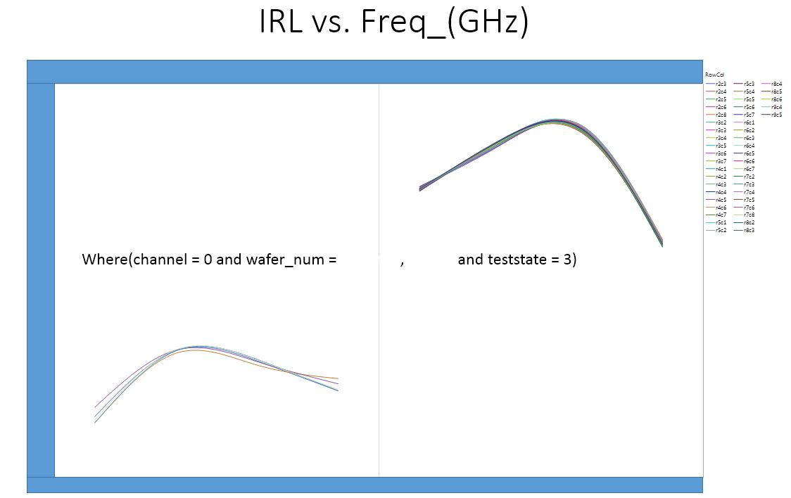
- Mark as New
- Bookmark
- Subscribe
- Mute
- Subscribe to RSS Feed
- Get Direct Link
- Report Inappropriate Content
Re: JSL - Generate -x-y Plot that loops through columns with different variables
Thank you for the information it is always insightful. I do think it is very fortuitous that you happened to be the one helping me out the most. See, I am an Industrial Engineer in a foundry that has a very high mix low volume product mix and we do a significant amount of RF testing. Everything you mentioned:
- there is a known range like control or spec limits,
- need to scale to something like +/- k sigma,
- need to control the grid lines, for example, a grid line at each 0.5 sigma,
- data whose nominal value is large but variation is very small, for example, means value is 1750222 stdev is 0.000023, then I plot a transform Y- mean and figure out a good scale and use the alogorithm, gdinc.jsl
- perform an analyses and determine whether the data is highly skewed or lumpy (clustered).
Is what i am trying to accomplish we are testing and our customer is using some broad spec limits based on no data so we are trying to determine spec limits based on +/- 3 sigma and +/- 4.5 sigma with accompaning upper and lower control limits. Another example is when i was asking about widening the X-Axis for the distribution plots it was because our current spec limits are LSL = 20 and USL = 40. This is why i am an avid JMP advocate because of the awesome tools you have in the Quality and Process utilities.
I know very little if any at all about plotting multivariate data analysis but i will give it whirl.
Actually this converation brings to me why am here again. I would like your input regarding using the same method of plotting you have given me for the graph builder and distribution for the Fix Y by X analysis. I feel that this is a very good analysis tool as we can see the difference (statistically) between data sets which in our case is wafer_number. Of course I use a Each Pair Student's T test to compare the means... I tried to plug and plug and play the and get confused with the dispacth function.. Attached is the data table and a Save to Script Window of what i am trying to do along with a picture of the output.. Again, all your help is extremely helpful.
Side note, I asked my manager if I could take a in depth script writing class and he said yes so if you have any recommendations please let me know. I am in the Balitmore, MD area.
yng
- Mark as New
- Bookmark
- Subscribe
- Mute
- Subscribe to RSS Feed
- Get Direct Link
- Report Inappropriate Content
Re: JSL - Generate -x-y Plot that loops through columns with different variables
I guess the other two didn't attach
- « Previous
- Next »
Recommended Articles
- © 2026 JMP Statistical Discovery LLC. All Rights Reserved.
- Terms of Use
- Privacy Statement
- Contact Us