- New to JMP? Join us Sept. 23-24 for the Early User Edition of Discovery Summit, tailor-made for new users. Register now for free!
- Learn some foundational elements of JMP Scripting Language (JSL) and how to extend point & click automation into repeatable, shareable routines. Register. June 26, 2 p.m. US Eastern Time.
- Subscribe to RSS Feed
- Mark Topic as New
- Mark Topic as Read
- Float this Topic for Current User
- Bookmark
- Subscribe
- Mute
- Printer Friendly Page
Discussions
Solve problems, and share tips and tricks with other JMP users.- JMP User Community
- :
- Discussions
- :
- JSL - Generate -x-y Plot that loops through columns with different variables

- Mark as New
- Bookmark
- Subscribe
- Mute
- Subscribe to RSS Feed
- Get Direct Link
- Report Inappropriate Content
JSL - Generate -x-y Plot that loops through columns with different variables

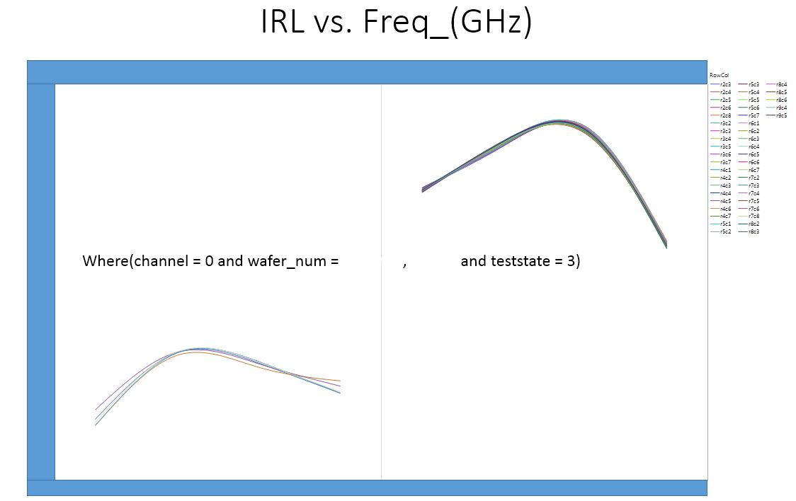
Background: I have a very large data set that is an output of specific RF testing for semi-conductor devices. During this RF test there are a variety of differnt conditions that are important. I have 3 outputs that are tested on 16 different channels at 6 different test states which require me to generate 105 differnt graphs.
example: Gain vs Frequency on Channel 1 at Test State 1; Gain vs Frequency on Channel 2 at Test State 1 where i have 15 channels and 6 test states.
I have searched these discussion boards for a solution and the closets i have come is a thread started in 2017 titled "How to export JMP graph to PPT by JSL?"
I tried to incorperate the script used in this solution to help me and i can get it to make the required number of plots but cannot get specific channels to filter out.
I think i am having a hard time communicating this so please if you need clarification, ask.
Thanks
Summarize( dt, lstChannel = By( :channel ) );
gb = Graph Builder(
	invisible,
	Size( 1225, 952 ),
	Show Control Panel( 0 ),
	Variables(
		X( :Name( "Freq _(GHz)" ) ),
		Y( :Gain ),
		Group X( :wafer_num ),
		Overlay( :RowCol ) ),
		Elements( Smoother( X, Y, Legend( 19 ) ) )
);

For( i = 1, i <= N Items( GroupBy ), i++,
		gb << Local Data Filter(
			columns(
				:wafer_num,
				:channel,
				:RowCol),
			Where( :channel == LstChannel[i] ) ),

// I would like to loop through the teststates as well
			Where( :teststate == 1 ),
			Mode( Show( 1 ), Include( 1 ) ) );
	If( i == 1,
		gb << Save Presentation( "$TEMP/jmp_example2.pptx" ),
		gb << Save Presentation( "$TEMP/jmp_example2.pptx", Append )
	);
	gb << remove data filter;
);

Open( "$TEMP/jmp_example2.pptx" );Accepted Solutions

- Mark as New
- Bookmark
- Subscribe
- Mute
- Subscribe to RSS Feed
- Get Direct Link
- Report Inappropriate Content
Re: JSL - Generate -x-y Plot that loops through columns with different variables
Hi,
I would recommend modifying your approach for generating the graphs to use where statements instead of the data filter. The data filter is great for interactive visual analytics, however, since your view is invisible, I suggest you use a where statement. When a where statement is used, a where text box is visible; it can be deleted. You can also use a By argument, By(:Channel, :Test State). Then the script needs to access each GB and save the presentation.
I am not a fan of Save Presentation, I like to use P3ICLI, a free external command line program to create PPTX slides from my JMP output. See JSL example to create PPTX using P3ICLI . Like any code it looks messy, but can create very customized and can control the graph and title sizing.
However, for multiple plot saves using Save Presentation we wrote up some tricks to journal multiple layout displays as pictures, the use save presentation, but you have to play around with the sizing.
Anyway, attached is a dummy data table to emulate your scenario and two scripts, each saves one picture per page
Hope this helps.
- Mark as New
- Bookmark
- Subscribe
- Mute
- Subscribe to RSS Feed
- Get Direct Link
- Report Inappropriate Content
Re: JSL - Generate -x-y Plot that loops through columns with different variables
gd_inc() is a user function that was sent previously on this blog path. I attached it again. Either add the code to your script prior to using it, or save the script ( I call mine gd_inc.jsl ) to a common directory of useful functions, your own personal library, and for any script when you want to compute good axis increments, add the statement.
Include( "mydirectory/gd_inc.jsl" );
For people who support reports for their company, they often create one big script, named something like usr_functions.jsl. Then instead of numerous Include() statements, they use just one Include("mydirectory/usr_functions.jsl")
Here is the function again. Look at the previous posting, there are examples of how to use this function.
gd_inc = Function({xlo, xhi, ntic}, {sp,tt, yrnd, ginc, ndec,lc, ll},
 sp = (xhi - xlo)/ntic;
 tt = log10(sp);
 yrnd = If(
	tt > 0, 1 - Floor( tt ),
	Abs( Floor( tt ) - 1 )
 );
 ginc =round(sp,yrnd);
 ndec = length(word(2,char(ginc),"."));
 lc    = length(word(1,char(xhi),"."));
 if(ndec>0, lc=lc+ndec+1);
 if(xlo <0, lc++); //add 1 character for the negative sign
 ll=[1,1,1];
 ll[1] = ginc; //increment
 ll[2] = ndec; //# decimals
 ll[3] = lc;   //character length
 ll
);  // end gd_inc
/* test cases
show(gd_inc(1,11,10), gd_inc(.001, .005, 10), gd_inc(10000,20200, 10) )
*/
By the way, I have been using and teaching JMP and JSL for many years. So my knowledge is not so amazing, just trying to share.
- Mark as New
- Bookmark
- Subscribe
- Mute
- Subscribe to RSS Feed
- Get Direct Link
- Report Inappropriate Content
Re: JSL - Generate -x-y Plot that loops through columns with different variables
Hi,
I would recommend modifying your approach for generating the graphs to use where statements instead of the data filter. The data filter is great for interactive visual analytics, however, since your view is invisible, I suggest you use a where statement. When a where statement is used, a where text box is visible; it can be deleted. You can also use a By argument, By(:Channel, :Test State). Then the script needs to access each GB and save the presentation.
I am not a fan of Save Presentation, I like to use P3ICLI, a free external command line program to create PPTX slides from my JMP output. See JSL example to create PPTX using P3ICLI . Like any code it looks messy, but can create very customized and can control the graph and title sizing.
However, for multiple plot saves using Save Presentation we wrote up some tricks to journal multiple layout displays as pictures, the use save presentation, but you have to play around with the sizing.
Anyway, attached is a dummy data table to emulate your scenario and two scripts, each saves one picture per page
Hope this helps.
- Mark as New
- Bookmark
- Subscribe
- Mute
- Subscribe to RSS Feed
- Get Direct Link
- Report Inappropriate Content
Re: JSL - Generate -x-y Plot that loops through columns with different variables
Thank You for the response. I am going to use your examples to see if i can figure it out..
I tried using the "select where" statement and it worked pretty well.. I was just trying to reduce the amount of code that i was going to have to write.. I have 5 different tests with all the parameters listed above..
I will report back when i give this a try.
Thanks again..
- Mark as New
- Bookmark
- Subscribe
- Mute
- Subscribe to RSS Feed
- Get Direct Link
- Report Inappropriate Content
Re: JSL - Generate -x-y Plot that loops through columns with different variables
I can't thank you enough for your help with this.. No one here at work could even remotely tell me how to do what you did..
With this you have cut the time it takes me to do this down by at least 80%..
Your solution and the SQL scripts i am writing to access our database files will put us in a fantastic position with our customer.
Thank you again..
D
- Mark as New
- Bookmark
- Subscribe
- Mute
- Subscribe to RSS Feed
- Get Direct Link
- Report Inappropriate Content
Re: JSL - Generate -x-y Plot that loops through columns with different variables
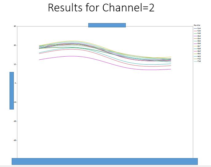
Can I ask you one more question related to the For() loop with the graphs?
Is there a way to autoscale best fit?
If i can get the scale in the example from Min = 5 and Max = 30 we can get a better idea on exactly how the parts perform across the Frequencies...
Of course i am going to have to remove the outliers before hand..
Thanks
- Mark as New
- Bookmark
- Subscribe
- Mute
- Subscribe to RSS Feed
- Get Direct Link
- Report Inappropriate Content
Re: JSL - Generate -x-y Plot that loops through columns with different variables
You can create a fixed scale or use a favorite algorithm to find the best scale for the data at hand.
A modified version of the previously supplied script is attached below. The new code is listed below. Note, for the dummy data, the scaling best scaling is probably -8 to 8, however, I chose -7 for demonstration that several graphs might be clipped.
_xx = gb<< Xpath("//ScaleBox[@charID='Y']");
_xx[1] << Axis Setings({Min( -7 ), Max( 8 ), Inc( 1 ), Minor Ticks( 1 ),
			Label Row( {Show Major Grid( 1 ), Show Minor Grid( 1 )} )});
There are multiple methods to figure out how to script a change. The easiest is to script one graph, then use the GUI to
change the axes or titles or legends. Then from the red inverted triangle (on the graph builder outline) select Save Script > To Script Window. Using this method it will show a Dispatch argument. See below.
Graph Builder(
	Size( 1242, 709 ),
	Show Control Panel( 0 ),
	Variables( X( :X ), Y( :Y ), Group X( :Wafer ID ), Overlay( :RowCol ) ),
	Elements( Smoother( X, Y, Legend( 19 ) ) ),
	Where( dt:Channel == chnl & dt:Test State == tst ),
	SendToReport(
		Dispatch(
			{},
			"Graph Builder",
			OutlineBox,
			{Set Title( "Results for Channel=1 and Test State=1" )}
		),
		Dispatch(
			{},
			"Y",
			ScaleBox,
			{Min( -7 ), Max( 8 ), Inc( 1 ), Minor Ticks( 1 ),
			Label Row( {Show Major Grid( 1 ), Show Minor Grid( 1 )} )}
		)
	)
);
Since your title is custom, remove the Dispatch to the OutlineBox, then use this code in your for loop and each graph will have the same scaling specified in your script.
- Mark as New
- Bookmark
- Subscribe
- Mute
- Subscribe to RSS Feed
- Get Direct Link
- Report Inappropriate Content
Re: JSL - Generate -x-y Plot that loops through columns with different variables
Very much appreciated.. I am going to try it this evening..
- Mark as New
- Bookmark
- Subscribe
- Mute
- Subscribe to RSS Feed
- Get Direct Link
- Report Inappropriate Content
Re: JSL - Generate -x-y Plot that loops through columns with different variables
I just tried your solution. I usually do the Save Script to Window so i can see how the graph is supposed to look.
I have attached a modified dummy data to give you an idea of what exactly I am trying to accomplish.
With the 15 channels and in this case 2 test states that have different ouputs I can't see a one size fits all solution..
Let me know what you think please.
This particular tests has 3 outputs. which i have to evaluate separate.
David
- Mark as New
- Bookmark
- Subscribe
- Mute
- Subscribe to RSS Feed
- Get Direct Link
- Report Inappropriate Content
Re: JSL - Generate -x-y Plot that loops through columns with different variables
didn't load the table..
- Mark as New
- Bookmark
- Subscribe
- Mute
- Subscribe to RSS Feed
- Get Direct Link
- Report Inappropriate Content
Re: JSL - Generate -x-y Plot that loops through columns with different variables
As I mentioned in my previous response, "You can create a fixed scale or use a favorite algorithm to find the best scale for the data at hand." Below is the function gd_inc() created for script 7_InteractiveDisplays_Alternates.jsl (for book JSL Companion, 2nd Ed.).
It is a simplification of functions I use when coding an application where the range of values are unknown. This script assumes Fixed Decimal format will work. A more general script would determine, if too many decimals, then switch to scientific notation or change to a log scale etc. Before using it, you should try it out.
The arguments are Low, High and Number of increments. It returns a vector of inc value, #of decimals for the format and the max length; in the full script, it is used for an x-axis and the orientation is changed based upon its length. Or the length might be used to trigger if something else other than Fixed Decimal format should be used.
gd_inc = Function({xlo, xhi, ntic}, {sp,tt, yrnd, ginc, ndec,lc, ll},
 sp = (xhi - xlo)/ntic;
 tt = log10(sp);
 yrnd = If(
	tt > 0, 1 - Floor( tt ),
	Abs( Floor( tt ) - 1 )
 );
 ginc =round(sp,yrnd);
 ndec = length(word(2,char(ginc),"."));
 lc    = length(word(1,char(xhi),"."));
 if(ndec>0, lc=lc+ndec+1);
 if(xlo <0, lc++); //add 1 character for the negative sign
 ll=[1,1,1];
 ll[1] = ginc; //increment
 ll[2] = ndec; //# decimals
 ll[3] = lc;   //character length
 ll
);  // end gd_inc
/* test cases
show(gd_inc(1,11,10), gd_inc(.001, .005, 10), gd_inc(10000,20200, 10) )
*/
Once you have the results, then modify your script
	_yscl = gd_inc(Lo,Hi, 10);
      _xx[1] << Axis Setings( {Min( Lo ), Max( Hi ), Inc( _yscl[1] ),
                       Minor Ticks( 1 ),
			Label Row( {Show Major Grid( 1 ), Show Minor Grid( 1 )} ),
                      	Format("Fixed Dec",12,_yscl[2])
                       });
JMP does a good job auto scaling, the reason the scaling is too wide for your graphbuilder is that it is scaling to be able to display the points not just the smoothed curves. One option is to get the spline curve values and just plot those.
If you choose to not do that you willneed to find the max and min of the curves and you need to decide if you want all graphs for Y_i to have the same scale, or if each Y_i and Test needs to have the same scale or each graph its own scale. The JMP Spline Smooth() function returns the spline values, and you can find the max and min for each possible curve then get the max and min over all. That will provide the Lo and Hi and, I typically use 10 for the number of increments.
Then use the gd_inc() function and modify. If you know the low and high values, then create a table or constats for each Y.
Custom scaling can get messy with multiple curves and custom curves like splines. If I have time, I'll attach an updated script for your dummy data.
BTW, I am not sure how realistic your dummy data might be. Comparing multiple graphs in PowerPoint can be confusing. GraphBuilder is good for comparing graphs. Instead of numerous graphs, possibly some comparison (not necessarily the one below) might be useful. Below is Y_3 vs. channels, for Test, and different values of X.

Recommended Articles
- © 2026 JMP Statistical Discovery LLC. All Rights Reserved.
- Terms of Use
- Privacy Statement
- Contact Us