- New to JMP? Let the Data Analysis Director guide you through selecting an analysis task, an analysis goal, and a data type. Available now in the JMP Marketplace!
- See how to install JMP Marketplace extensions to customize and enhance JMP.
- Subscribe to RSS Feed
- Mark Topic as New
- Mark Topic as Read
- Float this Topic for Current User
- Bookmark
- Subscribe
- Mute
- Printer Friendly Page
Discussions
Solve problems, and share tips and tricks with other JMP users.- JMP User Community
- :
- Discussions
- :
- How to visualize change in pareto rankings over time
- Mark as New
- Bookmark
- Subscribe
- Mute
- Subscribe to RSS Feed
- Get Direct Link
- Report Inappropriate Content
How to visualize change in pareto rankings over time
I work in manufacturing. One improvement activity that I do is analyze loss data. Losses occur when we don't meet production targets. Causes for losses are assigned. These data lend themselves well to analysis using Pareto Charts. I was doing that this morning and when this question came to mind "how do the top 15 causes change with time?". I came up with the following bubble chart. Two questions:
- Can you think of a better way to visualize this?
- Is there a better formula to get the rank highest to lowest? Look at the formula for Year.Rank.
Data have been anonymized and randomized...
Thanks in advance!
Accepted Solutions
- Mark as New
- Bookmark
- Subscribe
- Mute
- Subscribe to RSS Feed
- Get Direct Link
- Report Inappropriate Content
Re: How to visualize change in pareto rankings over time
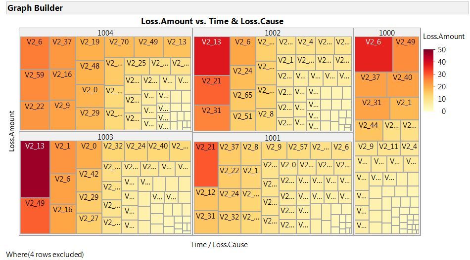
I'm partial to Tree Maps when trying to display this type of data, they pack a lot of info into a small space:
Although not necessary to create the above visual, your rank column could be used to subset the table to the values 1 thru 15 and then combined with the data filter you could answer the specific question "how do the top 15 causes change with time":
Just one idea, I'm sure there are more.
- Mark as New
- Bookmark
- Subscribe
- Mute
- Subscribe to RSS Feed
- Get Direct Link
- Report Inappropriate Content
Re: How to visualize change in pareto rankings over time
Hi Mark,
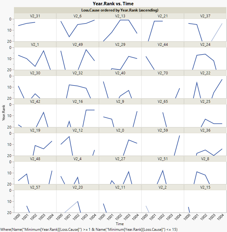
1. It's hard to beat line charts for changes over time.Below is a small multiples view of all the causes that ever make the top 15, ordered by the average rank. If you use a Group X instead of Group Wrap, you would get a layout similar to your bubble view.
2. I think the formula could be simplfied to Col Rank( -:Loss.Amount, :Time ).
Graph Builder(
	Size( 728, 731 ),
	Show Control Panel( 0 ),
	Variables(
		X( :Time ),
		Y( :Year.Rank ),
		Wrap( :Loss.Cause,
			Order By( :Year.Rank, Ascending, Order Statistic( "Mean" ) )
		)
	),
	Elements(
		Line( X, Y, Legend( 11 ),
			Missing Factors( "Treat as Missing" ),
			Missing Values( "Connect Faded" )
		)
	),
	Local Data Filter(
		Add Filter(
			columns(
				Transform Column(
					"Minimum[Year.Rank][Loss.Cause]",
					Formula( Col Minimum( :Year.Rank, :Loss.Cause ) )
				)
			),
			Where(
				Transform Column(
					"Minimum[Year.Rank][Loss.Cause]",
					Formula( Col Minimum( :Year.Rank, :Loss.Cause ) )
				) >= 1 & Transform Column(
					"Minimum[Year.Rank][Loss.Cause]",
					Formula( Col Minimum( :Year.Rank, :Loss.Cause ) )
				) <= 15
			)
		)
	),
	SendToReport( Dispatch( {}, 	"Year.Rank", ScaleBox,
		{Min( 20 ), Max( 0 ), Inc( 10 ), Minor Ticks( 1 )})
	)
)
- Mark as New
- Bookmark
- Subscribe
- Mute
- Subscribe to RSS Feed
- Get Direct Link
- Report Inappropriate Content
Re: How to visualize change in pareto rankings over time
I'm partial to Tree Maps when trying to display this type of data, they pack a lot of info into a small space:
Although not necessary to create the above visual, your rank column could be used to subset the table to the values 1 thru 15 and then combined with the data filter you could answer the specific question "how do the top 15 causes change with time":
Just one idea, I'm sure there are more.
- Mark as New
- Bookmark
- Subscribe
- Mute
- Subscribe to RSS Feed
- Get Direct Link
- Report Inappropriate Content
Re: How to visualize change in pareto rankings over time
Jerry:
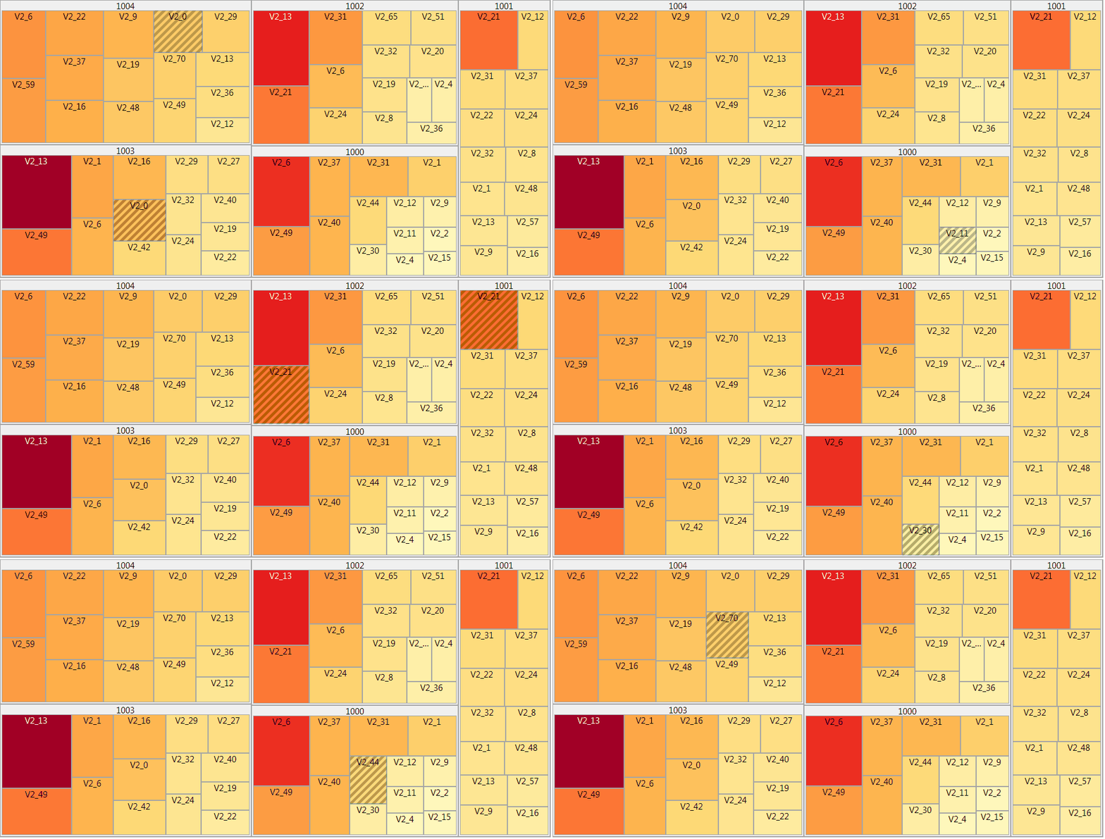
Thanks! Sorry for the delayed reply, was busy with meetings last week. I took your idea of using a treemap and made one change since V2 values are text strings of up to 20 characters: I used Color Theme Spectral. This made it really easy for the eyes to compare the rectangles for a given V2 value from one time period to another.
Graph Builder(
Size( 1523, 678 ),
Show Control Panel( 0 ),
Show Legend( 0 ),
Continuous Color Theme( "Spectral" ),
Categorical Color Theme( "Spectral" ),
Variables(
X( :Pareto.Category ),
Y( :Losses ),
Wrap( :Year ),
Color( :Pareto.Category )
),
Elements( Treemap( X, Y, Legend( 4 ), Layout( "Squarify" ) ) ),
SendToReport(
Dispatch( {}, "graph title", TextEditBox, {Set Text( "2010-2017 Losses" )} ),
Dispatch(
{},
"Graph Builder",
FrameBox,
{DispatchSeg( TreeMapSeg( 1 ), Frame Size( 499, 176 ) )}
),
Dispatch(
{},
"Graph Builder",
FrameBox( 2 ),
{DispatchSeg( TreeMapSeg( 1 ), Frame Size( 498, 176 ) )}
),
Dispatch(
{},
"Graph Builder",
FrameBox( 3 ),
{DispatchSeg( TreeMapSeg( 1 ), Frame Size( 499, 176 ) )}
),
Dispatch(
{},
"Graph Builder",
FrameBox( 4 ),
{DispatchSeg( TreeMapSeg( 1 ), Frame Size( 499, 177 ) )}
),
Dispatch(
{},
"Graph Builder",
FrameBox( 5 ),
{DispatchSeg( TreeMapSeg( 1 ), Frame Size( 498, 177 ) )}
),
Dispatch(
{},
"Graph Builder",
FrameBox( 6 ),
{DispatchSeg( TreeMapSeg( 1 ), Frame Size( 499, 177 ) )}
),
Dispatch(
{},
"Graph Builder",
FrameBox( 7 ),
{DispatchSeg( TreeMapSeg( 1 ), Frame Size( 499, 176 ) )}
),
Dispatch(
{},
"Graph Builder",
FrameBox( 8 ),
{DispatchSeg( TreeMapSeg( 1 ), Frame Size( 498, 176 ) )}
)
)
)
- Mark as New
- Bookmark
- Subscribe
- Mute
- Subscribe to RSS Feed
- Get Direct Link
- Report Inappropriate Content
Re: How to visualize change in pareto rankings over time
Hi Mark,
1. It's hard to beat line charts for changes over time.Below is a small multiples view of all the causes that ever make the top 15, ordered by the average rank. If you use a Group X instead of Group Wrap, you would get a layout similar to your bubble view.
2. I think the formula could be simplfied to Col Rank( -:Loss.Amount, :Time ).
Graph Builder(
	Size( 728, 731 ),
	Show Control Panel( 0 ),
	Variables(
		X( :Time ),
		Y( :Year.Rank ),
		Wrap( :Loss.Cause,
			Order By( :Year.Rank, Ascending, Order Statistic( "Mean" ) )
		)
	),
	Elements(
		Line( X, Y, Legend( 11 ),
			Missing Factors( "Treat as Missing" ),
			Missing Values( "Connect Faded" )
		)
	),
	Local Data Filter(
		Add Filter(
			columns(
				Transform Column(
					"Minimum[Year.Rank][Loss.Cause]",
					Formula( Col Minimum( :Year.Rank, :Loss.Cause ) )
				)
			),
			Where(
				Transform Column(
					"Minimum[Year.Rank][Loss.Cause]",
					Formula( Col Minimum( :Year.Rank, :Loss.Cause ) )
				) >= 1 & Transform Column(
					"Minimum[Year.Rank][Loss.Cause]",
					Formula( Col Minimum( :Year.Rank, :Loss.Cause ) )
				) <= 15
			)
		)
	),
	SendToReport( Dispatch( {}, 	"Year.Rank", ScaleBox,
		{Min( 20 ), Max( 0 ), Inc( 10 ), Minor Ticks( 1 )})
	)
)
- Mark as New
- Bookmark
- Subscribe
- Mute
- Subscribe to RSS Feed
- Get Direct Link
- Report Inappropriate Content
Re: How to visualize change in pareto rankings over time
Xan:
Thanks! Sorry for the delayed reply - was in meetings all week. I like your solution! As we work on improvements, we always ask "Is last year's #1 problem still #1 this year?" The #1 should go down in rank (move to the right on a pareto chart), or if still #1 should get smaller. The line chart is a great way to see change in rank. Combining the line chart and Jerry's treemap solution (which shows the magnitude of the losses) really helps tell the story of where we are making progress.
One question: was the script your posted created only by point-click in GraphBuilder or did you have to edit the Save to data table script?
I'm looking forward to using a Local Data Filter for time and JMP14 Packed Bars to re-analyze this data!
- Mark as New
- Bookmark
- Subscribe
- Mute
- Subscribe to RSS Feed
- Get Direct Link
- Report Inappropriate Content
Re: How to visualize change in pareto rankings over time
Great, Mark. It was all point and click. The only tricky part was adding the transform column in the data filter.
Recommended Articles
- © 2026 JMP Statistical Discovery LLC. All Rights Reserved.
- Terms of Use
- Privacy Statement
- Contact Us


