- New to JMP? Let the Data Analysis Director guide you through selecting an analysis task, an analysis goal, and a data type. Available now in the JMP Marketplace!
- See how to install JMP Marketplace extensions to customize and enhance JMP.
- Subscribe to RSS Feed
- Mark Topic as New
- Mark Topic as Read
- Float this Topic for Current User
- Bookmark
- Subscribe
- Mute
- Printer Friendly Page
Discussions
Solve problems, and share tips and tricks with other JMP users.- JMP User Community
- :
- Discussions
- :
- Re: How to plot fit Y by X plot automatically from many columns
- Mark as New
- Bookmark
- Subscribe
- Mute
- Subscribe to RSS Feed
- Get Direct Link
- Report Inappropriate Content
How to plot fit Y by X plot automatically from many columns
try to plot many fit by x plots and find the RSquare from each linear fit. How can I do it at once? (make all plots and do the linear fit at once)
1. select item to plot: A-1 vs B-1, A-2 vs B-2 ... etc.
2. Linear fit and find the RSquare
3. create the heat map
- Mark as New
- Bookmark
- Subscribe
- Mute
- Subscribe to RSS Feed
- Get Direct Link
- Report Inappropriate Content
Re: How to plot fit Y by X plot automatically from many columns
Hi @daily_learn ,
try using the multivariate platform under the Analysis menu.
just put all your variables in the Y, Columns and run. once it ran you can choose whatever plot you need out of the red triangle including colour maps of the correlations.
let us know if it worked.
- Mark as New
- Bookmark
- Subscribe
- Mute
- Subscribe to RSS Feed
- Get Direct Link
- Report Inappropriate Content
Re: How to plot fit Y by X plot automatically from many columns
A suggestion is to put your data in a different format. Here is the walk through.
Here is the data
Then "stack" your X variables. Check out menu item "Stack" Under "Tables". In the dialog, uncheck "Stack by Row", check "Drop All" as indicated in the following screenshot.
Then you get this:
Do the same on your Y variables and you get this:
Now, you put them side by side. A copy-n-paste will do. And rename the columns. Get this:
Now fit your regressions by Label:
When you do the fit, remember to hold the Control key when you click menu. This will fit model to all By-groups.
Now right click on the interested number, select Make Combined Data Table.
Now you should have a bunch of numbers in the generated table, but in an organized way. You can select, subset to get what you want.
- Mark as New
- Bookmark
- Subscribe
- Mute
- Subscribe to RSS Feed
- Get Direct Link
- Report Inappropriate Content
Re: How to plot fit Y by X plot automatically from many columns
Another option is to use Response Screening under Analyze>Screening. It will give you all Y by X pairs and the last tab in the report is a slope tab that has a table with R Squared for each pair. You can ignore the pairs you are not interested.
Data Scientist, Life Sciences - Global Technical Enablement
JMP Statistical Discovery, LLC. - Denver, CO
Tel: +1-919-531-9927 ▪ Mobile: +1-303-378-7419 ▪ E-mail: chris.kirchberg@jmp.com
www.jmp.com
- Mark as New
- Bookmark
- Subscribe
- Mute
- Subscribe to RSS Feed
- Get Direct Link
- Report Inappropriate Content
Re: How to plot fit Y by X plot automatically from many columns
@daily_learn : In addition to all of those great ideas, you could use the Multivariate platform: Just put in all your Xs and Ys, then take a look at the "Pairwise Correlations" report. The R^2 values can be generated by squaring those correlations: right-mouse click on the Pairwise Correlations output and choose "Make in to Data Table". Then, add a column that is the Correlation squared.
Then Just keep the ones of interest.
- Mark as New
- Bookmark
- Subscribe
- Mute
- Subscribe to RSS Feed
- Get Direct Link
- Report Inappropriate Content
Re: How to plot fit Y by X plot automatically from many columns
thanks for all the answers, am looking for fast mapping method (A vs A1 and B vs B1.. only) instead of choosing wanted or deleted unwanted from the final results.
- Mark as New
- Bookmark
- Subscribe
- Mute
- Subscribe to RSS Feed
- Get Direct Link
- Report Inappropriate Content
Re: How to plot fit Y by X plot automatically from many columns
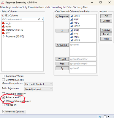
How I would approach this, is to use
Analyze=>Screening=>Response Screening
This will allow you to select the pairwise analyses you want
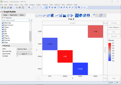
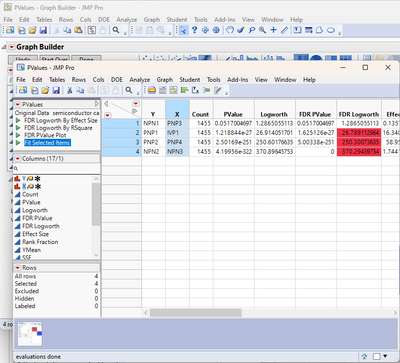
The platform creates a Pvalues table, which you can easily plot the pairs of X and Y columns using Graph Builder,. and specifying RSquare as the Color column.
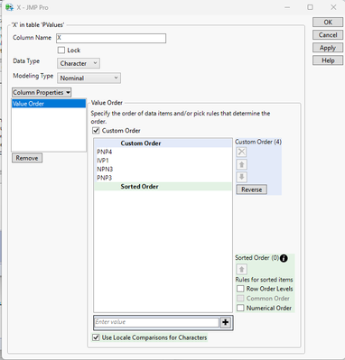
The order can easily be changed by setting the Value Order column property
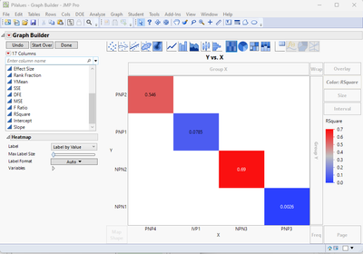
Which when the Apply button is pressed, the graph is changed to:
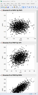
The Bivariate plots are also available. By selecting 1, 2, ......n rows in the Pvalues data table, and then clicking on the embedded script, "Fit Selected Items"
A window will be displayed with all of the Bivariate plots within it.
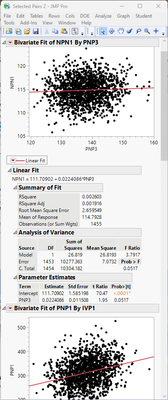
The Fit Line, etc. can then be run. By holding down the CNTL key as you select Fit Line or any of the other options, the selection will be run on all graphs.
Recommended Articles
- © 2026 JMP Statistical Discovery LLC. All Rights Reserved.
- Terms of Use
- Privacy Statement
- Contact Us


