- JMP User Community
- :
- Discussions
- :
- How to make contour plot for data that contains categorical variables
- Subscribe to RSS Feed
- Mark Topic as New
- Mark Topic as Read
- Float this Topic for Current User
- Bookmark
- Subscribe
- Printer Friendly Page
- Mark as New
- Bookmark
- Subscribe
- Mute
- Subscribe to RSS Feed
- Get Direct Link
- Report Inappropriate Content
How to make contour plot for data that contains categorical variables
Hi,
I'd like to make contour plots for a dataset that has 2 continuous variables, and one categorical variable. When I was messing around with the plot, I was somehow able to make it generate plots for both scenarios (one plot for assuming categorical condition A, another for categorical condition B) automatically.
I can no longer repeat that analysis as it tells me the X values must be numerical when I use the contour plot function.
How can I generate a contour plot for each categorical condition?
Thanks!
- Mark as New
- Bookmark
- Subscribe
- Mute
- Subscribe to RSS Feed
- Get Direct Link
- Report Inappropriate Content
Re: How to make contour plot for data that contains categorical variables
Hi @MetaLizard62080 ,
I'm not exactly sure what you want the graph to look like, but there are a few ways you can do this in graph builder.
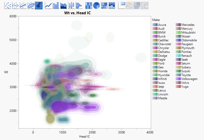
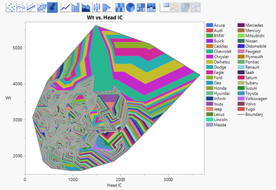
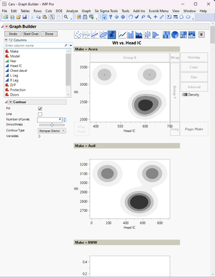
One option is use your two numerical columns as the X and Y in GB, and then use the categorical as (1) an Overlay, or (2) Color, or (3) as a Page option. See the results below -- for these examples, I'm using the Cars.jmp example data table with Wt as the Y, Head IC as X, and Make as the GB option. The graphs looks crazy busy, but it's because there are so many different Makes of cars. Hopefully your graph isn't as busy.
(1)
(2)
(3) Here I did a screenshot because it crease a separate GB for each Make of vehicle.
This should at least get you started.
Hope this helps!,
DS
- Mark as New
- Bookmark
- Subscribe
- Mute
- Subscribe to RSS Feed
- Get Direct Link
- Report Inappropriate Content
Re: How to make contour plot for data that contains categorical variables
It is difficult to know exactly what the problem is without more details of your data and the steps you are taking to create the plot. Can you post a sanitized version of your data that illustrates the problem?
Are you attempting to create a contour plot with the raw data or to create a contour profiler with the prediction formula that has been derived from data analysis? Both should be possible.
If you want the contour plot, you should be able to select this from the Graph menu, then add your Y, add the two continuous variables as Xs and them add the categorical variable to the "By" box
- © 2025 JMP Statistical Discovery LLC. All Rights Reserved.
- Terms of Use
- Privacy Statement
- Contact Us


