- JMP will suspend normal business operations for our Winter Holiday beginning on Wednesday, Dec. 24, 2025, at 5:00 p.m. ET (2:00 p.m. ET for JMP Accounts Receivable).
Regular business hours will resume at 9:00 a.m. EST on Friday, Jan. 2, 2026. - We’re retiring the File Exchange at the end of this year. The JMP Marketplace is now your destination for add-ins and extensions.
- Subscribe to RSS Feed
- Mark Topic as New
- Mark Topic as Read
- Float this Topic for Current User
- Bookmark
- Subscribe
- Mute
- Printer Friendly Page
Discussions
Solve problems, and share tips and tricks with other JMP users.- JMP User Community
- :
- Discussions
- :
- How to make a line graph containing multiple lines?
- Mark as New
- Bookmark
- Subscribe
- Mute
- Subscribe to RSS Feed
- Get Direct Link
- Report Inappropriate Content
How to make a line graph containing multiple lines?
Hello,
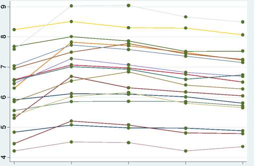
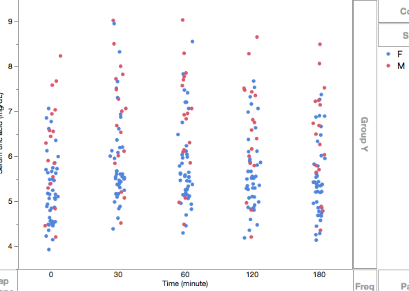
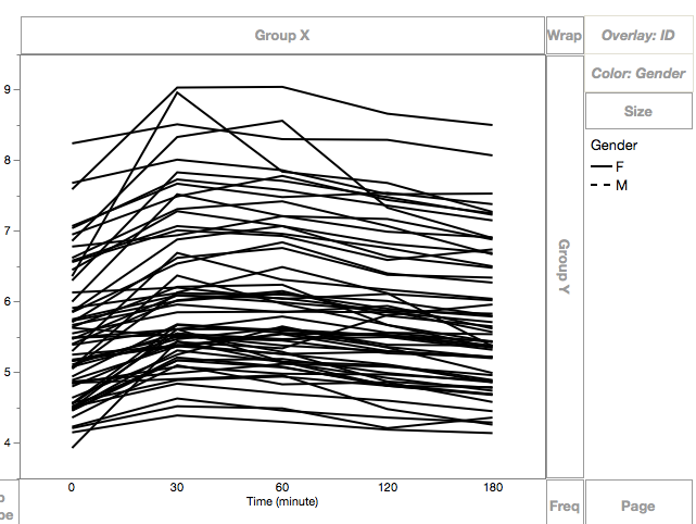
I have 50 people and each people have 5 values corresponding to 5 time points. I am trying to create a graph looks like this in JMP, showing everyone's 5 values on this graph:
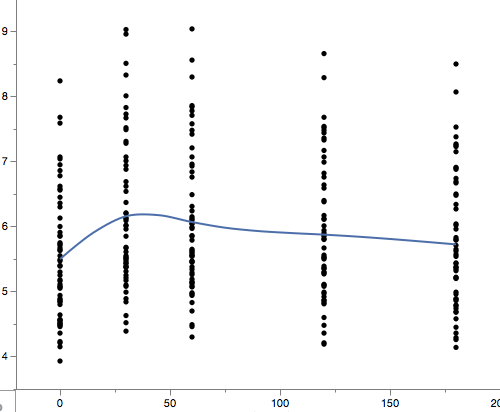
But instead, this is what I got in JMP:
Is there any way I can connect the 5 values for each person and show this on the graph? Thank you!
Accepted Solutions
- Mark as New
- Bookmark
- Subscribe
- Mute
- Subscribe to RSS Feed
- Get Direct Link
- Report Inappropriate Content
Re: How to make a line graph containing multiple lines?
If you are using GraphBuilder:
- make your time variable Ordinal instead of Continuous if you want equally spaced time periods
- make the person variable an Overlay variable
- right click and change Smoother to Line
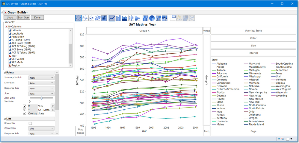
Here is the JMP sample data SAT by Year.jmp with SAT Math for Y, Year (note ordinal) for X and State as the Overlay
If you are using Fit Y by X:
- use Response for Y
- use Time for X (Continuous)
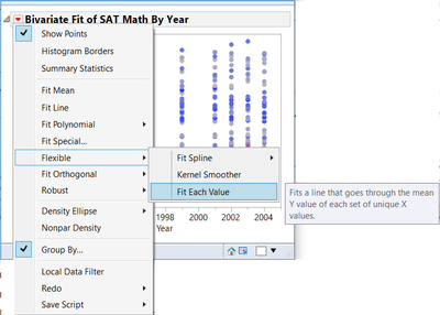
- From the pull down menu, select Group By and select the variable for People
- The use the pull down to select Fit Flexible > Fit each value
- Mark as New
- Bookmark
- Subscribe
- Mute
- Subscribe to RSS Feed
- Get Direct Link
- Report Inappropriate Content
Re: How to make a line graph containing multiple lines?
Thanks!
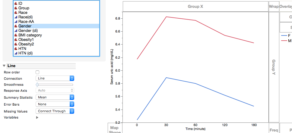
However when I tried your method using the Graph Builder, this is what I achieved before changing Smoother to line:
And here is after:
I am stilling getting only 2 lines (one for women and the other for men), instead of 50 lines. Do you know where could I have done incorrectly?
- Mark as New
- Bookmark
- Subscribe
- Mute
- Subscribe to RSS Feed
- Get Direct Link
- Report Inappropriate Content
Re: How to make a line graph containing multiple lines?
Overlay by the ID column, not the gender column.
- Mark as New
- Bookmark
- Subscribe
- Mute
- Subscribe to RSS Feed
- Get Direct Link
- Report Inappropriate Content
Re: How to make a line graph containing multiple lines?
- Mark as New
- Bookmark
- Subscribe
- Mute
- Subscribe to RSS Feed
- Get Direct Link
- Report Inappropriate Content
Re: How to make a line graph containing multiple lines?
Just a follow-up question: I am trying to separate women from men on this graph (which we intend to make only black and white) by assigning solid lines to women and dash lines to men. But apparently the "Color" on Graph Builder wouldn't let me do so, it only changes color.
- Mark as New
- Bookmark
- Subscribe
- Mute
- Subscribe to RSS Feed
- Get Direct Link
- Report Inappropriate Content
Re: How to make a line graph containing multiple lines?
I do not know of a single simple point and click method. But here are two options:
Brute Force:
- Right click on the frame box and select Customize,
- Then click on each female line and change the line style.
JSL script:
Names Default to Here(1);

dt = Open("$sample_data/SATByYear.jmp");

gbb = dt << Graph Builder(
	Size( 514, 484 ),
	Show Control Panel( 0 ),
	Variables( X( :Year ), Y( :SAT Math ), Overlay( :State ) ),
	Elements( Line( X, Y, Legend( 10 ) ) )
);
regSum = dt << summary( Group(:State, :Region));
_idx = regSum << get rows where(:Region == "Midwest");

//get a handle to all all line segments
_xls = gbb << Xpath("//LineSeg");


_xls[_idx] << LineStyle("Dotted");
- The first part draws the graph,
- Summary will display the IDs ( state names) in the order they appear in graph builder. For your data, the group columns would be ID and Gender.
- Your script would be _idx = regSum << get rows where( :Gender == "F");
- The _xls = gbb << Xpath() statement gets a reference to each lineseg in your graph. That is _xls has a handle to each line.
- _xls[_idx] << Linestyle () will change all the female lines to dashed.
I realize this script is using JSL and more advanced methods.
Maybe someone has a simpler point and click method other than Brute Force.
Good luck
Recommended Articles
- © 2026 JMP Statistical Discovery LLC. All Rights Reserved.
- Terms of Use
- Privacy Statement
- Contact Us
