Turn on suggestions
Auto-suggest helps you quickly narrow down your search results by suggesting possible matches as you type.
- New to JMP? Join us Sept. 23-24 for the Early User Edition of Discovery Summit, tailor-made for new users. Register now for free!
- Use World Cup data to build models, explore spatial relationships, and create informative visualizations in JMP. Register. July 17, 2 pm US Eastern Time.
- Your voice matters! Tell us how you prefer to receive JMP updates, so we can tailor our communication to your needs. Take short survey.
Options
- Subscribe to RSS Feed
- Mark Topic as New
- Mark Topic as Read
- Float this Topic for Current User
- Bookmark
- Subscribe
- Mute
- Printer Friendly Page
Discussions
Solve problems, and share tips and tricks with other JMP users.- JMP User Community
- :
- Discussions
- :
- Re: How to make Candlestick Charts with JMP?
Level VIII
- Mark as New
- Bookmark
- Subscribe
- Mute
- Subscribe to RSS Feed
- Get Direct Link
- Report Inappropriate Content
How to make Candlestick Charts with JMP?
Oct 14, 2019 03:50 AM
(4972 views)
Hi Experts!
I found the drawing JSL in several sample JMP files for stocks, but did not find a way to make the Candlestick Charts.
dt = Open( "I:\00\jmp\Samples\Data\TechStock.jmp" );
5 REPLIES 5
Level VIII
- Mark as New
- Bookmark
- Subscribe
- Mute
- Subscribe to RSS Feed
- Get Direct Link
- Report Inappropriate Content
Re: How to make Candlestick Charts with JMP?
How to make Candlestick Charts (at image lower left) with JMP?Or are there other plug-ins?
Thanks!
Level VIII
- Mark as New
- Bookmark
- Subscribe
- Mute
- Subscribe to RSS Feed
- Get Direct Link
- Report Inappropriate Content
Re: How to make Candlestick Charts with JMP?
It is still very fast to make Candlestick Charts with excel.It would be nice if could make a graph like this with JMP.


Super User
- Mark as New
- Bookmark
- Subscribe
- Mute
- Subscribe to RSS Feed
- Get Direct Link
- Report Inappropriate Content
Re: How to make Candlestick Charts with JMP?
Please add your request to the JMP Wish List
Jim

Staff
- Mark as New
- Bookmark
- Subscribe
- Mute
- Subscribe to RSS Feed
- Get Direct Link
- Report Inappropriate Content
Re: How to make Candlestick Charts with JMP?
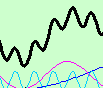
I had not heard of candlestick charts. They looked like boxplots! I looked them up, and of course, they are not boxplots. I think the similarity might be confusing for people.
I agree with Jim that you should put on the JMP Wish List. In the meantime, without writing a script, an overlay plot can convey the same message. Here is a made-up example.

Dan Obermiller
Level VIII
- Mark as New
- Bookmark
- Subscribe
- Mute
- Subscribe to RSS Feed
- Get Direct Link
- Report Inappropriate Content
Re: How to make Candlestick Charts with JMP?
OK、Thanks!
It's Japanese version of a bar chart.
It's Japanese version of a bar chart.
Recommended Articles
- © 2026 JMP Statistical Discovery LLC. All Rights Reserved.
- Terms of Use
- Privacy Statement
- Contact Us