- JMP User Community
- :
- Discussions
- :
- How to keep Graph Builder from changing markers (or, how to force Graph Builder ...
- Subscribe to RSS Feed
- Mark Topic as New
- Mark Topic as Read
- Float this Topic for Current User
- Bookmark
- Subscribe
- Printer Friendly Page
- Mark as New
- Bookmark
- Subscribe
- Mute
- Subscribe to RSS Feed
- Get Direct Link
- Report Inappropriate Content
How to keep Graph Builder from changing markers (or, how to force Graph Builder to only use row state markers and colors)
Hi JMP Community,
(W10 Enterprise, 64-bit, JMP Pro 15.0.0)
I'm trying to help a user who's using Graph Builder to visualize some data on products. The products come from different regions, different sources, and across different years.
When doing this, they Overlay and Color by a column called :Source. They also include some Data Filters and Column Switchers. The Data Filters are: year, region, source; the Column Switchers are there to allow swapping out different data on the products.
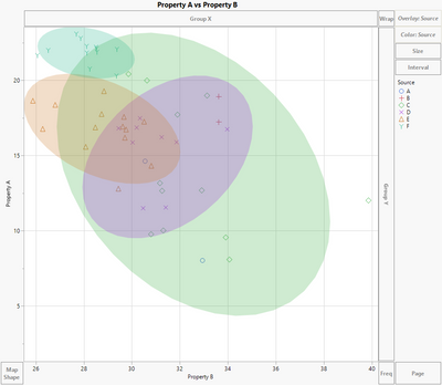
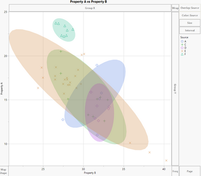
The issue that we're having is that even though we've set the row state to be a specific marker and color by :Source, when we change the Data Filter to only show data from Year 1 and change it to Year 2, Graph builder automatically overrides our row state assignments and uses the default.
Below is the output for Year 1 (left) and Year 2 (right).
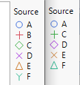
The correct marker and color scheme is on the left above, Year 1. If you look closely, you can see that for Year 2, Graph Builder change Source C from a green diamond to a green cross. D changes from a purple X to a purple diamond, E from an orange triangle to an orange X, and F from a teal Y to a teal triangle.
So, it appears that Graph Builder keeps the assigned colors that we've given to the row states, but it changes the markers to default according JMP's settings.
I've seen some similar posts, and I think I might need to use Marker Seg in Graph Builder, but having a challenging time understanding how to use that syntax to get the desired outcome. Is this a bug in 15.0 that is fixed in the latest update, and if so, can we somehow work around this issue and force Graph Builder to use the markers and colors of choice?
Thanks for any feedback!,
DS
- Mark as New
- Bookmark
- Subscribe
- Mute
- Subscribe to RSS Feed
- Get Direct Link
- Report Inappropriate Content
Re: How to keep Graph Builder from changing markers (or, how to force Graph Builder to only use row state markers and colors)
This is excellent, thank you! The third graph fits well. I'm trying to figure out how to add the sum of all the yields for each Increase Category back into the y-axis, which was in the original visualization graph.
Definitely learning some new things here, greatly appreciated!
Thanks!
jv
- « Previous
-
- 1
- 2
- Next »
- © 2025 JMP Statistical Discovery LLC. All Rights Reserved.
- Terms of Use
- Privacy Statement
- Contact Us


