- Mark as New
- Bookmark
- Subscribe
- Mute
- Subscribe to RSS Feed
- Get Direct Link
- Report Inappropriate Content
How to generate bar graphs that show significance between bars?
I would like to generate graphs that show significance between levels like this:
My current graphs contain everything shown above except the lines and stars showing significance. I saw a previous post which shows how to label each bar with a star to indicate significance against a control, but is there a way to indicate significance against each category in JMP?
1 REPLY 1
- Mark as New
- Bookmark
- Subscribe
- Mute
- Subscribe to RSS Feed
- Get Direct Link
- Report Inappropriate Content
Re: How to generate bar graphs that show significance between bars?
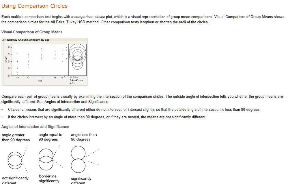
The simplest way to do this in JMP is to use the Fit Y by X platform, and select one of the means comparisons to get the Comparison Circles for one or more of the statistics.
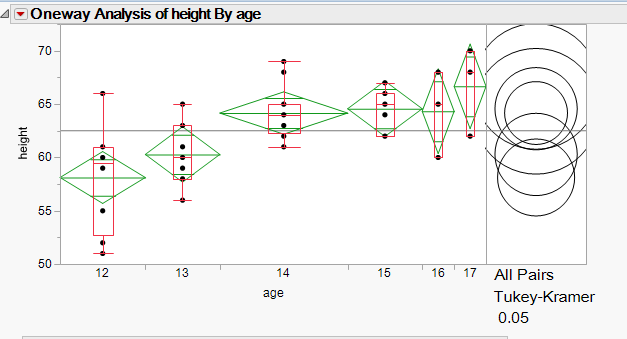
You can get the details on this technique by running a sample analysis, and then either selecting the ? tool, or typing in "?" and then clicking on the comjpairson circles
Jim