- New to JMP? Let the Data Analysis Director guide you through selecting an analysis task, an analysis goal, and a data type. Available now in the JMP Marketplace!
- See how to install JMP Marketplace extensions to customize and enhance JMP.
- Subscribe to RSS Feed
- Mark Topic as New
- Mark Topic as Read
- Float this Topic for Current User
- Bookmark
- Subscribe
- Mute
- Printer Friendly Page
Discussions
Solve problems, and share tips and tricks with other JMP users.- JMP User Community
- :
- Discussions
- :
- How to draw conclusions from circle comparison graph
- Mark as New
- Bookmark
- Subscribe
- Mute
- Subscribe to RSS Feed
- Get Direct Link
- Report Inappropriate Content
How to draw conclusions from circle comparison graph
Hi,
This is my first time posting to this forum, but I was wondering if the community might be able some information regarding the circle comparison graph on a student's t-test performed on an XY chart. First off, let me state that I am not a statistical expert and have been only using JMP for a short time now. In the process of trying to convince more people to use it, there have been a few colleagues who question its practicality and the conclusions that we can draw from the data. I was wondering if the community might be able some information regarding the circle comparison graph on a student's t-test performed on an XY chart.
The skepticism was generated from a data set consisting of a table with 500 samples represented by two columns, column (A) being a number between zero and one(ie: 0.4876). Column (B) was a choice of 6 separate conditions (ie: X/Y/Z or X/X/Y). We then generated a "Plot Y by X" and associated column (A) with the "Y" choice in the graph interface and column(B) with with "X" choice so that the data points were grouped into 6 columns on the graph. We then performed a student's t-test and showed the comparison circles on the right of the plot.
Upon presenting the data, there was quite extensive discussion as to the meaning of the circles and if groups could be distinguished and/or indistinguishable. Namely, the size of the circles, their overlap and the math behind everything was put into question. I was wondering if anybody out there in the JMP community could provide some sort of meaningful logic behind the interpretation of such a graph beyond the "95% confidence interval" that JMP gives in the guide book. Specifically, what kind of confidence can we obtain (as observers) from such a comparison and how much rigor should be put into understanding the meaning of circle overlap and size for the interpretation of data.
Thanks in advance,
Tei
Accepted Solutions
- Mark as New
- Bookmark
- Subscribe
- Mute
- Subscribe to RSS Feed
- Get Direct Link
- Report Inappropriate Content
Re: How to draw conclusions from circle comparison graph
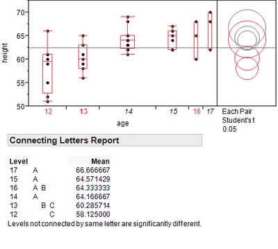
It's tricky to draw conclusions from the confidence intervals alone, but in conjuction with the connecting letters report you can draw statistically meaningful conclusions. Take for example the report shown below. When you click on the circle corresponding to the age 13 group two of the overlapping circles (12 and 16) are also highlighted in red meaning that the age 13 groups is not significanlty different from either group. The connecting letters report shows that Ages 13 and 16 are not significanlty different at this confidence level because they are connected by B. Similarly, ages 13 and 12 are not significanlty different because they are connected by C. However, since no letter connects 12 and 16, these two groups are said to be significantly different, which in the circle plot is visualized as confidence intervals with very little overlap.
open("$SAMPLE_DATA/Big Class.jmp");
Oneway(
Y( :height ),
X( :age ),
Each Pair( 1 ),
Quantiles( 1 ),
Box Plots( 1 ),
Comparison Circles( 1 )
);
- Mark as New
- Bookmark
- Subscribe
- Mute
- Subscribe to RSS Feed
- Get Direct Link
- Report Inappropriate Content
Re: How to draw conclusions from circle comparison graph
See also Multiple Comparison Circles and John Sall's original article: Graphical Comparison of Means. Sorry that the images in the secomd link aren't very clear.
- Mark as New
- Bookmark
- Subscribe
- Mute
- Subscribe to RSS Feed
- Get Direct Link
- Report Inappropriate Content
Re: How to draw conclusions from circle comparison graph
Can you please post a screenshot of your analysis? My guess is that you are better off focusing your attention to the P-values for the group comparisons rather than the circles which are inherently non-quantitative and are only intended for quick visual reference.
- Mark as New
- Bookmark
- Subscribe
- Mute
- Subscribe to RSS Feed
- Get Direct Link
- Report Inappropriate Content
Re: How to draw conclusions from circle comparison graph
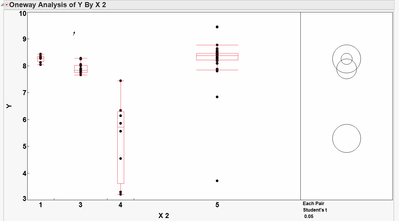
Unfortunately, I don't currently have access to the exact data set that I am using. However, I have attached a screenshot of the test the visualization that I am alluding to. There are 5 "groups" and a mixed number of data points in each group. Our group is trying to decide how to interpret the relative position of the circles as well as their radii. Any clues as to their meaning and mathematical derivation would be very helpful.
Thanks,
Tei
- Mark as New
- Bookmark
- Subscribe
- Mute
- Subscribe to RSS Feed
- Get Direct Link
- Report Inappropriate Content
Re: How to draw conclusions from circle comparison graph
The position of the circles correspond to the means of the various groups. I believe that by default the radii show the 95% confidence interval (someone please correct me if I'm wrong), meaning that the true mean should lie within the circle 95% of the time for data with a normal distribution. You can google "confidence interval" to understand the math behind their derivation. You can better appreciate their meaning and implications by changing the alpha value (via the red arrow drop-down menu) to higher and lower values. Smaller alpha values will lead to circles with larger radii because if you want to be >95% certain that you are capturing the true mean then you need a bigger window.
- Mark as New
- Bookmark
- Subscribe
- Mute
- Subscribe to RSS Feed
- Get Direct Link
- Report Inappropriate Content
Re: How to draw conclusions from circle comparison graph
Thank you very much for the response. Is there any way to better understand the overlap between circles? What would be the statistically correct way to phrase this type of graphical comparison for the sake of statement accuracy?
Thanks,
Tei
- Mark as New
- Bookmark
- Subscribe
- Mute
- Subscribe to RSS Feed
- Get Direct Link
- Report Inappropriate Content
Re: How to draw conclusions from circle comparison graph
It's tricky to draw conclusions from the confidence intervals alone, but in conjuction with the connecting letters report you can draw statistically meaningful conclusions. Take for example the report shown below. When you click on the circle corresponding to the age 13 group two of the overlapping circles (12 and 16) are also highlighted in red meaning that the age 13 groups is not significanlty different from either group. The connecting letters report shows that Ages 13 and 16 are not significanlty different at this confidence level because they are connected by B. Similarly, ages 13 and 12 are not significanlty different because they are connected by C. However, since no letter connects 12 and 16, these two groups are said to be significantly different, which in the circle plot is visualized as confidence intervals with very little overlap.
open("$SAMPLE_DATA/Big Class.jmp");
Oneway(
Y( :height ),
X( :age ),
Each Pair( 1 ),
Quantiles( 1 ),
Box Plots( 1 ),
Comparison Circles( 1 )
);
- Mark as New
- Bookmark
- Subscribe
- Mute
- Subscribe to RSS Feed
- Get Direct Link
- Report Inappropriate Content
Re: How to draw conclusions from circle comparison graph
Huh, that is very interesting. Do you know of any references that can explain the math behind this report?
Thanks,
Tei
- Mark as New
- Bookmark
- Subscribe
- Mute
- Subscribe to RSS Feed
- Get Direct Link
- Report Inappropriate Content
Re: How to draw conclusions from circle comparison graph
- Mark as New
- Bookmark
- Subscribe
- Mute
- Subscribe to RSS Feed
- Get Direct Link
- Report Inappropriate Content
Re: How to draw conclusions from circle comparison graph
See also Multiple Comparison Circles and John Sall's original article: Graphical Comparison of Means. Sorry that the images in the secomd link aren't very clear.
- Mark as New
- Bookmark
- Subscribe
- Mute
- Subscribe to RSS Feed
- Get Direct Link
- Report Inappropriate Content
Re: How to draw conclusions from circle comparison graph
Hi Rick,
That is a very helpful link. Do you have any further information along those lines that could answer the other question I had regarding the p-values in this test?
https://communities.sas.com/message/163421#163421
Thanks,
Tei
Recommended Articles
- © 2026 JMP Statistical Discovery LLC. All Rights Reserved.
- Terms of Use
- Privacy Statement
- Contact Us


