- New to JMP? Let the Data Analysis Director guide you through selecting an analysis task, an analysis goal, and a data type. Available now in the JMP Marketplace!
- See how to install JMP Marketplace extensions to customize and enhance JMP.
- Subscribe to RSS Feed
- Mark Topic as New
- Mark Topic as Read
- Float this Topic for Current User
- Bookmark
- Subscribe
- Mute
- Printer Friendly Page
Discussions
Solve problems, and share tips and tricks with other JMP users.- JMP User Community
- :
- Discussions
- :
- How to draw a chart with percentile on the horizontal axis and the number of obs...
- Mark as New
- Bookmark
- Subscribe
- Mute
- Subscribe to RSS Feed
- Get Direct Link
- Report Inappropriate Content
How to draw a chart with percentile on the horizontal axis and the number of observations on the vertical?
Hi,
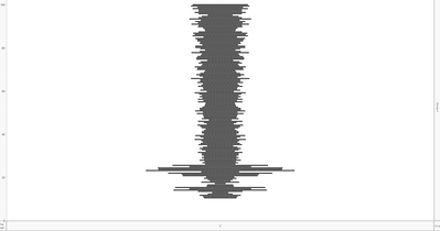
Now I have build a graph like below, showing the distribution of a variable based on its percentiles. Each dot is an observation. Now I wish to show a chart with percentile on the horizontal axis (currently on the vertical axis) and the number of observations on the vertical axis. Can JMP do it without requiring me to create a new "count of observation for each percentile range" variable? Thanks.
Accepted Solutions
- Mark as New
- Bookmark
- Subscribe
- Mute
- Subscribe to RSS Feed
- Get Direct Link
- Report Inappropriate Content
Re: How to draw a chart with percentile on the horizontal axis and the number of observations on the vertical?
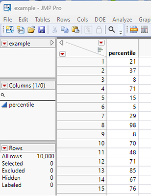
This can easily be accomplished by using JMP's ability to add virtual columns. Assuming your data table has a column that has the percentile value, such as below
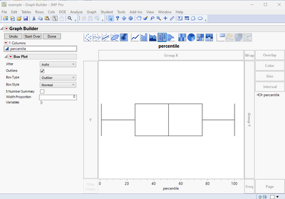
Then open Graph Builder and drag the percentile column to the X axis
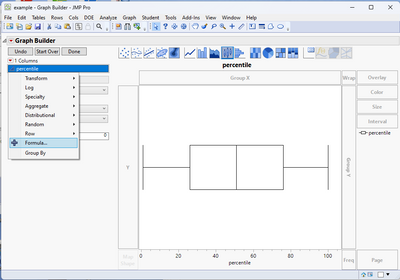
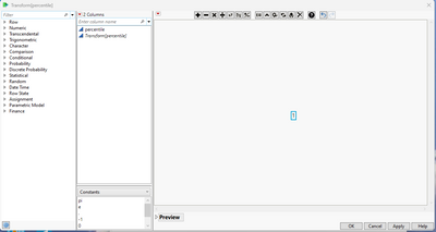
Next, a virtual count variable needs to be created. Right click on the Percentile column and select Formula
Change the value of the formula from the original column( in my example Percentile), to just the number "1"
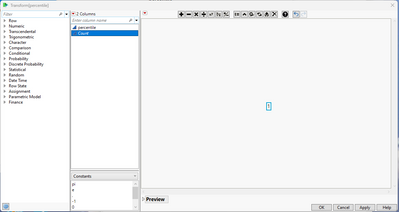
If you right click on the Transform(percentile) column, you can select "Rename" and change the name to whatever you want. I chose the name "Count"
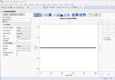
Close this window and now drag the new virtual column to the Y axis
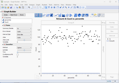
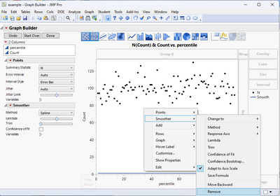
Now go to the Points control section and change the Summary Statistic to N
And then finally right click on the chart, and select Smoother>Remove
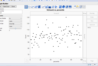
And you will get the final graph
- Mark as New
- Bookmark
- Subscribe
- Mute
- Subscribe to RSS Feed
- Get Direct Link
- Report Inappropriate Content
Re: How to draw a chart with percentile on the horizontal axis and the number of observations on the vertical?
Thanks, Jim, marvelous.
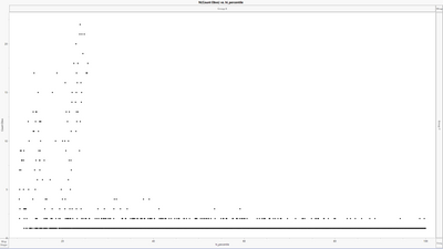
But since many unique percentile numbers correspond to only 1 or 2 observations, the bottom line is too heavy:
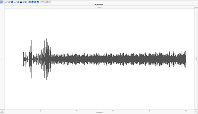
What I want is just like the chart below but the dots are not symmetric on Y axis. Is it possible?
- Mark as New
- Bookmark
- Subscribe
- Mute
- Subscribe to RSS Feed
- Get Direct Link
- Report Inappropriate Content
Re: How to draw a chart with percentile on the horizontal axis and the number of observations on the vertical?
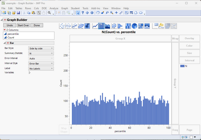
Try using the Count virtual column as the Y variable, and change the graph display from Points to Bar
Recommended Articles
- © 2026 JMP Statistical Discovery LLC. All Rights Reserved.
- Terms of Use
- Privacy Statement
- Contact Us
