- Mark as New
- Bookmark
- Subscribe
- Mute
- Subscribe to RSS Feed
- Get Direct Link
- Report Inappropriate Content
How to create a second Y axes scale?
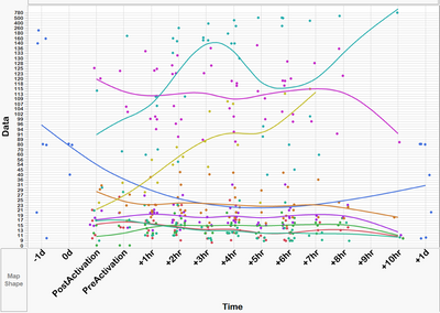
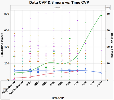
I have 9 parameter and 4 of them have a low values (0 to 40) while the others 5 have values from 21 to 780. I would like to graph all together as seem below, but built a second Y axes for the first 4 parameters.
My data set (table) has the following columns:
ID
Time
Parameter
Data
Accepted Solutions
- Mark as New
- Bookmark
- Subscribe
- Mute
- Subscribe to RSS Feed
- Get Direct Link
- Report Inappropriate Content
Re: How to create a second Y axes scale?
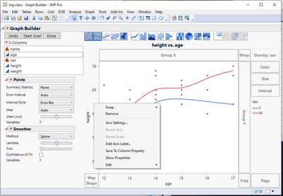
I suspect the 9 parameters that you reference in your first entry are actually differentiated by an Overlay, and not as separate columns. The Graph Builder output below, does not allow separate axes. That is because there is only one column referenced on the Y axis. The 2 lines/colors are being generated by the specified Overlay column, Sex.
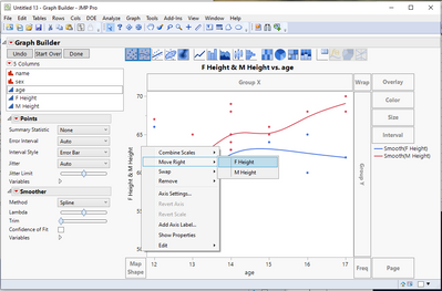
To be able to specify the left and right axes, in my example I split the Height column into separate columns f
or F Height and M Height, and then drag both columns to the Y axis.
In your case, you just need to split your column into the 9 different parameters
Tables=>Split
- Mark as New
- Bookmark
- Subscribe
- Mute
- Subscribe to RSS Feed
- Get Direct Link
- Report Inappropriate Content
Re: How to create a second Y axes scale?
Try adding the Smoother before doing the Move Right. On the example I ran to test this out, if I added the Smoother after the Move Right, only the left columns had a smoother. But, if I added the Smoother before the Move Right, the Smoothers were on all
- Mark as New
- Bookmark
- Subscribe
- Mute
- Subscribe to RSS Feed
- Get Direct Link
- Report Inappropriate Content
Re: How to create a second Y axes scale?
Thank you so much, it worked!
- Mark as New
- Bookmark
- Subscribe
- Mute
- Subscribe to RSS Feed
- Get Direct Link
- Report Inappropriate Content
Re: How to create a second Y axes scale?
Right click on the y-axis in the Graph Builder report and select Move Right, then select the columns you wish to put on a separate y-axis scale on the right side. To do this you would need the different series in different columns, so you need to split your data table (Tables menu > Split) by the column (Parameter) you are using in the overlay role in the visual you are showing. Then with the split table, drag all the parameters columns to the y-axis and then you can right click and select the cols you wish to move to the right scale.
- Mark as New
- Bookmark
- Subscribe
- Mute
- Subscribe to RSS Feed
- Get Direct Link
- Report Inappropriate Content
Re: How to create a second Y axes scale?
Thank you!
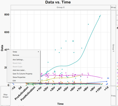
I am not sure why but the option to move right is not showing on my graph builder (see below). Is there a different way to find it?
- Mark as New
- Bookmark
- Subscribe
- Mute
- Subscribe to RSS Feed
- Get Direct Link
- Report Inappropriate Content
Re: How to create a second Y axes scale?
I suspect the 9 parameters that you reference in your first entry are actually differentiated by an Overlay, and not as separate columns. The Graph Builder output below, does not allow separate axes. That is because there is only one column referenced on the Y axis. The 2 lines/colors are being generated by the specified Overlay column, Sex.
To be able to specify the left and right axes, in my example I split the Height column into separate columns f
or F Height and M Height, and then drag both columns to the Y axis.
In your case, you just need to split your column into the 9 different parameters
Tables=>Split
- Mark as New
- Bookmark
- Subscribe
- Mute
- Subscribe to RSS Feed
- Get Direct Link
- Report Inappropriate Content
Re: How to create a second Y axes scale?
Thank you, Jim.
Done!
but now the right Y axis does not shows the smoother lines only the dots (see below). How can I show also the lines or another way to represent the trend?
again thank you so much
- Mark as New
- Bookmark
- Subscribe
- Mute
- Subscribe to RSS Feed
- Get Direct Link
- Report Inappropriate Content
Re: How to create a second Y axes scale?
Try adding the Smoother before doing the Move Right. On the example I ran to test this out, if I added the Smoother after the Move Right, only the left columns had a smoother. But, if I added the Smoother before the Move Right, the Smoothers were on all
- Mark as New
- Bookmark
- Subscribe
- Mute
- Subscribe to RSS Feed
- Get Direct Link
- Report Inappropriate Content
Re: How to create a second Y axes scale?
Thank you so much, it worked!
- Mark as New
- Bookmark
- Subscribe
- Mute
- Subscribe to RSS Feed
- Get Direct Link
- Report Inappropriate Content
Re: How to create a second Y axes scale?
Hello @txnelson,
Is there an alternative in the cases where there are more than 2 categories (F & M in your case) ? In my case I might have more than 20 categories and I would like to send to the secondary axis just 1 and let the other 19 in the first axis.
Doing it with "table>>split" would multiply enormously the number of columns which would not be very practical for my case.
Thank you,
Julian
- Mark as New
- Bookmark
- Subscribe
- Mute
- Subscribe to RSS Feed
- Get Direct Link
- Report Inappropriate Content
Re: How to create a second Y axes scale?
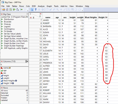
All you need to do is to separate the one group you want to specify on your right axis into one column and all others into a second column. In my example I have separated out the heights for individuals of age 14
This can either be done as real columns
Using the formula for the column "Most Heights"
If( :age != 14, :height, . )Name the formula for "Height 14"
If( :age == 14, :height, . )Or the columns can be virtual columns by just adding them to the Graph Builder definition....using the same formulas as above
- Mark as New
- Bookmark
- Subscribe
- Mute
- Subscribe to RSS Feed
- Get Direct Link
- Report Inappropriate Content
Re: How to create a second Y axes scale?
Thank you @txnelson. It was very helpful
