- Subscribe to RSS Feed
- Mark Topic as New
- Mark Topic as Read
- Float this Topic for Current User
- Bookmark
- Subscribe
- Mute
- Printer Friendly Page
Discussions
Solve problems, and share tips and tricks with other JMP users.- JMP User Community
- :
- Discussions
- :
- Re: how to plot CDF plot without doing y by x plot
- Mark as New
- Bookmark
- Subscribe
- Mute
- Subscribe to RSS Feed
- Get Direct Link
- Report Inappropriate Content
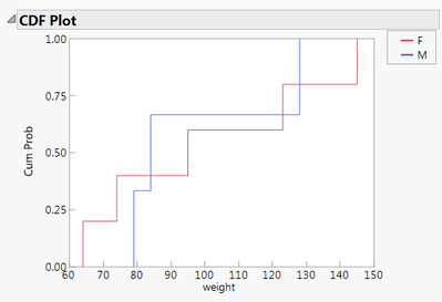
How to create a CDF plot without using the Fit Y by X platform interactively?
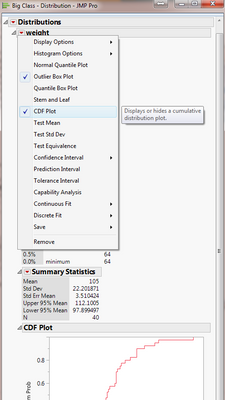
hi, Here is an example, using big class data table. In order to get the CDF plot, I have to do a y by x and enable CDF option to get it. My question is how to plot CDF plot without doing y by x plot? I scratched my hair very hard, no vial.
Oneway(
SendToByGroup( Bygroup Default ),
Y( :weight ),
SendToByGroup( {:age == 12}, Y( :weight ) ),
X( :sex ),
SendToByGroup( {:age == 12}, X( :sex ), CDF Plot( 1 ) ),
By( :age ),
SendToByGroup(
{:age == 12},
SendToReport(
Dispatch(
{"Oneway Analysis of weight By sex age=12"},
"CDF Plot",
OutlineBox,
{SetHorizontal( 1 )}
)
)
)
);
Accepted Solutions
- Mark as New
- Bookmark
- Subscribe
- Mute
- Subscribe to RSS Feed
- Get Direct Link
- Report Inappropriate Content
Re: how to plot CDF plot without doing y by x plot
I am a little confused about your statement that it is hard to make a script that uses the Distribution or Oneway platform to create a normal quantile plot or a CDF plot. Are you looking for a separate function that generates such a plot? You can generate a Graph Box, and then place into it any graphics you want. But you would have to generate the Normal quantile or CDF plots from scratch.
I am also wondering if you are not aware that all you have to do to create such a script, is to interactively create the display output using the platform you want, and then to go to the red triangle==>script==>Write Script to Script Window. It generates the exact code you need to generate the normal quantile of CDF plot, or whatever else you have specified.
Is this getting closer to what you need?
- Mark as New
- Bookmark
- Subscribe
- Mute
- Subscribe to RSS Feed
- Get Direct Link
- Report Inappropriate Content
Re: how to plot CDF plot without doing y by x plot
- Mark as New
- Bookmark
- Subscribe
- Mute
- Subscribe to RSS Feed
- Get Direct Link
- Report Inappropriate Content
Re: how to plot CDF plot without doing y by x plot
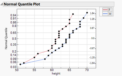
Let me rephrase my question, I would like be able to script a normal quantile plot or a CDF plot. I knew we can do it by doing distribution or oneway analysis but it is make very hard to script.
- Mark as New
- Bookmark
- Subscribe
- Mute
- Subscribe to RSS Feed
- Get Direct Link
- Report Inappropriate Content
Re: how to plot CDF plot without doing y by x plot
I am a little confused about your statement that it is hard to make a script that uses the Distribution or Oneway platform to create a normal quantile plot or a CDF plot. Are you looking for a separate function that generates such a plot? You can generate a Graph Box, and then place into it any graphics you want. But you would have to generate the Normal quantile or CDF plots from scratch.
I am also wondering if you are not aware that all you have to do to create such a script, is to interactively create the display output using the platform you want, and then to go to the red triangle==>script==>Write Script to Script Window. It generates the exact code you need to generate the normal quantile of CDF plot, or whatever else you have specified.
Is this getting closer to what you need?
- Mark as New
- Bookmark
- Subscribe
- Mute
- Subscribe to RSS Feed
- Get Direct Link
- Report Inappropriate Content
Re: how to plot CDF plot without doing y by x plot
hi, Jim,
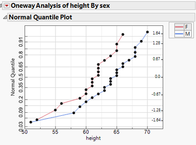
Yes, I am looking for a separate function that generates such a plot so that I could iterate it in a loop to plot the plots one by one and output it into a journal, then save a .png. The situation that normal qualtiles plot is embedded in either oneway or distribution make it difficult for me to enable it (my skill in scripting).
With your helps, I am able to make it just plot the normal quantile. I do not know how to change the title of the plot though.
Oneway(
Y( :height ),
X( :sex ),
All Graphs( 0 ),
Plot Quantile by Actual( 1 ),
Line of Fit( 0 ),
Mean Diamonds( 0 ),
X Axis Proportional( 0 ),
Grand Mean( 0 ),
SendToReport(
Dispatch(
{"Normal Quantile Plot"},
"2",
ScaleBox,
{Label Row( Label Orientation( "Vertical" ) )}
)
)
);
- Mark as New
- Bookmark
- Subscribe
- Mute
- Subscribe to RSS Feed
- Get Direct Link
- Report Inappropriate Content
Re: how to plot CDF plot without doing y by x plot
I will first deal with the figuring out, of how to change the Title of the Plot. I assume, what you are referring to, is the Title of the Outline Box that has the Title of "Normal Quantile Plot". The simple answer to this is that you change it interactively, and then have JMP generate the script. In the script, you will see the method to change the title.
Here is the script that JMP generated that will produce the change in the title
Oneway(
Y( :height ),
X( :sex ),
All Graphs( 0 ),
Plot Quantile by Actual( 1 ),
Line of Fit( 0 ),
X Axis Proportional( 0 ),
Grand Mean( 0 ),
SendToReport(
Dispatch(
{},
"Normal Quantile Plot",
OutlineBox,
{Set Title( "This is the title change" )}
),
Dispatch(
{"Normal Quantile Plot"},
"2",
ScaleBox,
{Label Row( Label Orientation( "Vertical" ) )}
)
)
);
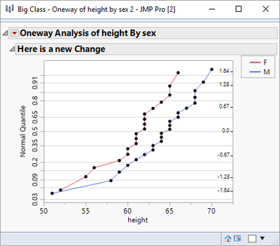
So given that, you can turn the title into a JMP variable, and just use it in the above structure
MyTitle = "Here is a new Change";
Oneway(
Y( :height ),
X( :sex ),
All Graphs( 0 ),
Plot Quantile by Actual( 1 ),
Line of Fit( 0 ),
X Axis Proportional( 0 ),
Grand Mean( 0 ),
SendToReport(
Dispatch(
{},
"Normal Quantile Plot",
OutlineBox,
{Set Title( MyTitle)}
),
Dispatch(
{"Normal Quantile Plot"},
"2",
ScaleBox,
{Label Row( Label Orientation( "Vertical" ) )}
)
)
);
Now, lets deal with the generation of all of the graphs. Using the Big Class data table, there are really only 2 columns to be graphed, but that is enough to illustrate the method.
Names Default To Here( 1 );
dt = Open( "$SAMPLE_DATA/Big Class.jmp" );
// Get the continuous columns from the data table
ColList = dt << get column names( continuous );
// Loop across the list of columns and produce a graph for each column
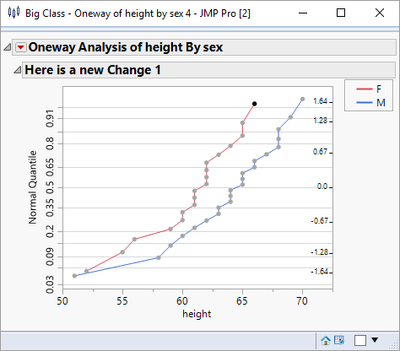
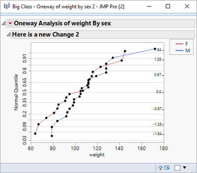
For( i = 1, i <= N Items( ColList ), i++,
MyTitle = "Here is a new Change " || char(i);
Oneway(
Y( ColList[i] ),
X( :sex ),
All Graphs( 0 ),
Plot Quantile by Actual( 1 ),
Line of Fit( 0 ),
X Axis Proportional( 0 ),
Grand Mean( 0 ),
SendToReport(
Dispatch( {}, "Normal Quantile Plot", OutlineBox, {Set Title( MyTitle )} ),
Dispatch( {"Normal Quantile Plot"}, "2", ScaleBox, {Label Row( Label Orientation( "Vertical" ) )} )
)
);
);
It produces a separate display for each Normal Quantile Plot
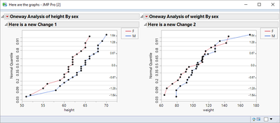
So the next step will put them all together in one window
Names Default To Here( 1 );
dt = Open( "$SAMPLE_DATA/Big Class.jmp" );
// Get the continuous columns from the data table
ColList = dt << get column names( continuous );
// Create your own display window and generate the graph inside
New Window( "Here are the graphs",
// Now I am choosing to put all of the graphs side by side so I am
// using an H List Box() to encaptulate the graphs
H List Box(
// Loop acrss the list of columns and produce a graph for each column
For( i = 1, i <= N Items( ColList ), i++,
MyTitle = "Here is a new Change " || Char( i );
Oneway(
Y( ColList[i] ),
X( :sex ),
All Graphs( 0 ),
Plot Quantile by Actual( 1 ),
Line of Fit( 0 ),
X Axis Proportional( 0 ),
Grand Mean( 0 ),
SendToReport(
Dispatch( {}, "Normal Quantile Plot", OutlineBox, {Set Title( MyTitle )} ),
Dispatch( {"Normal Quantile Plot"}, "2", ScaleBox, {Label Row( Label Orientation( "Vertical" ) )} )
)
);,
)
)
);
Which produces:
- Mark as New
- Bookmark
- Subscribe
- Mute
- Subscribe to RSS Feed
- Get Direct Link
- Report Inappropriate Content
Re: how to plot CDF plot without doing y by x plot
hi, Jim
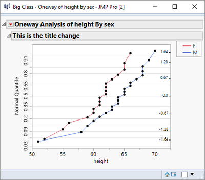
Where I wanted to change is :"Oneway Analysis".
Thanks for your helps!
Recommended Articles
- © 2026 JMP Statistical Discovery LLC. All Rights Reserved.
- Terms of Use
- Privacy Statement
- Contact Us
