- Discovery Summit 2026: Early User Edition - September 23-24.Register. It's free.
- Graph Builder Toolbar streamlines interactive graphing. Creates shortcuts on Report and GraphBuilder Helpers toolbars. Download and install the extension.
- Subscribe to RSS Feed
- Mark Topic as New
- Mark Topic as Read
- Float this Topic for Current User
- Bookmark
- Subscribe
- Mute
- Printer Friendly Page
Discussions
Solve problems, and share tips and tricks with other JMP users.- User Community
- :
- Discussions
- :
- Re: How to create DOE Scatter Plot and DOE Mean Plot using Graph Builder

- Mark as New
- Bookmark
- Subscribe
- Mute
- Subscribe to RSS Feed
- Get Direct Link
- Report Inappropriate Content
How to create DOE Scatter Plot and DOE Mean Plot using Graph Builder
I am reading the DOE guideline from NIST, and wanted to create a DOE Scatter Plot and DOE Mean Plot. Using Graph Builder I am not sure how I can include multiple columns, i.e. X's, on the x-axis? At most, it lets me do 2, but it overlaps the data, so I am wondering if JMP can create graphs like the one below?
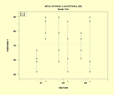
^ DOE Scatter Plot
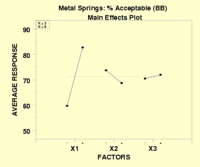
^ DOE Mean Plot
Accepted Solutions


- Mark as New
- Bookmark
- Subscribe
- Mute
- Subscribe to RSS Feed
- Get Direct Link
- Report Inappropriate Content
Re: How to create DOE Scatter Plot and DOE Mean Plot using Graph Builder
Hi @AsymptoticRules,
Both graphs are possible, but require a little preparation beforehand.
Basically you'll need to :
- Have the levels of your designs shown as coded (-1, 0 and 1),
- Stack your datatable with the coded factors,
- Use the stacked Factors column as Group X, Code (-1/0/1) as X, response as Y, and use a boxplot for your DoE ScatterPlot and Line of Fit for your DoE Mean Plot.
Here is an example on the Bounce Data dataset from JMP :
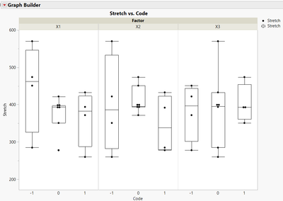
And for the Mean Plot :
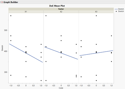
You'll find attached the datatable, containing script for the stacked table on which the graphs are made (and scripts are saved too on this stacked table).
Hope this will help you,
"It is not unusual for a well-designed experiment to analyze itself" (Box, Hunter and Hunter)

- Mark as New
- Bookmark
- Subscribe
- Mute
- Subscribe to RSS Feed
- Get Direct Link
- Report Inappropriate Content
Re: How to create DOE Scatter Plot and DOE Mean Plot using Graph Builder
Just select your 3 factors and drag them onto the X axis.
Without any additional action, you will get a hierarchical structure on the X Axis.
If you press Shift while dragging (second part of the video), Jmp will position the factors next to each other.
- Mark as New
- Bookmark
- Subscribe
- Mute
- Subscribe to RSS Feed
- Get Direct Link
- Report Inappropriate Content
Re: How to create DOE Scatter Plot and DOE Mean Plot using Graph Builder
Hi @AsymptoticRules,
Both graphs are possible, but require a little preparation beforehand.
Basically you'll need to :
- Have the levels of your designs shown as coded (-1, 0 and 1),
- Stack your datatable with the coded factors,
- Use the stacked Factors column as Group X, Code (-1/0/1) as X, response as Y, and use a boxplot for your DoE ScatterPlot and Line of Fit for your DoE Mean Plot.
Here is an example on the Bounce Data dataset from JMP :
And for the Mean Plot :
You'll find attached the datatable, containing script for the stacked table on which the graphs are made (and scripts are saved too on this stacked table).
Hope this will help you,
"It is not unusual for a well-designed experiment to analyze itself" (Box, Hunter and Hunter)
- Mark as New
- Bookmark
- Subscribe
- Mute
- Subscribe to RSS Feed
- Get Direct Link
- Report Inappropriate Content
Re: How to create DOE Scatter Plot and DOE Mean Plot using Graph Builder
Just select your 3 factors and drag them onto the X axis.
Without any additional action, you will get a hierarchical structure on the X Axis.
If you press Shift while dragging (second part of the video), Jmp will position the factors next to each other.


- Mark as New
- Bookmark
- Subscribe
- Mute
- Subscribe to RSS Feed
- Get Direct Link
- Report Inappropriate Content
Re: How to create DOE Scatter Plot and DOE Mean Plot using Graph Builder
Hi @AsymptoticRules,
An other solution would be to use the Variability Chart from the Analyze>>Quality and Process menu.
Starting from the Stacked table from the example from Victor, here is the plateform configuration.
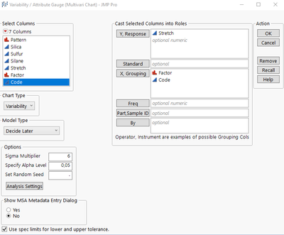
This gives you the following chart, close to yours.
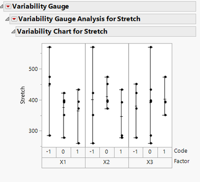
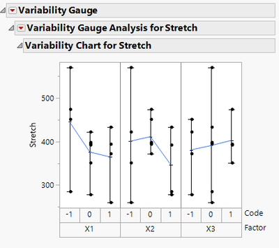
In the hotspot of the Variability Gauge Analysis, activate the option "Connect Cell Means" to get the following chart
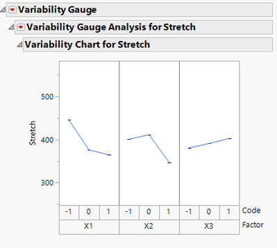
In case you want to separate the charts, you jus need to unselect the options "Show Points" and "Show Range bars"
Hope this will help you,
Recommended Articles
- © 2026 JMP Statistical Discovery LLC. All Rights Reserved.
- Terms of Use
- Privacy Statement
- Contact Us